nice to
have you
have you

we are
van lennep
van lennep


& we love
good ideas
good ideas


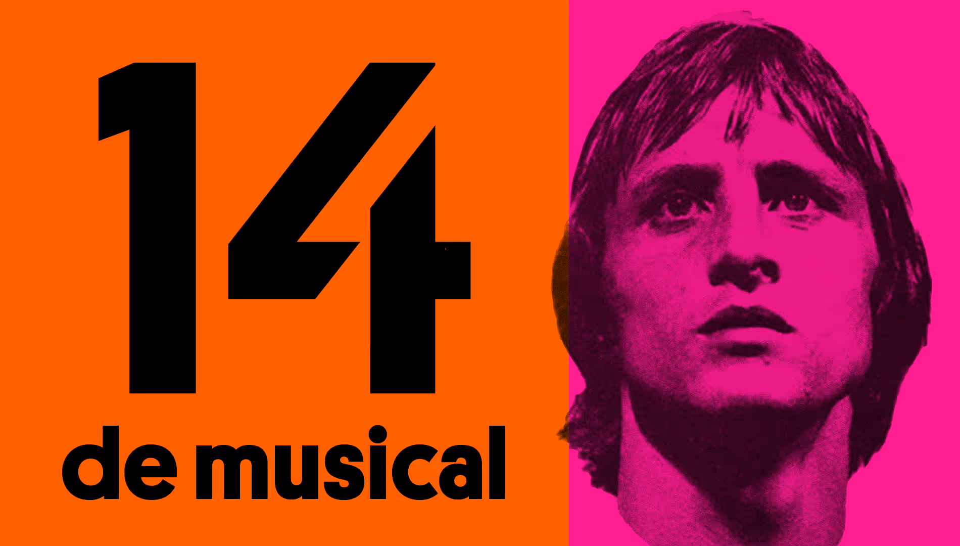
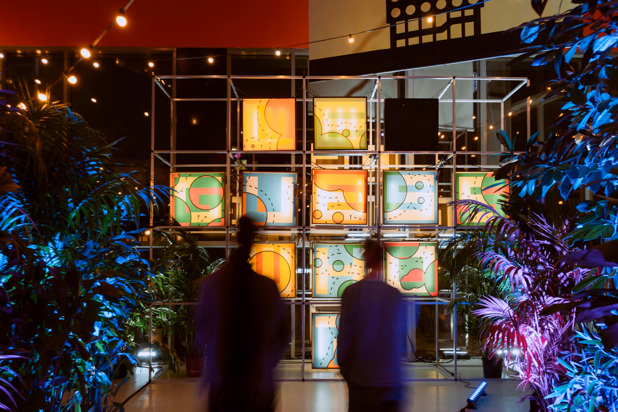
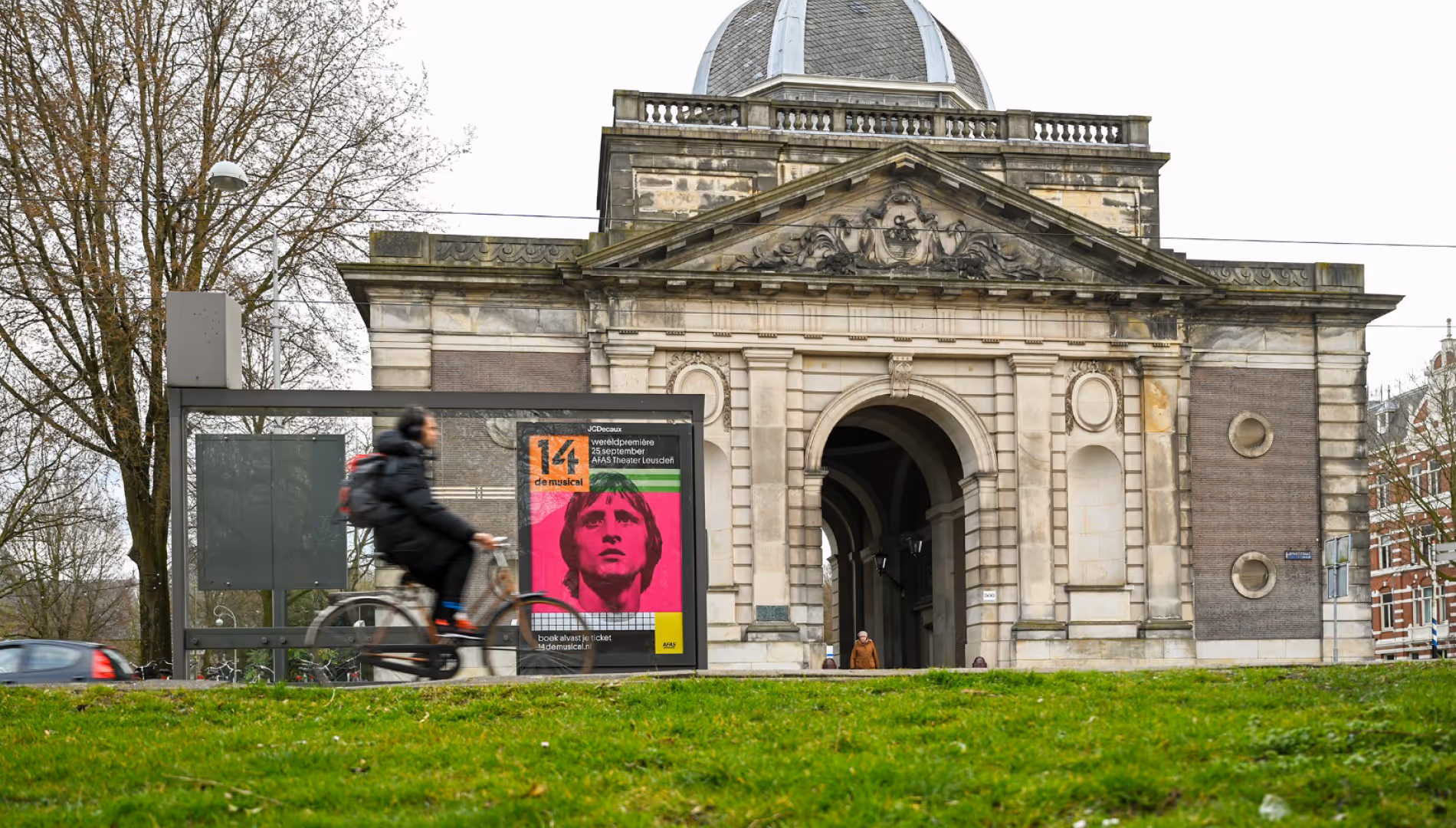
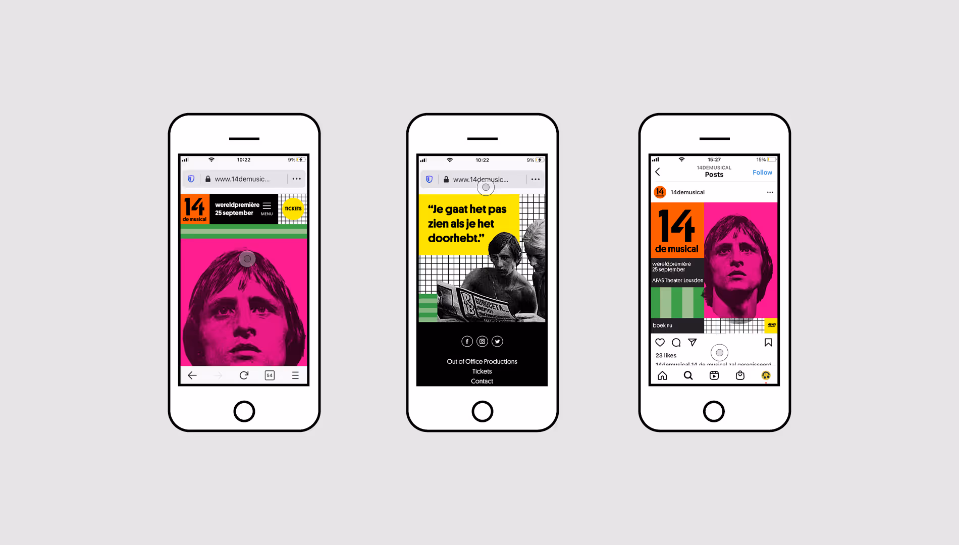
14 the musical shows how Johan Cruijff evolves into a superstar. Stemming from the period the musical is situated in, we used pop art as inspiration and created a building blocks-based concept. These building blocks allow each creation to be as distinguishable as the Great Cruijff himself.
.gif)
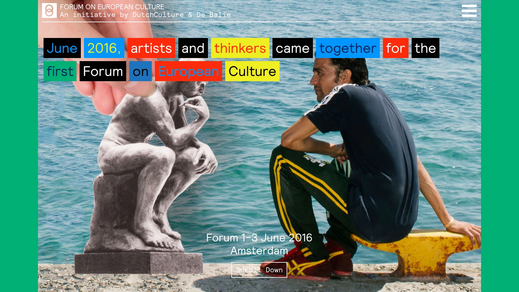
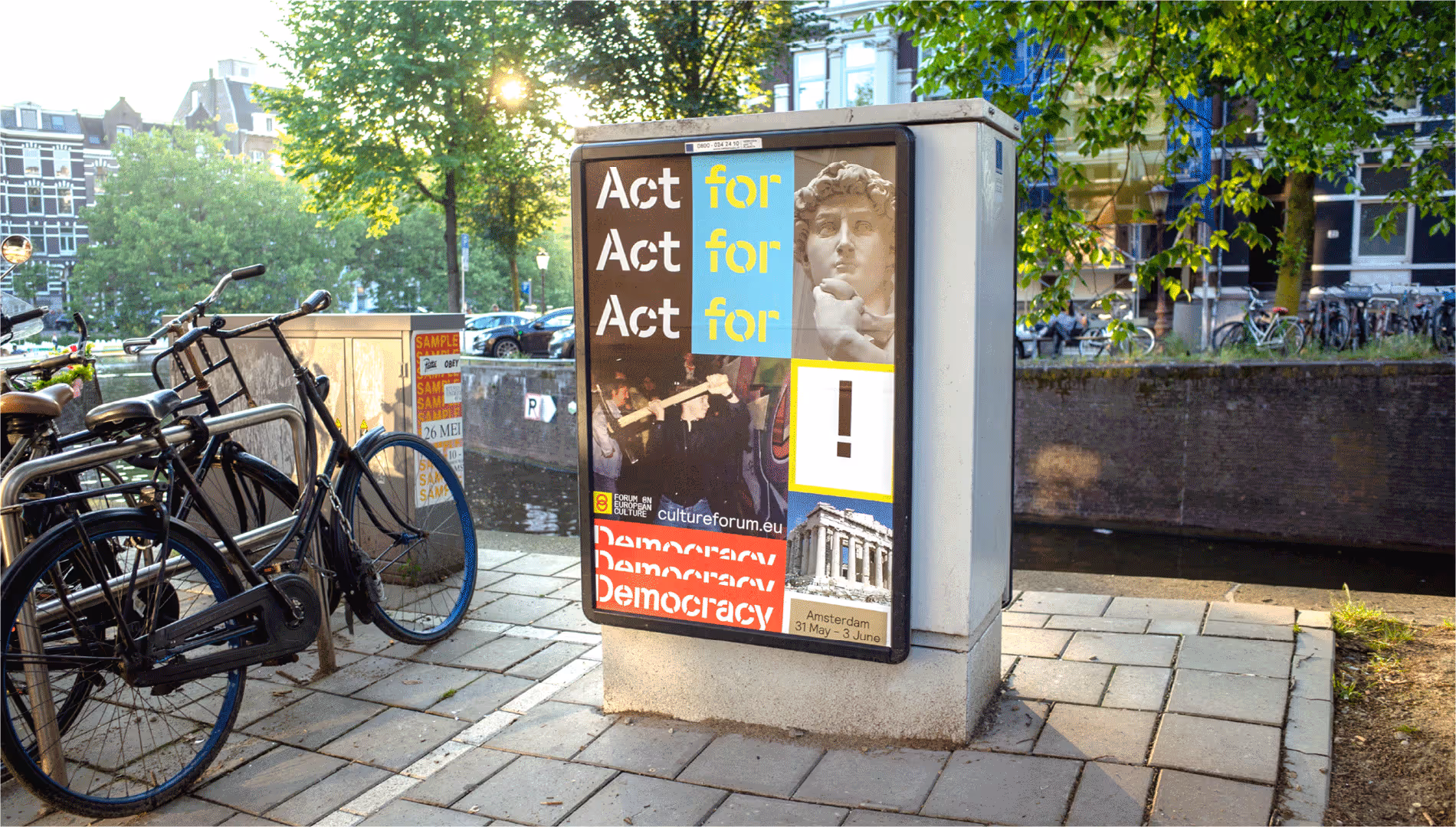
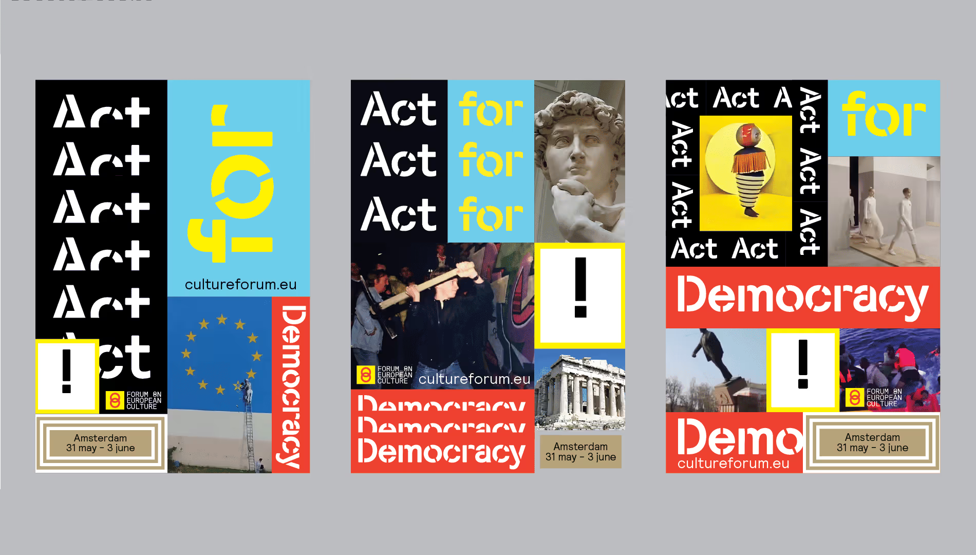
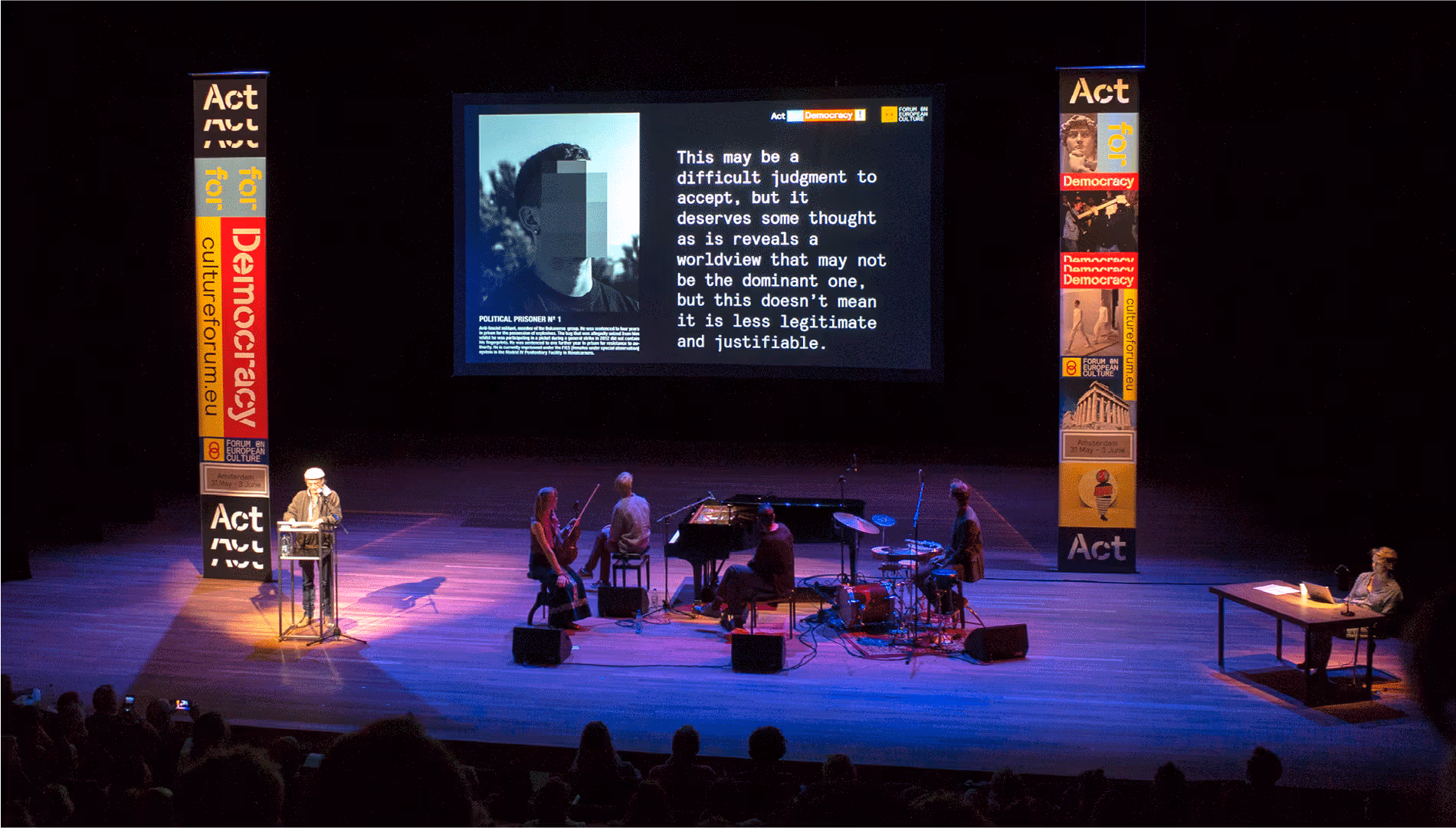
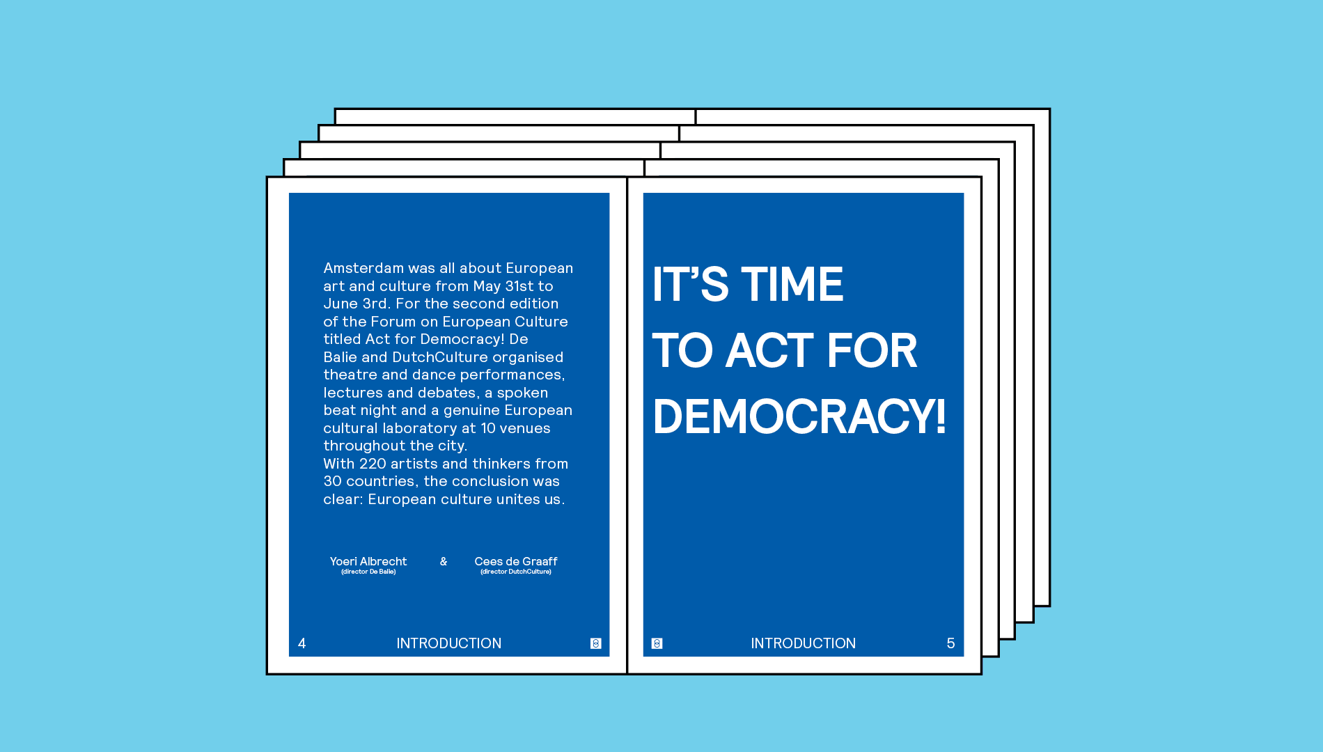
Act for Democracy is the second edition of Forum on European Culture, a biennial forum on the strength, impact and value of art and culture for European democracy organised by De Balie and DutchCulture. As with the first edition, we provided the visual identity. We felt that we had to express ourselves even more: against populism, more guts, more in your face. Time for action! Act for democracy.

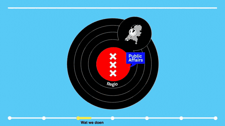
Amsterdam Public Affairs is the lobby organisation of the City of Amsterdam, representing the interests of the municipality in all possible national- and international networks, from the province to the UN. Their work is so diverse that it is difficult to explain to their colleagues within the City Goverment exactly what they do and how they can help them get their issues on the agenda in The Hague and abroad. We helped Amsterdam PA to visually clarify their story of tasks, challenges and possibilities.
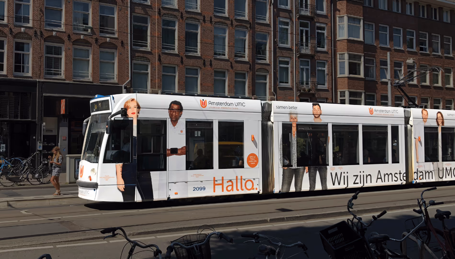
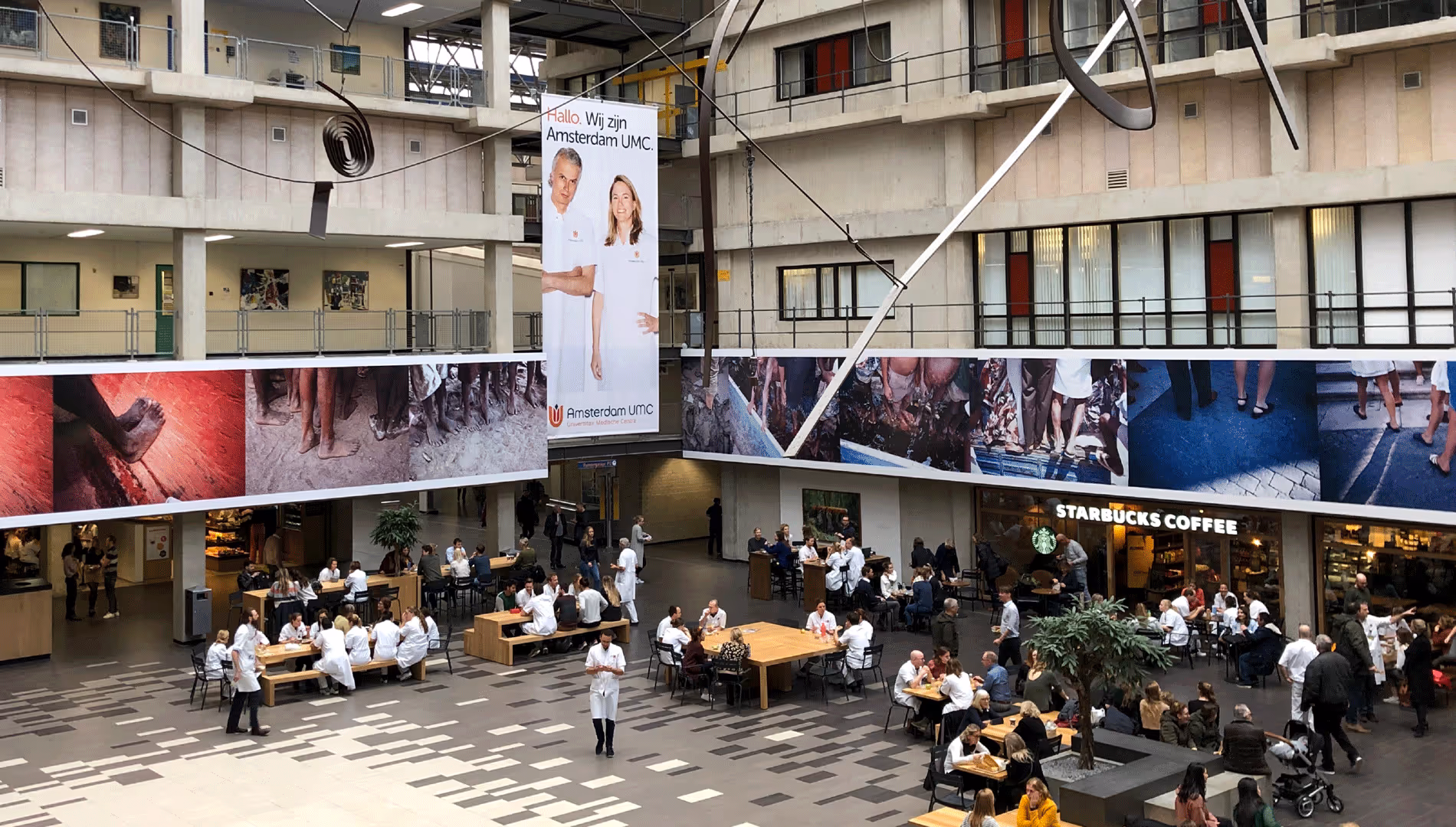
Hello. We are Amsterdam UMC. In 2018 two large hospitals in Amsterdam merged under the name Amsterdam UMC. Better together, because together they make the existing healthcare even better. We introduced Amsterdam UMC to the city of Amsterdam by developing a strong campaign in which everyone can recognize themselves: both the employees of the renewed hospital and the residents of the city of Amsterdam.


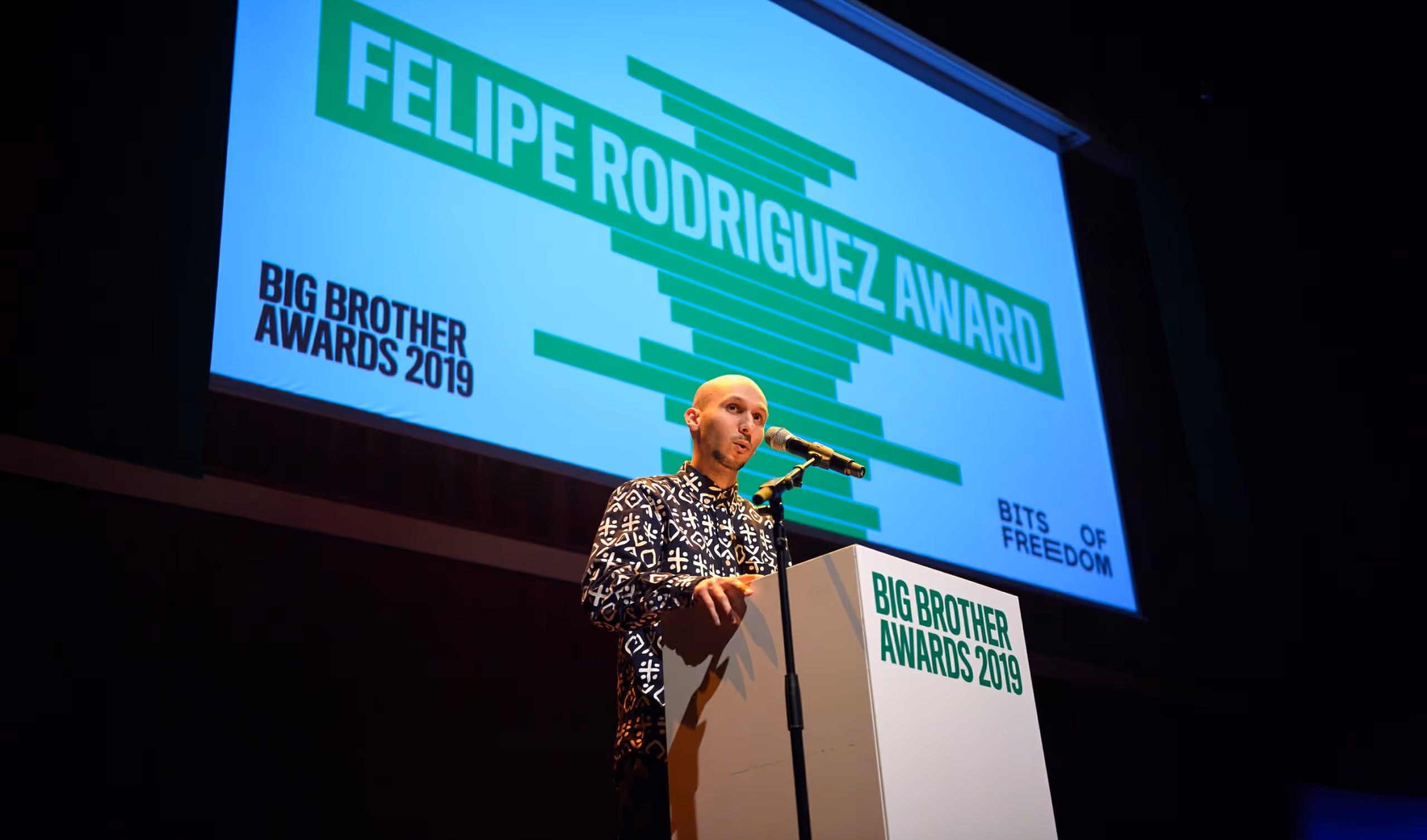
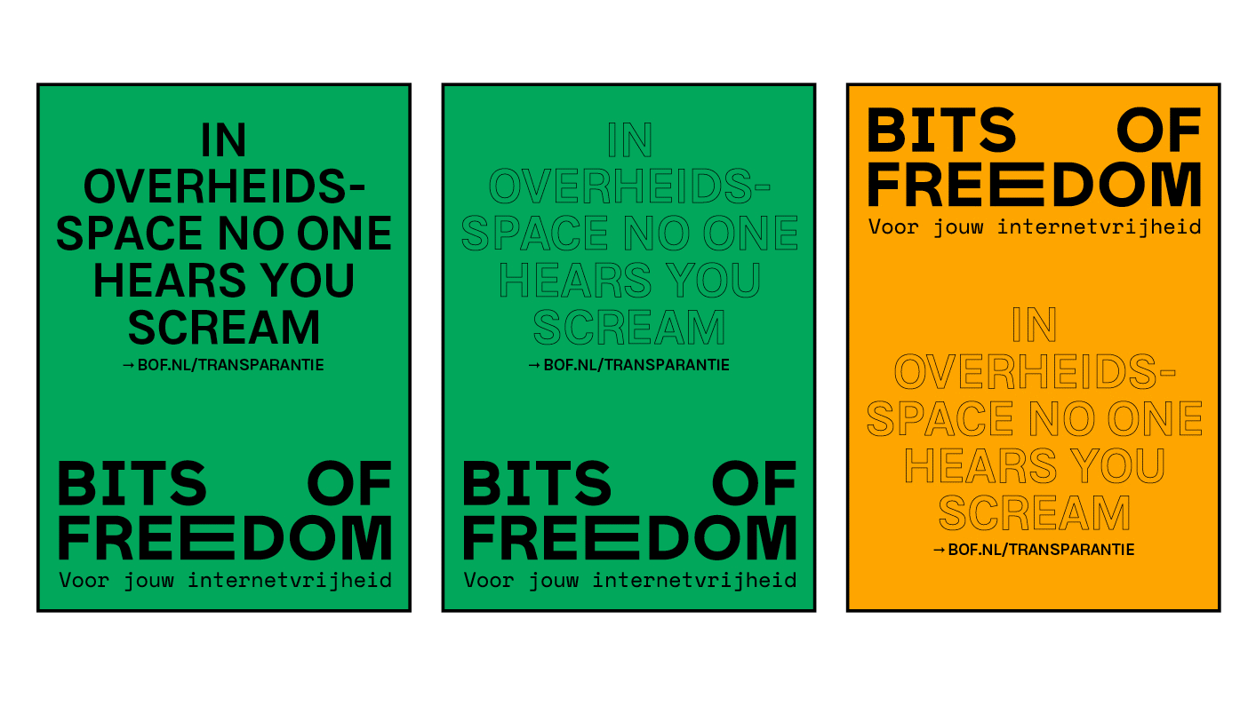
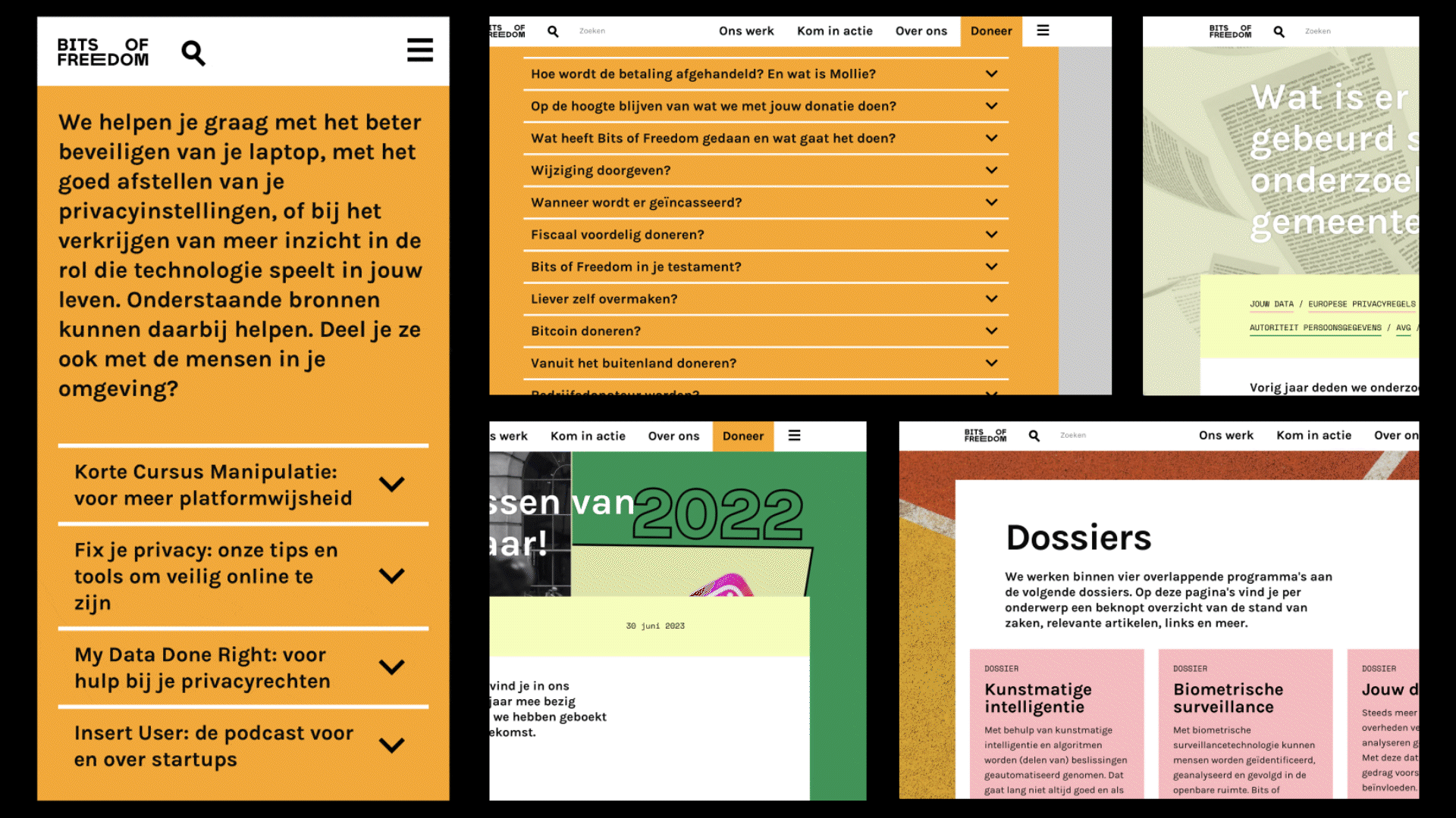
Since 1999, Bits of Freedom has stood up for online freedom in the Netherlands. Together we created the campaign “Data. Zo Zit Dat”. Four curious people ask pressing questions about digital freedom—like why algorithms discriminate, or how platforms track our searches. With rapper @fresku040 (Ambassador of Freedom) and an expert, they unravel these issues. Because the more we understand data, the better technology works for everyone. Watch all four videos at bitsoffreedom.nl/data-zo-zit-dat/.
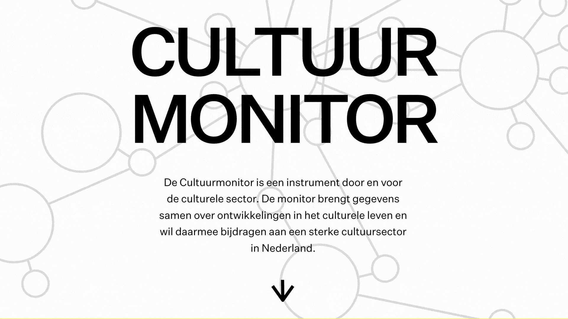
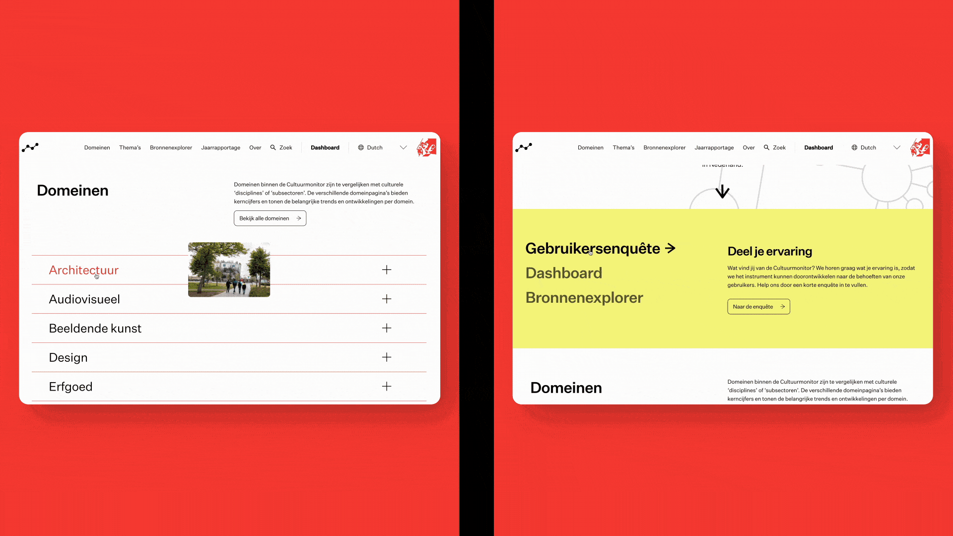
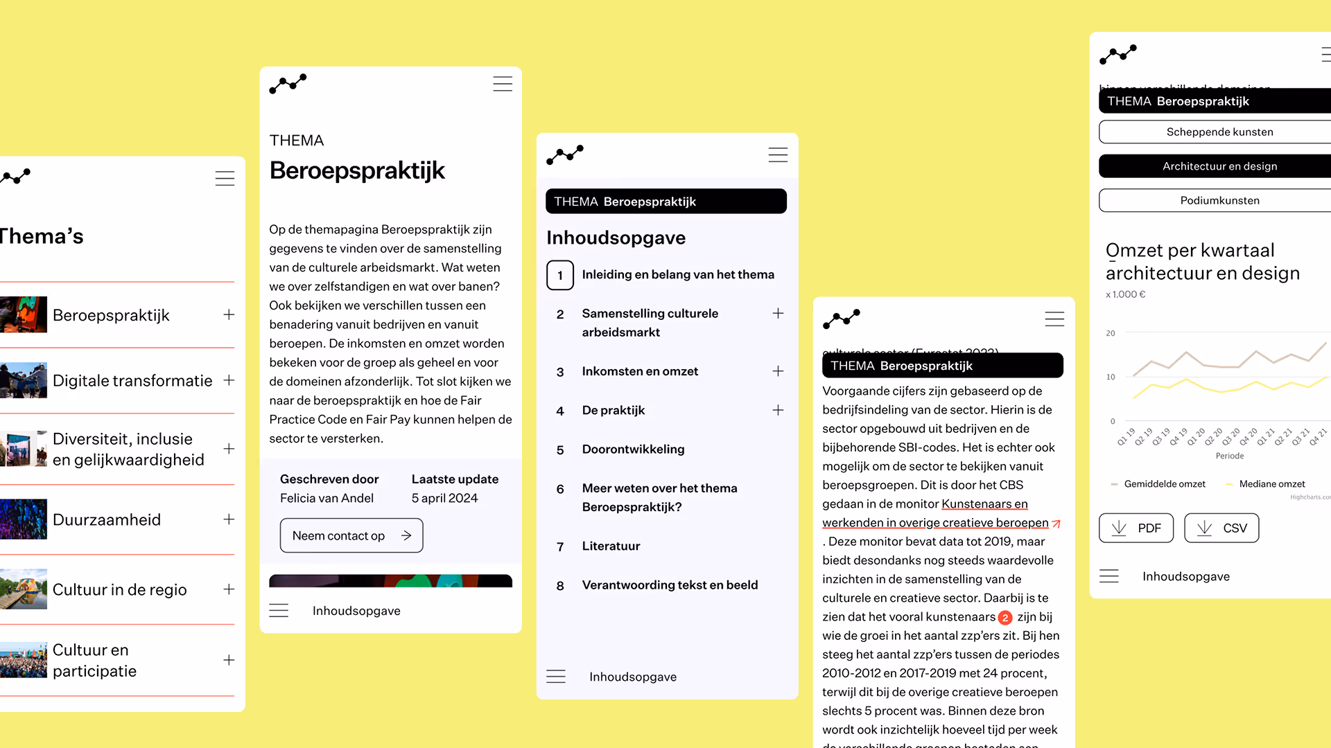
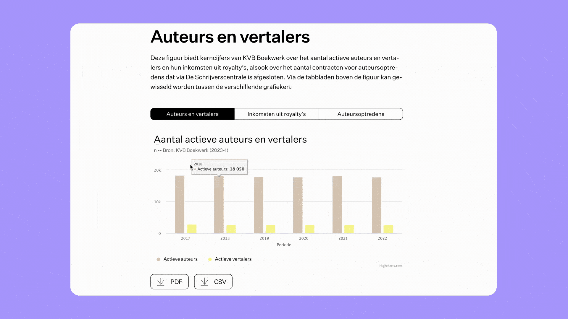
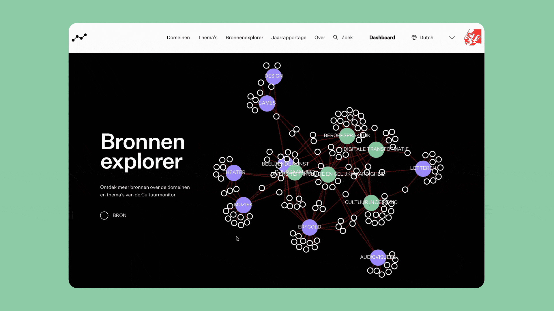
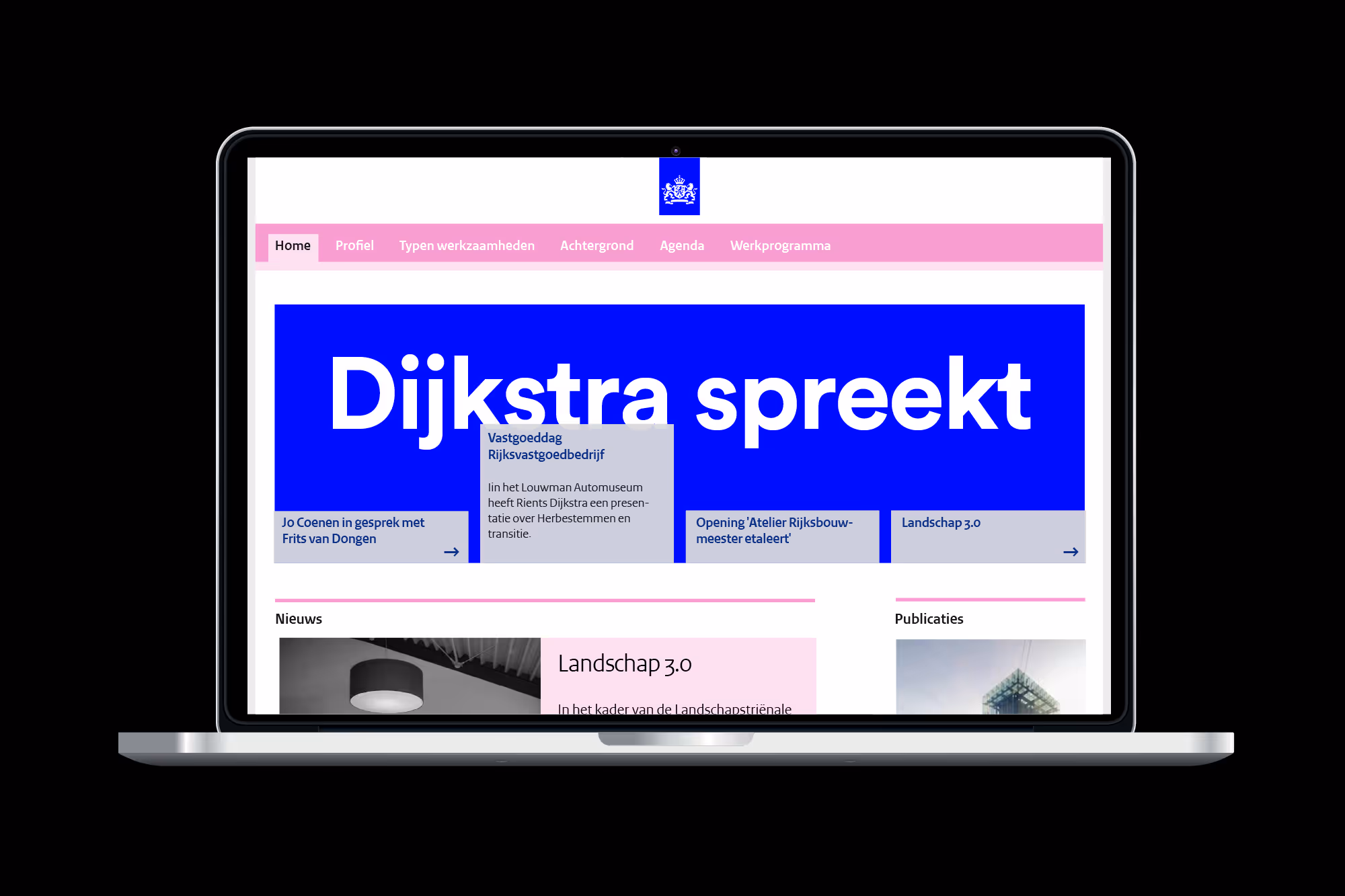
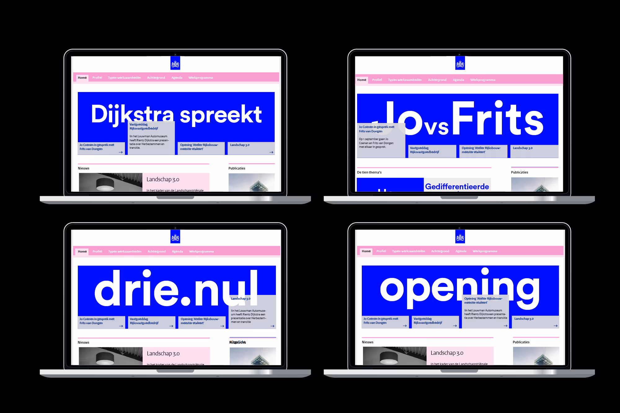
Cultuurmonitor is a data-driven platform designed for and by the cultural sector. It brings together and analyzes information on cultural life in the Netherlands, providing insights into long-term trends and current developments. By making complex data accessible, Cultuurmonitor serves policymakers, researchers, journalists, cultural professionals, and anyone interested in understanding the evolving cultural landscape.
We designed the website to present these insights in a clear and engaging way. Through clear design and intuitive navigation, we made it easy for users to explore and interpret the data that shapes the Dutch cultural sector.
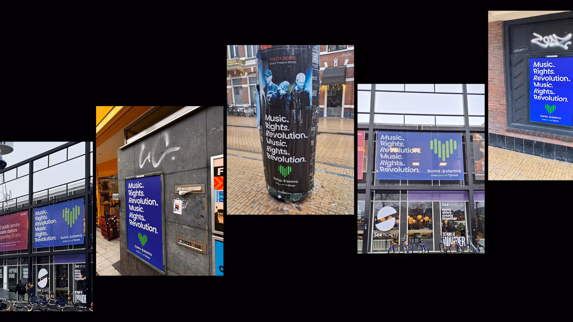
BumaStemra plays a fundamental role in the music industry. They ensure fair payment for artists, drive innovation, and have co-founded showcase festivals like Amsterdam Dance Event and Eurosonic Noorderslag. Now, it’s time to take center stage and share their mission with the world — because BumaStemra is at the heart of it.
During these two festivals, we created a dynamic campaign for both online and offline.
In collaboration with Huibert Jan van der Fange.

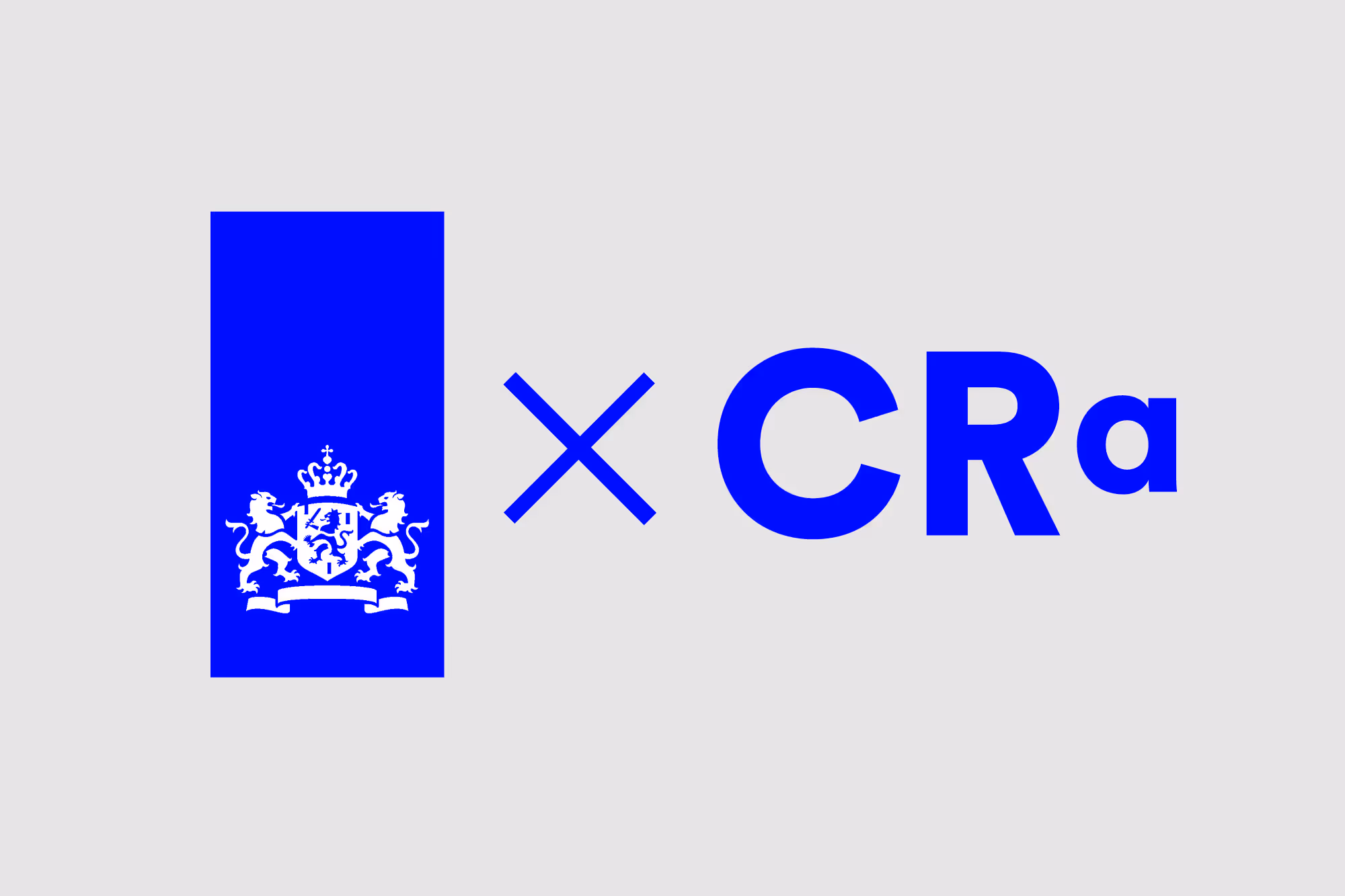
How do you create a separate identity within a large organisation as the government? Het College van Rijksadviseurs (formerly one person, the Rijksbouwmeester) is an independent advisory board that looked for an equally independent identity. We maintained the governmental feel while we pushed boundaries and stretched the notion of institutional means of communication.
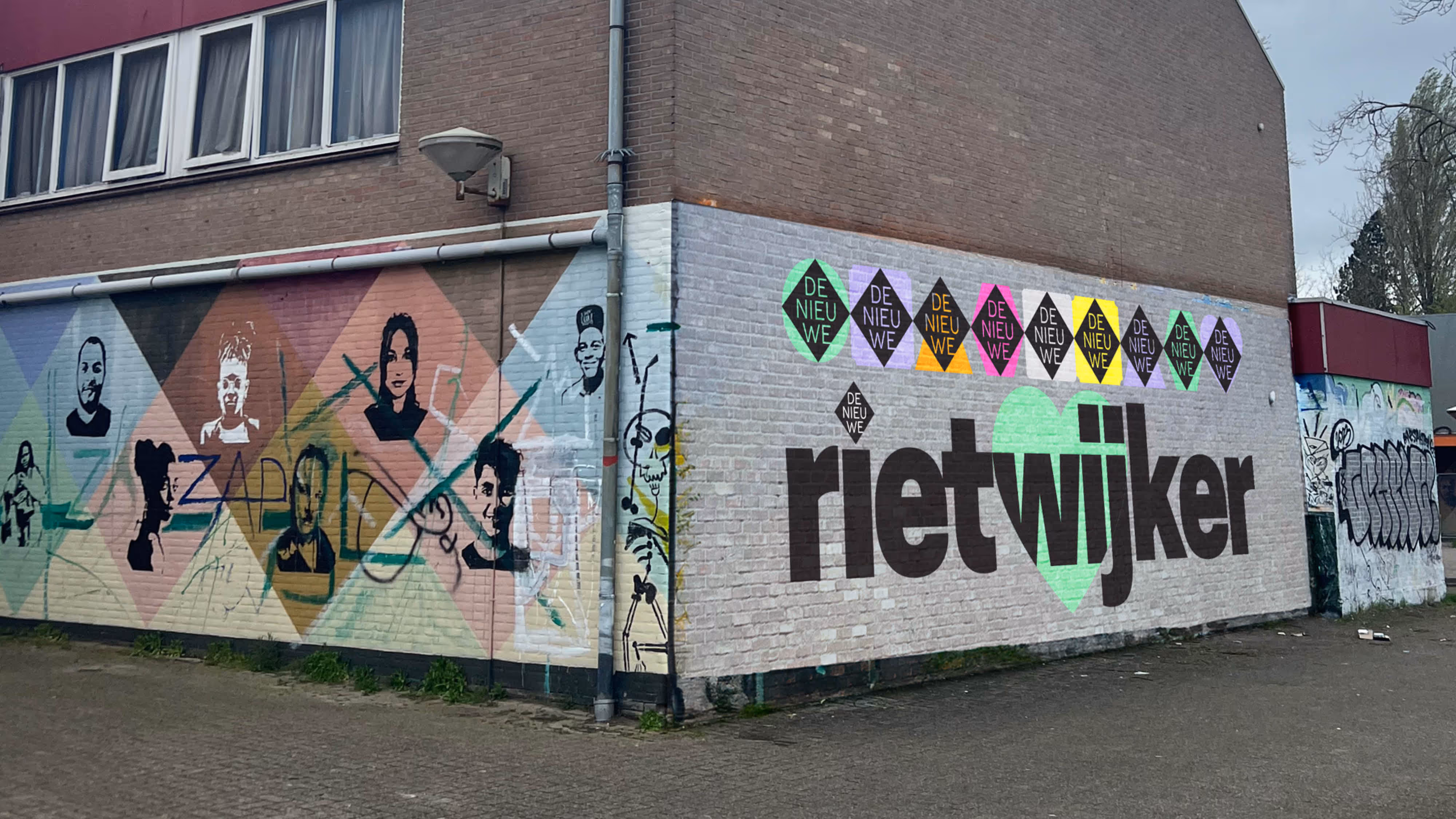
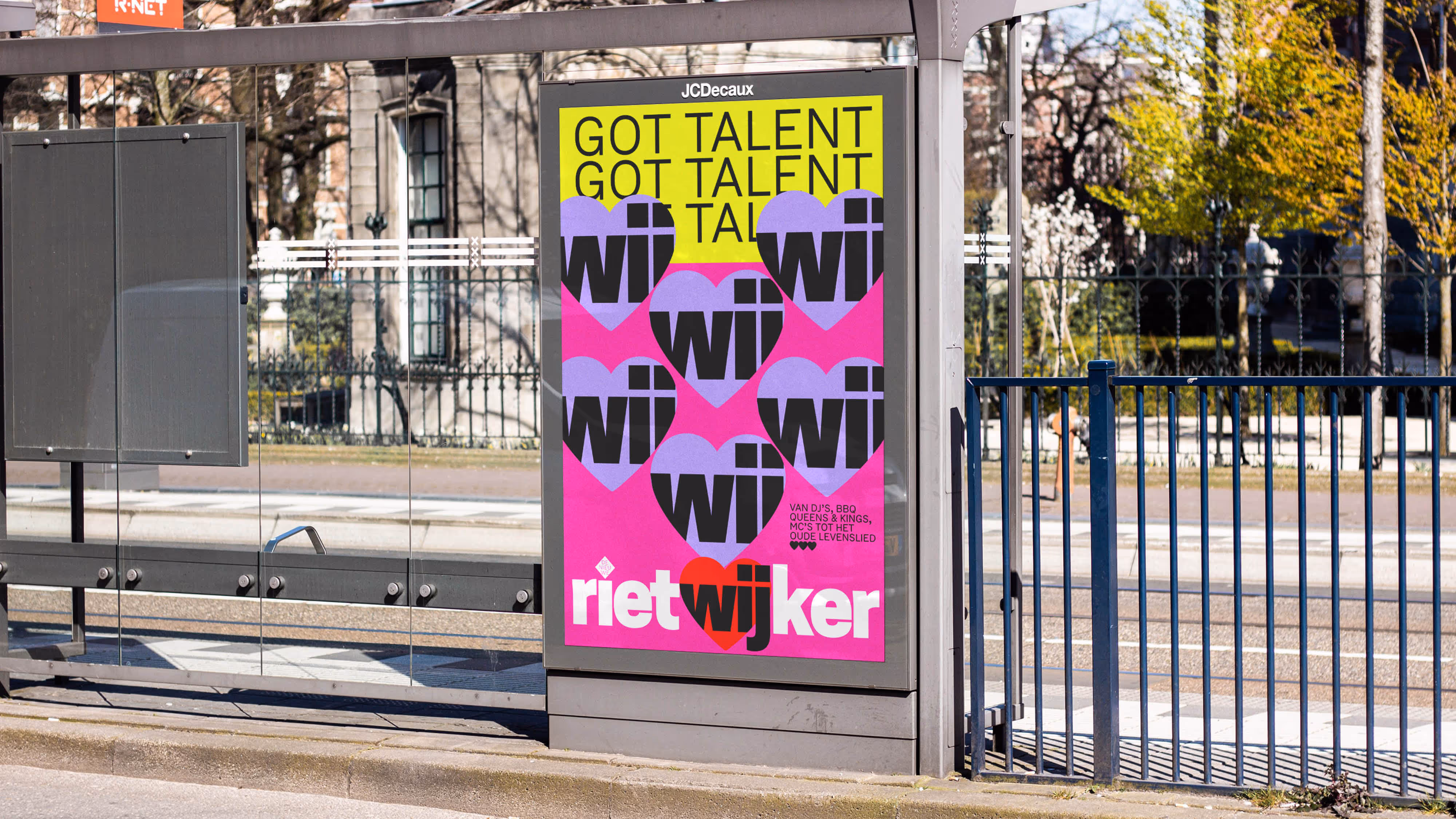
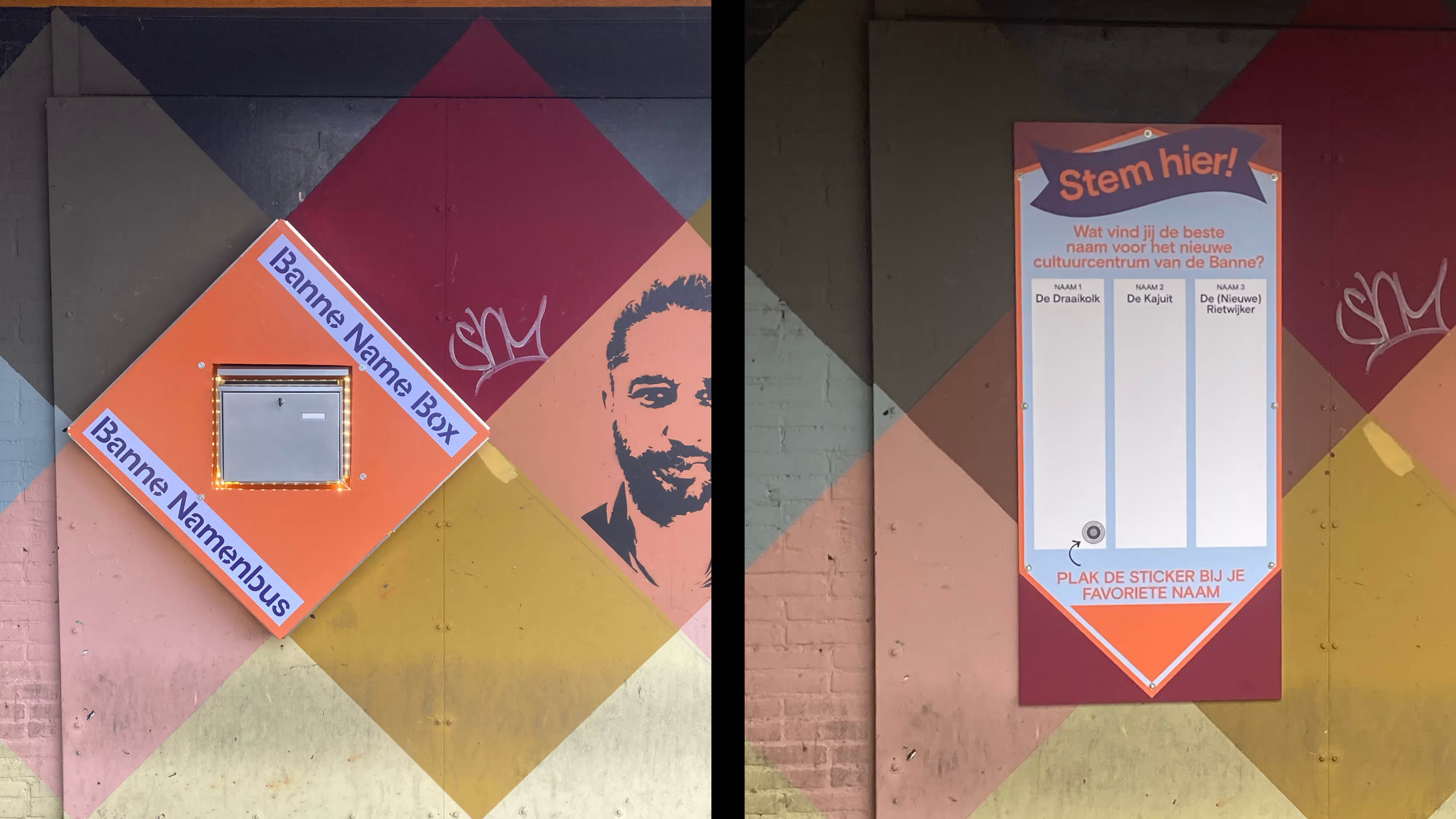
For the new community center De Nieuwe Rietwijker, located in district Banne Noord, we co-developed a recognizable visual identity with and for the neighborhood, stimulating connection and ownership. With a name, visual language, and branding that reflect local identity, we created a visual identity that invites both residents and neighbors to embrace the center as their own.

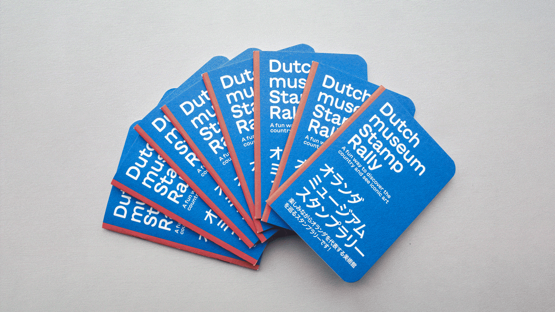
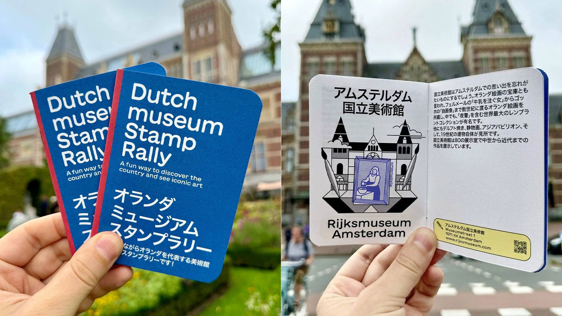
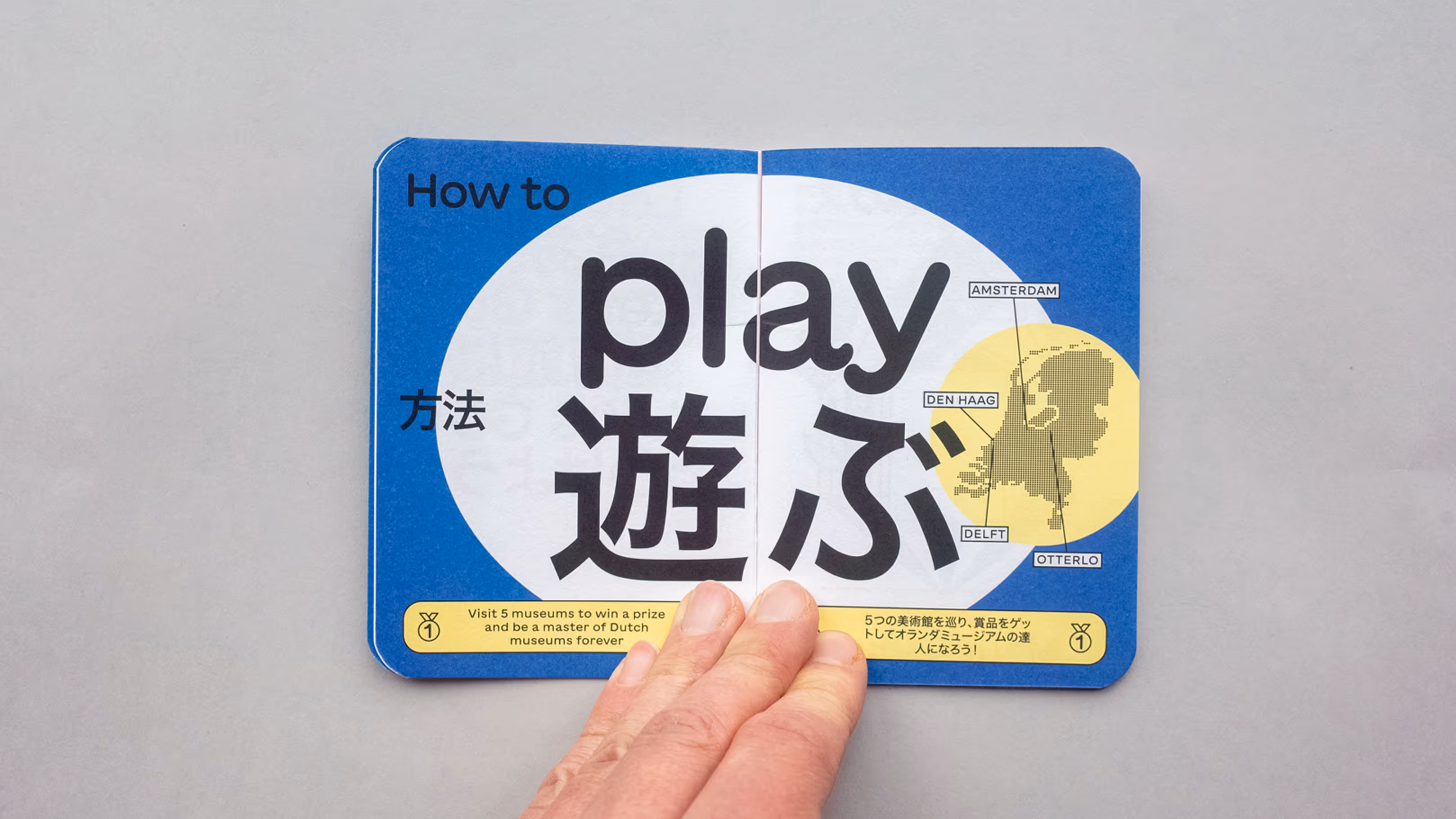
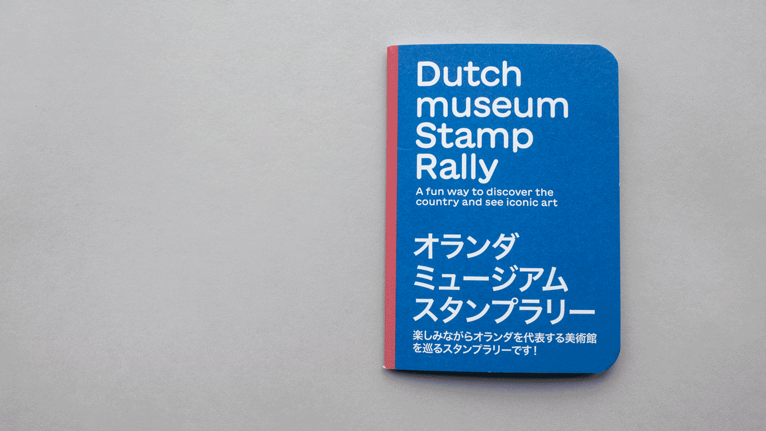
Inspired by Japan’s beloved tradition of stamp rallies where visitors collect unique stamps as they travel between locations, this project brings the experience to the Netherlands.
In collaboration with five leading Dutch institutions (Mauritshuis, Escher in Het Paleis, Royal Delft, Kröller-Müller Museum, and the Rijksmuseum) we designed the Dutch Museum Stamp Rally Booklet, inviting visitors to explore the country’s rich cultural landscape in a playful, interactive way.


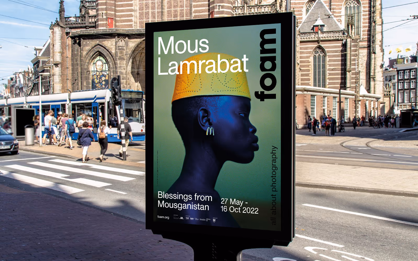
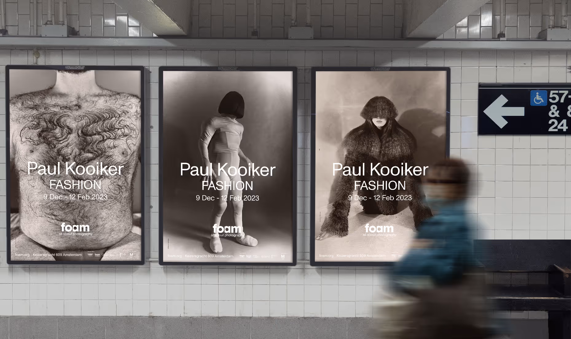
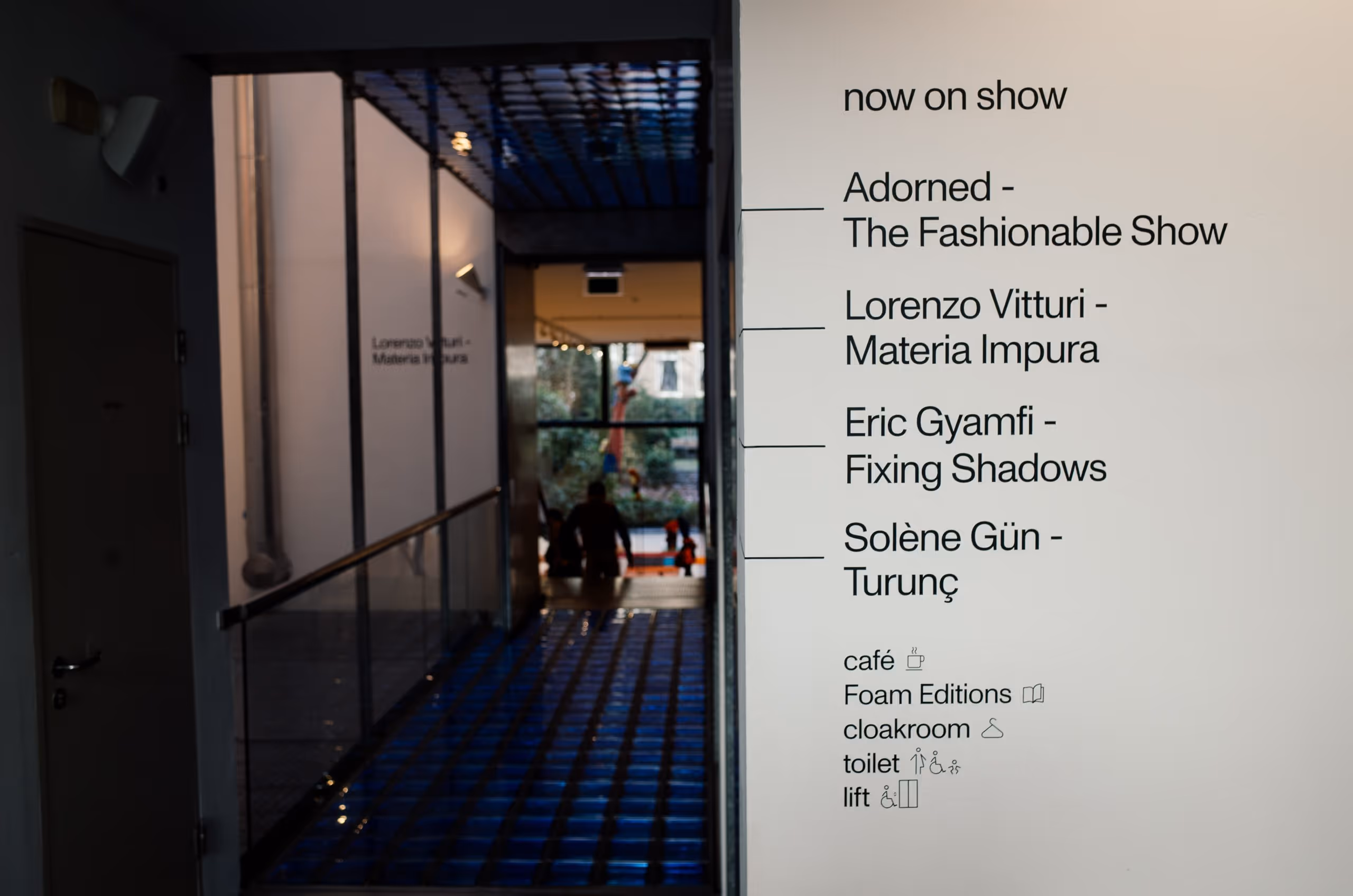
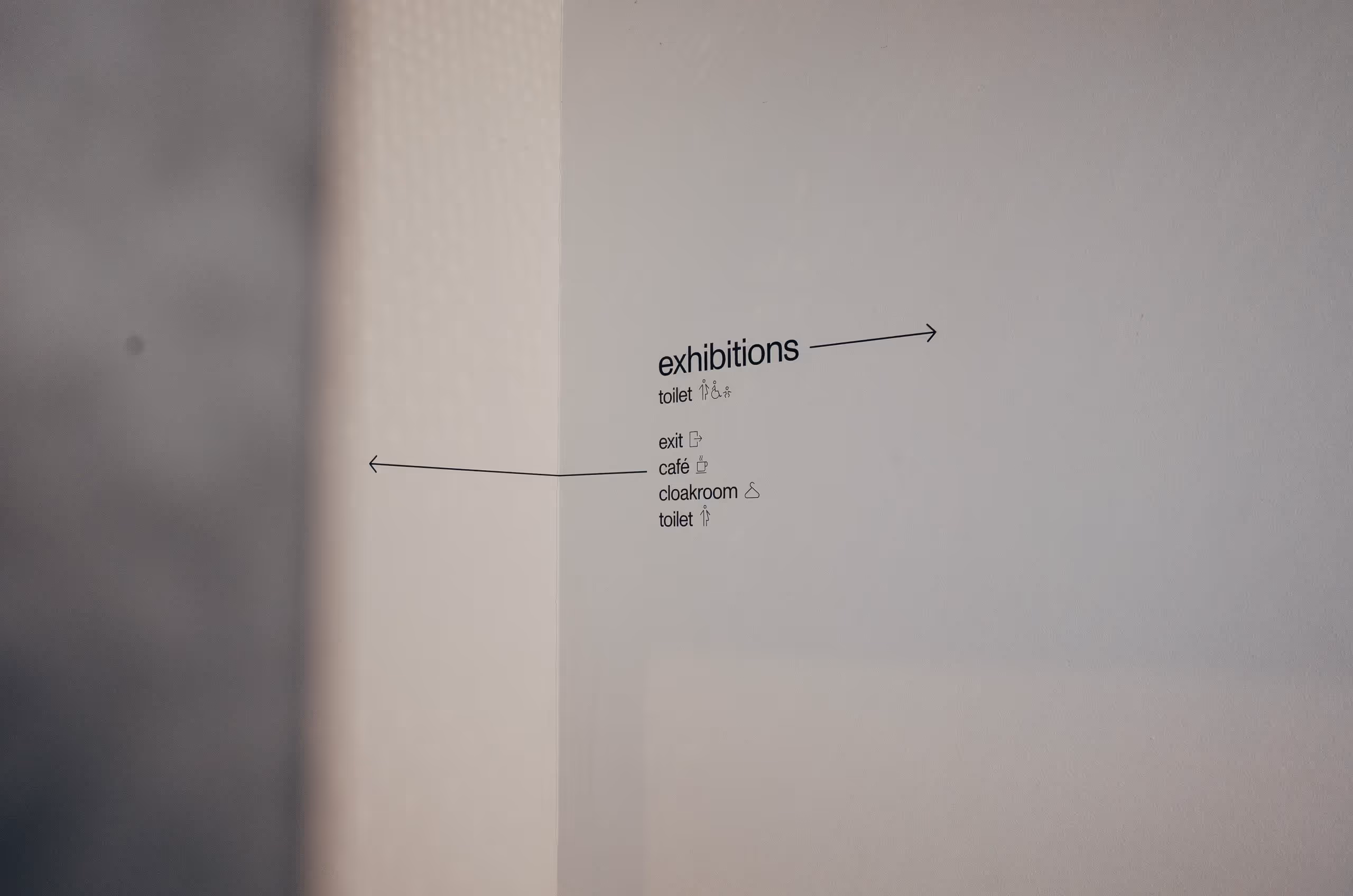
Foam is a leading photography museum in the centre of Amsterdam. Everything evolves around photography; from exhibitions to publications and education.
We were asked to research and update the brand; we then worked on all deliverables ranging from website, to poster design, museum signage, exhibitions communication. Ever since the rebranding we have been a permanent partner and have been closely involved with all communications.


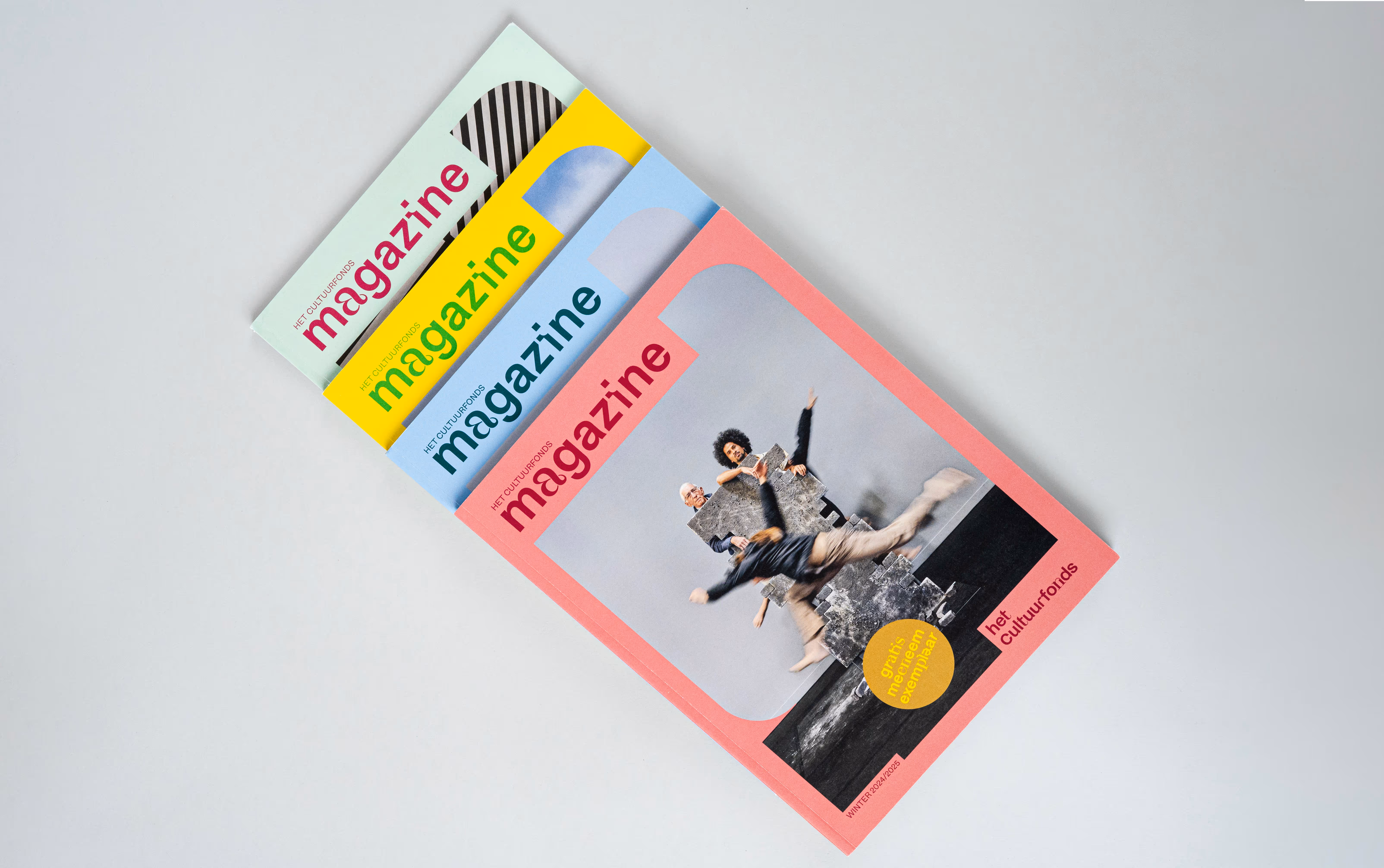
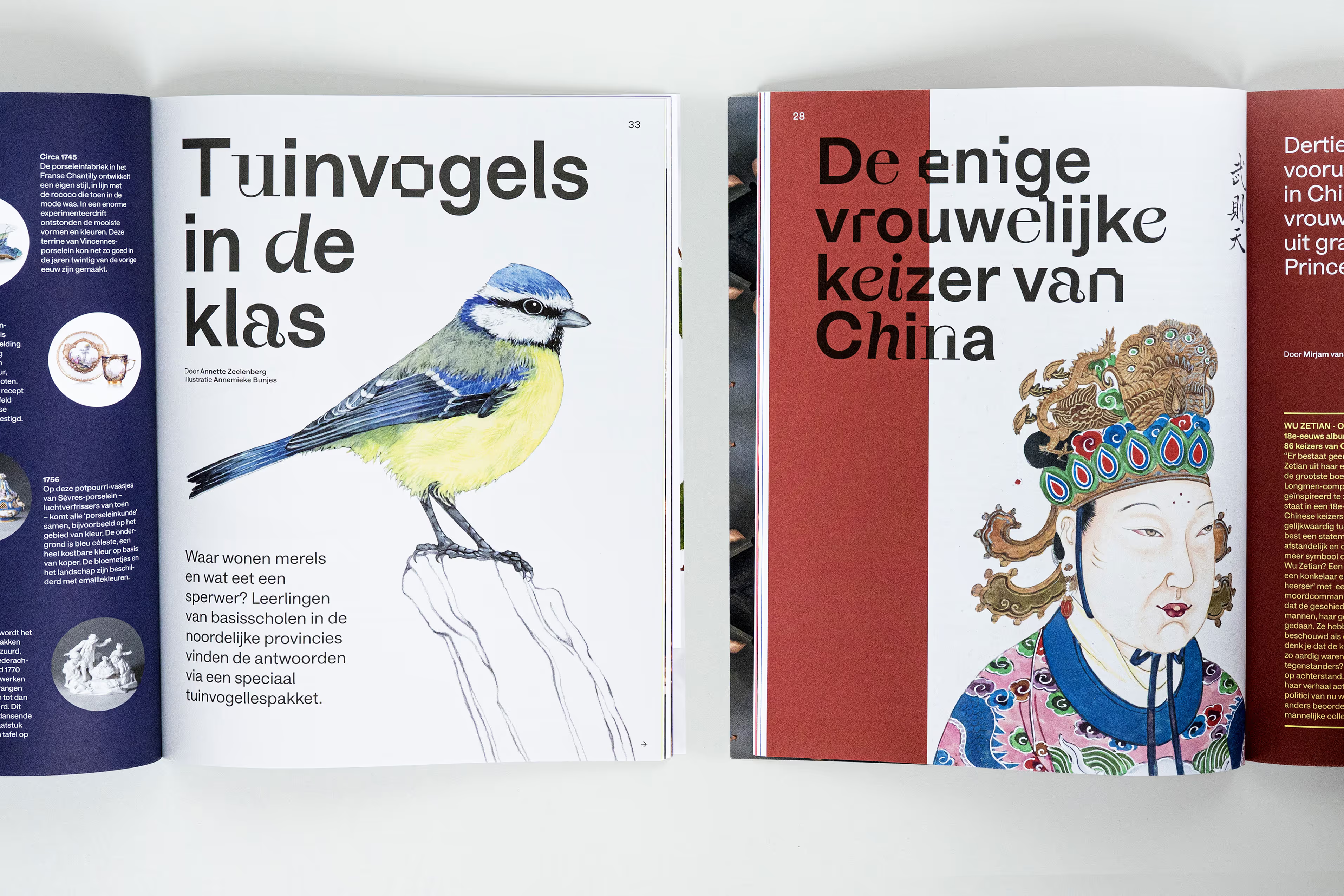
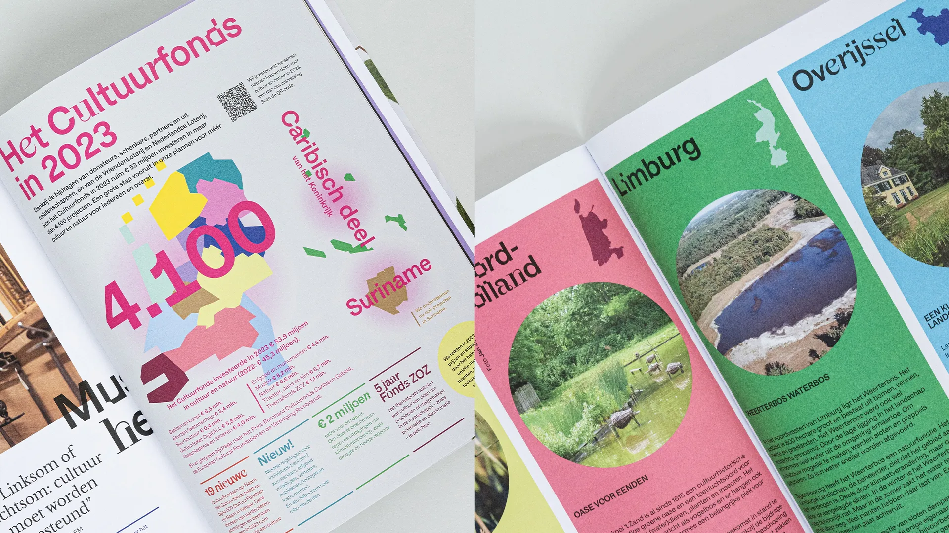
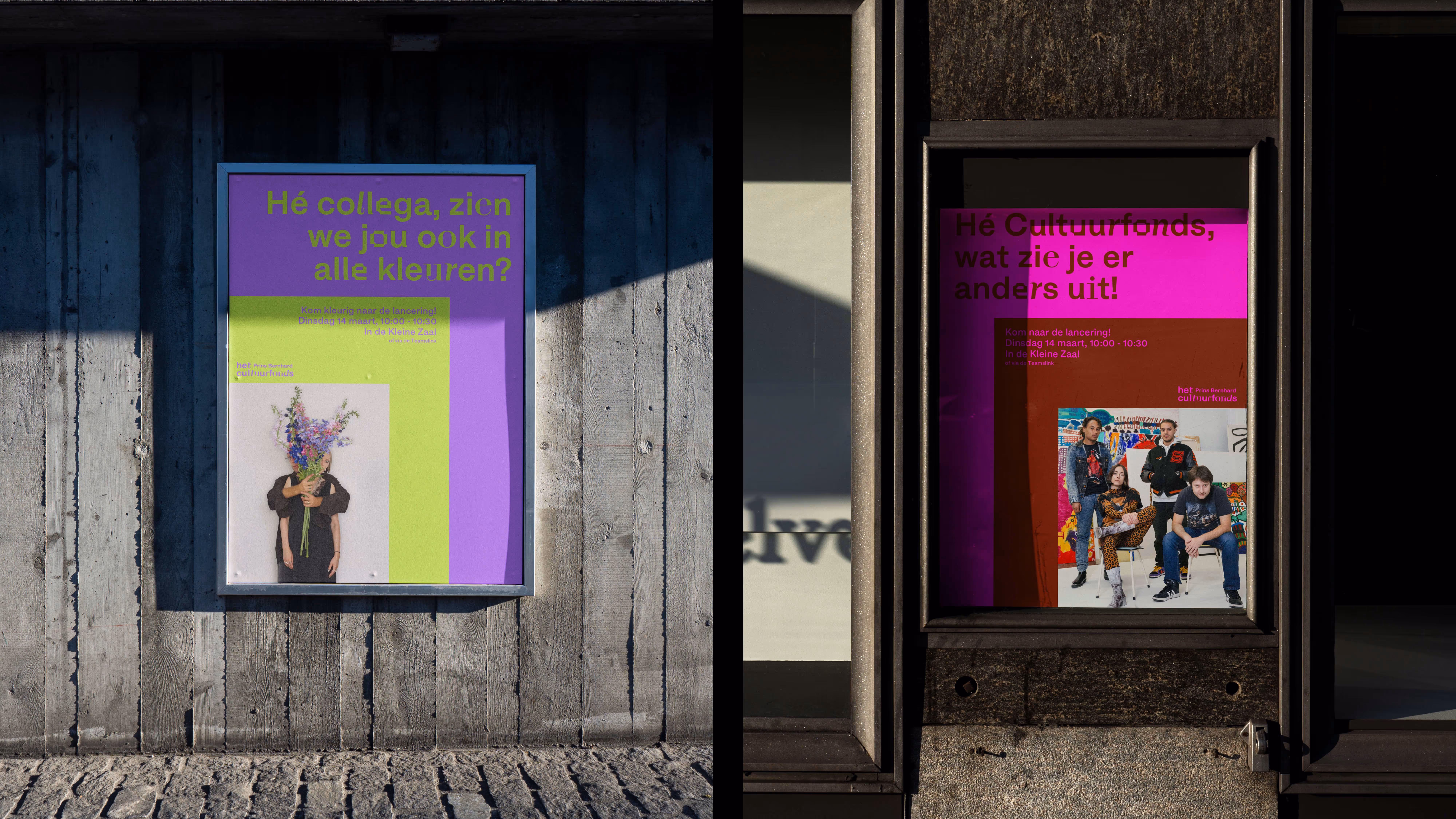
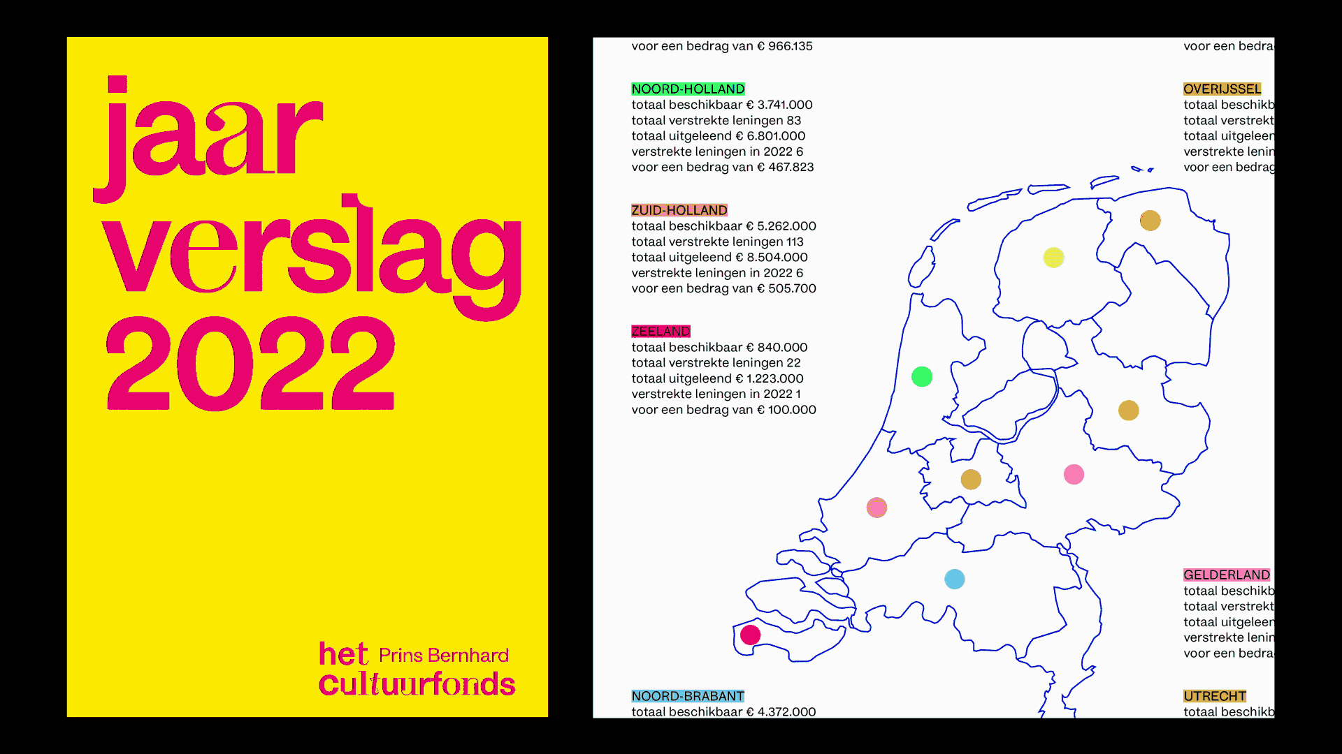
Cultuurfonds supports projects in the field of culture, nature, and science in the Netherlands. In line with its new visual identity, we redesigned the magazine along with brochures, posters, and annual reports.
In 2023, Cultuurfonds launched FAB (Fonds voor Architectuur en Bouwkunst), calling on architects and visionaries to realize an iconic public architectural structure. While rooted in the Cultuurfonds style, the identity for FAB introduces new elements that reflect structural and architectural forms through variable shapes. The result is a bold and dynamic identity, with all architectural images produced by an image generator.


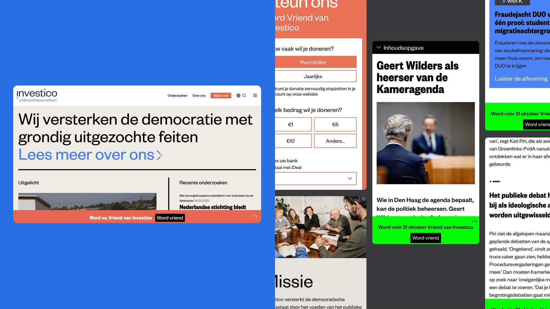
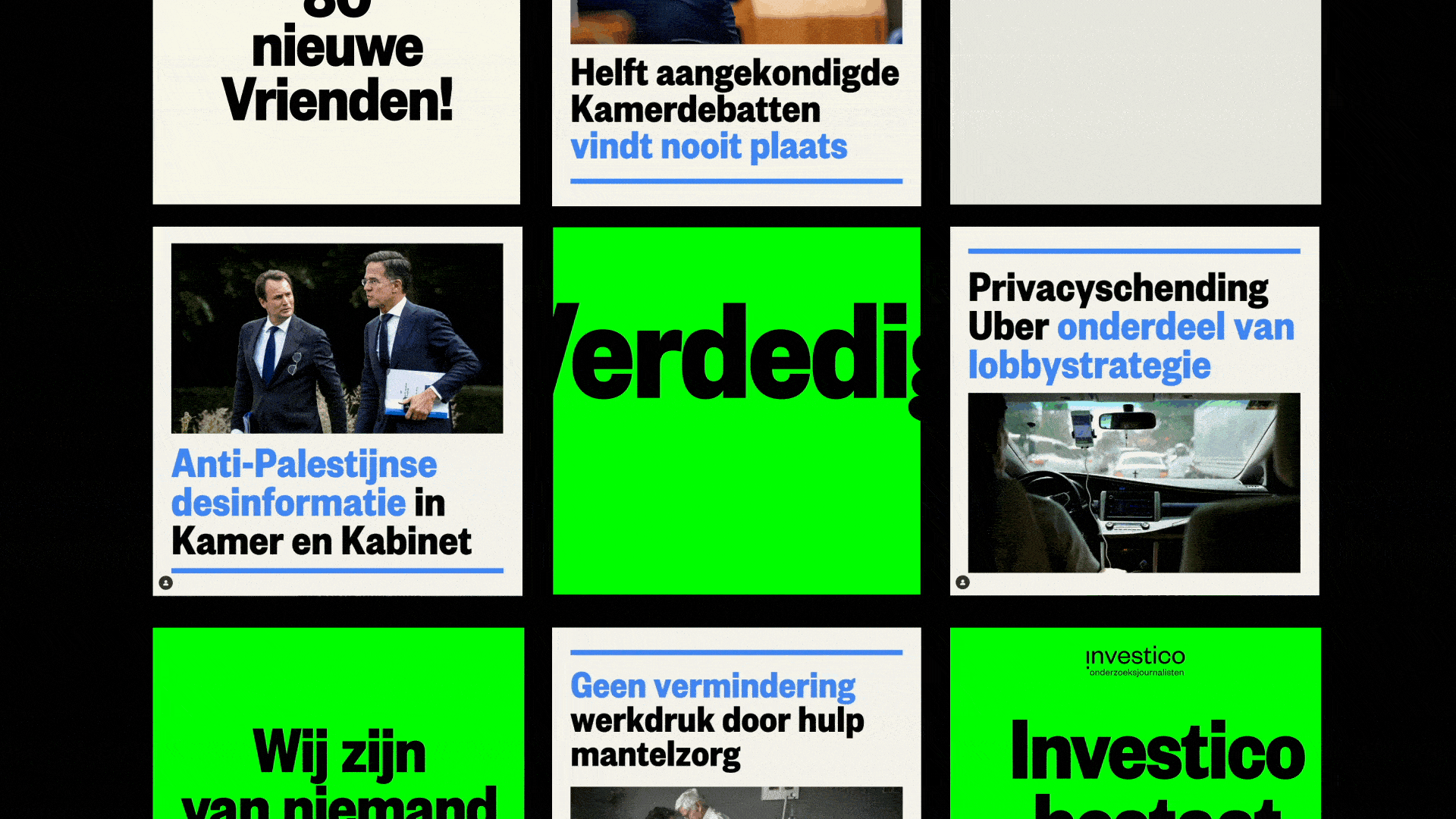
Democracy is under pressure worldwide, and in our country, anti-democratic forces are gaining ground. That makes Investico’s work more important than ever: delivering in-depth, structural investigative journalism that informs the public and holds power to account.
Over the past decade, Investico has produced impactful stories that have sharpened public debate, led to parliamentary questions, and even contributed to changes in the law. We developed a new identity and website. In addition, to mark their ten-year anniversary, we made a bold campaign: gaining 2,000 new supporters in just one month. Within a week, 1,000 people had already joined.
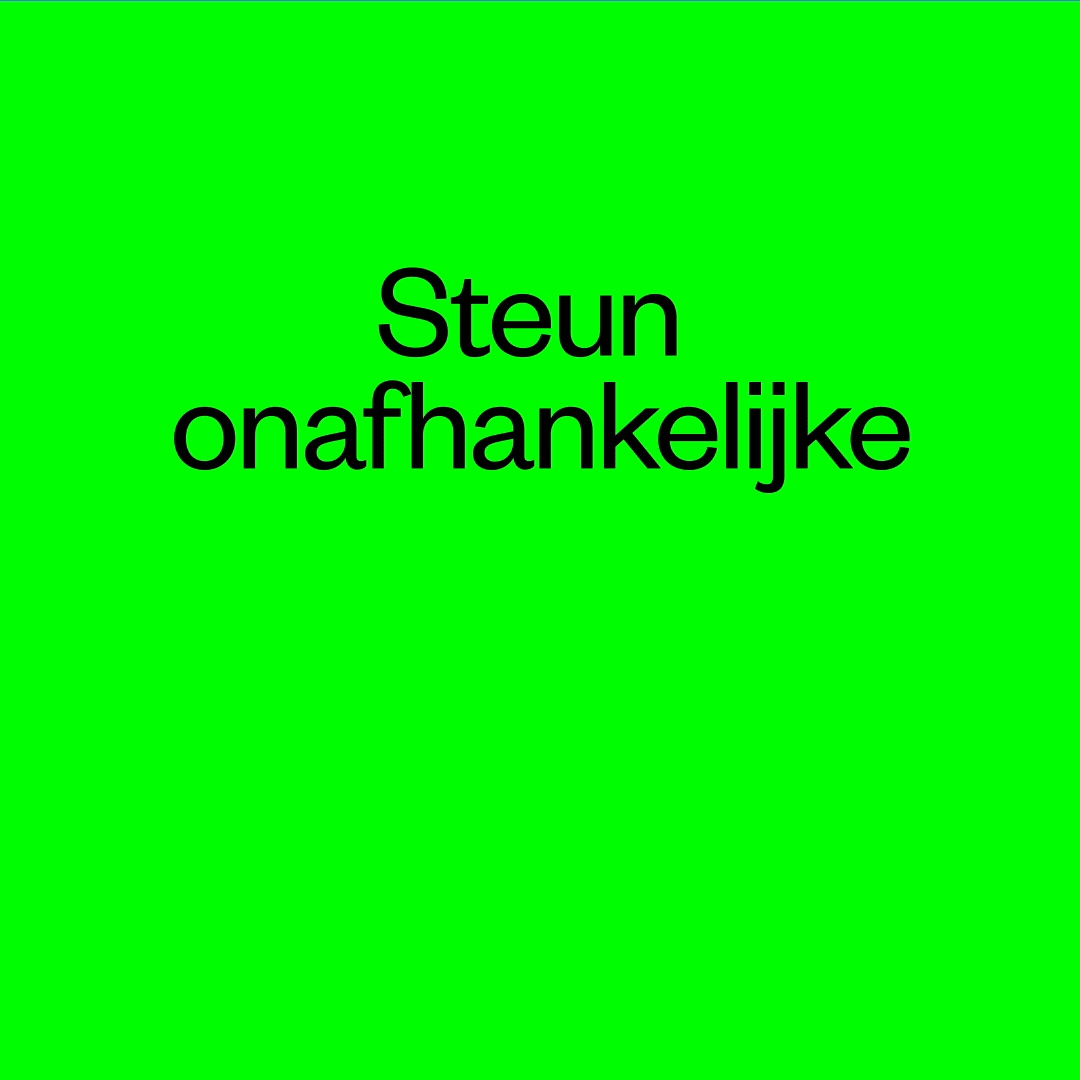
Support independent investigative journalism in the Netherlands. Visit their website and become a friend of Investico. (We don’t want to say it, but: juist nu.)


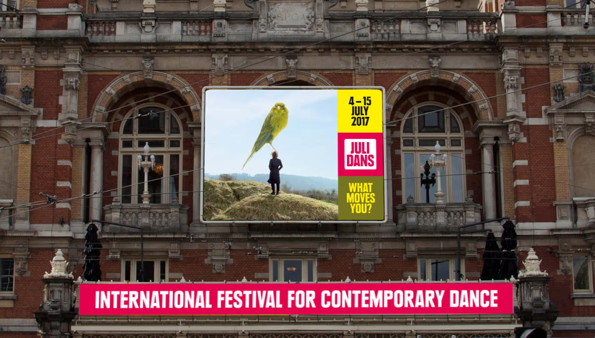
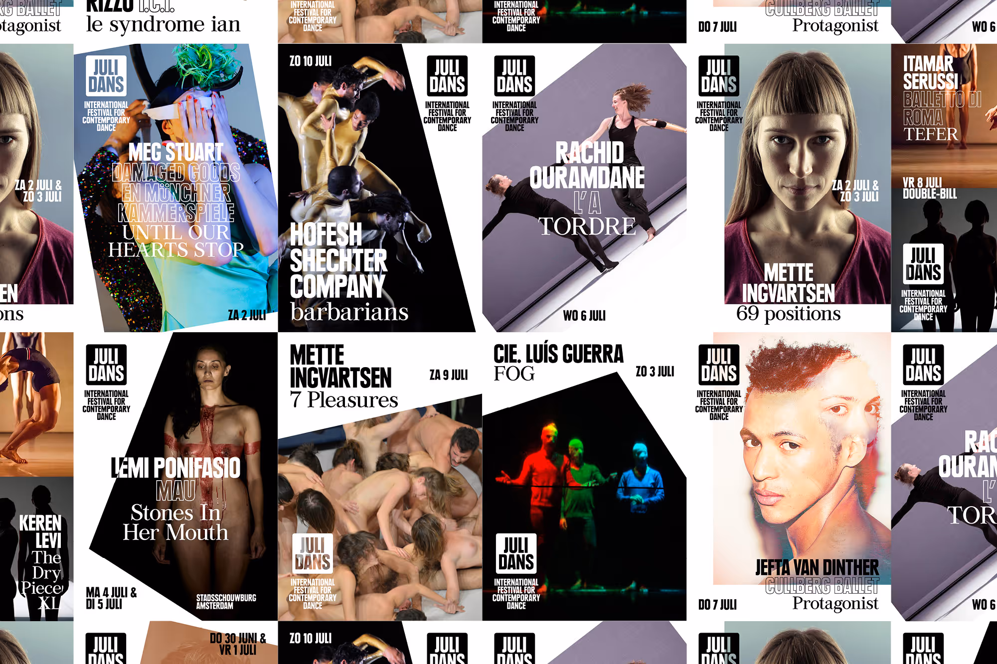
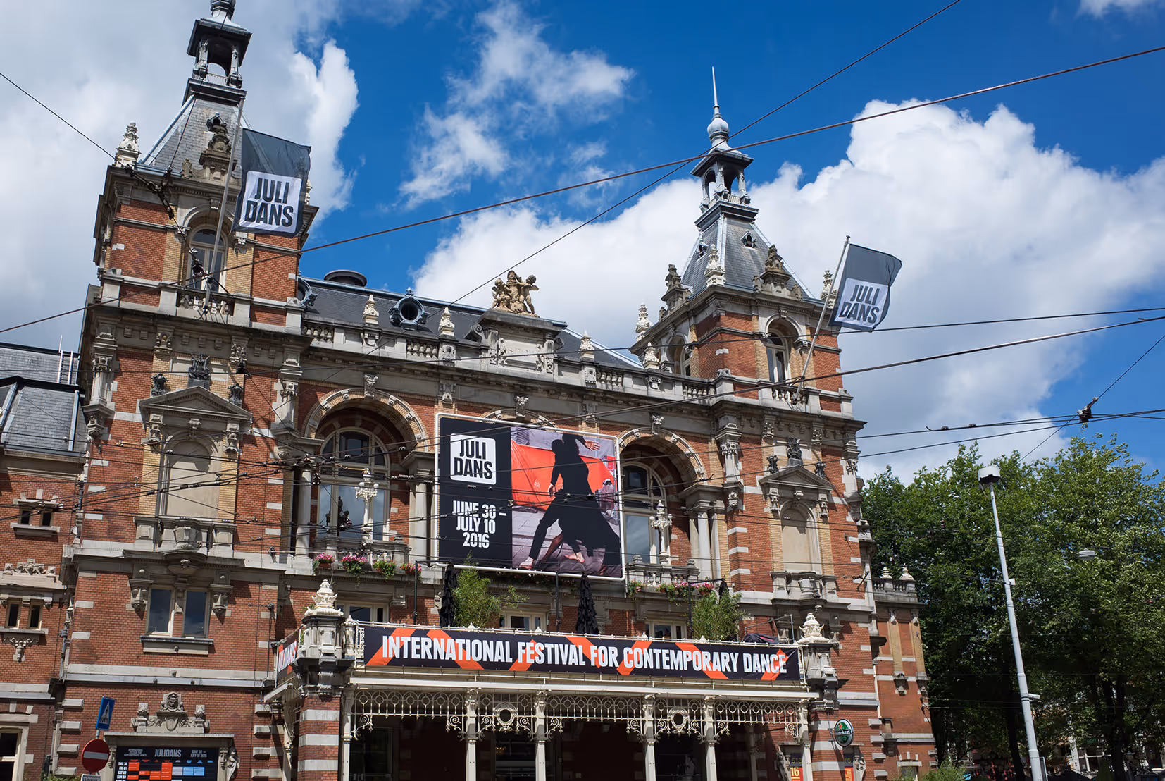
Contemporary dance is vital, resilient and versatile. In 2017 and 2018 we again designed the campaign for contemporary dance festival Julidans. Just like we did in 2015 and 2016. But this time we went one step further. As Julidans combines both the great masters as the enfants terribles of contemporary dance, we decided to involve visual artist Jaap Scheeren to turn the idea of what a dance image should look like, upside down. Let’s go beyond dogmas. Be disruptive.

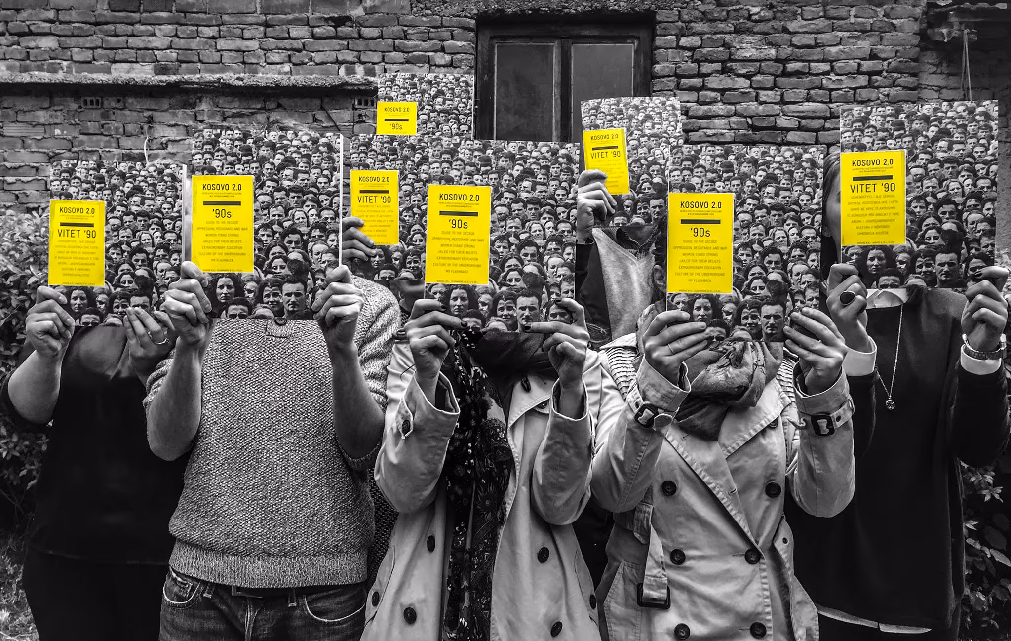
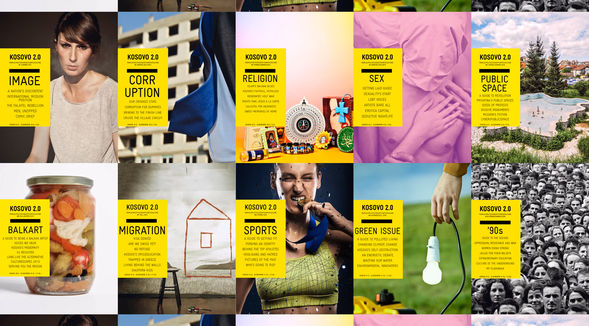
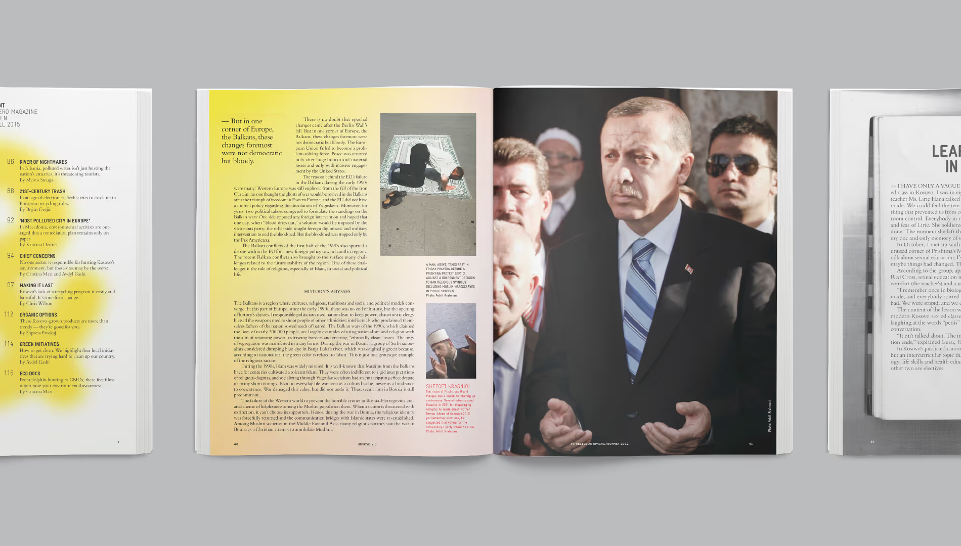
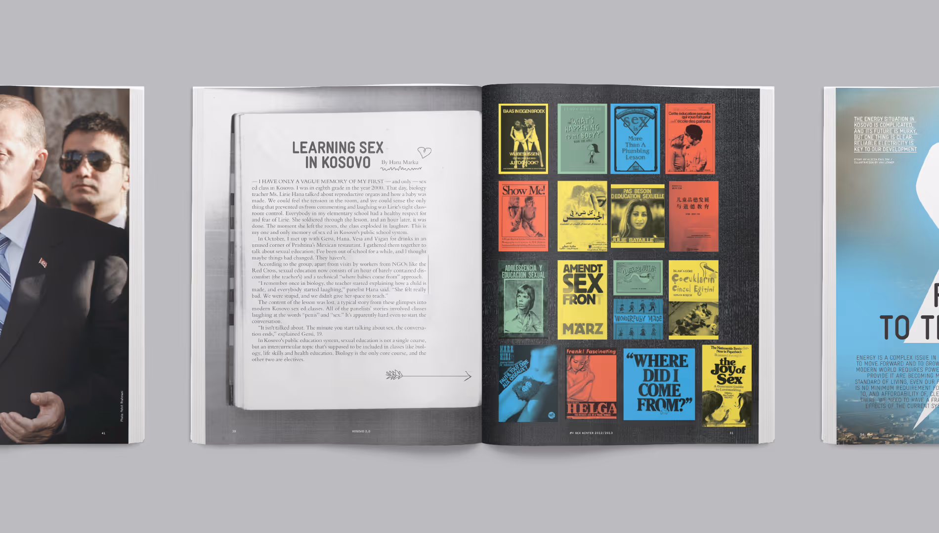
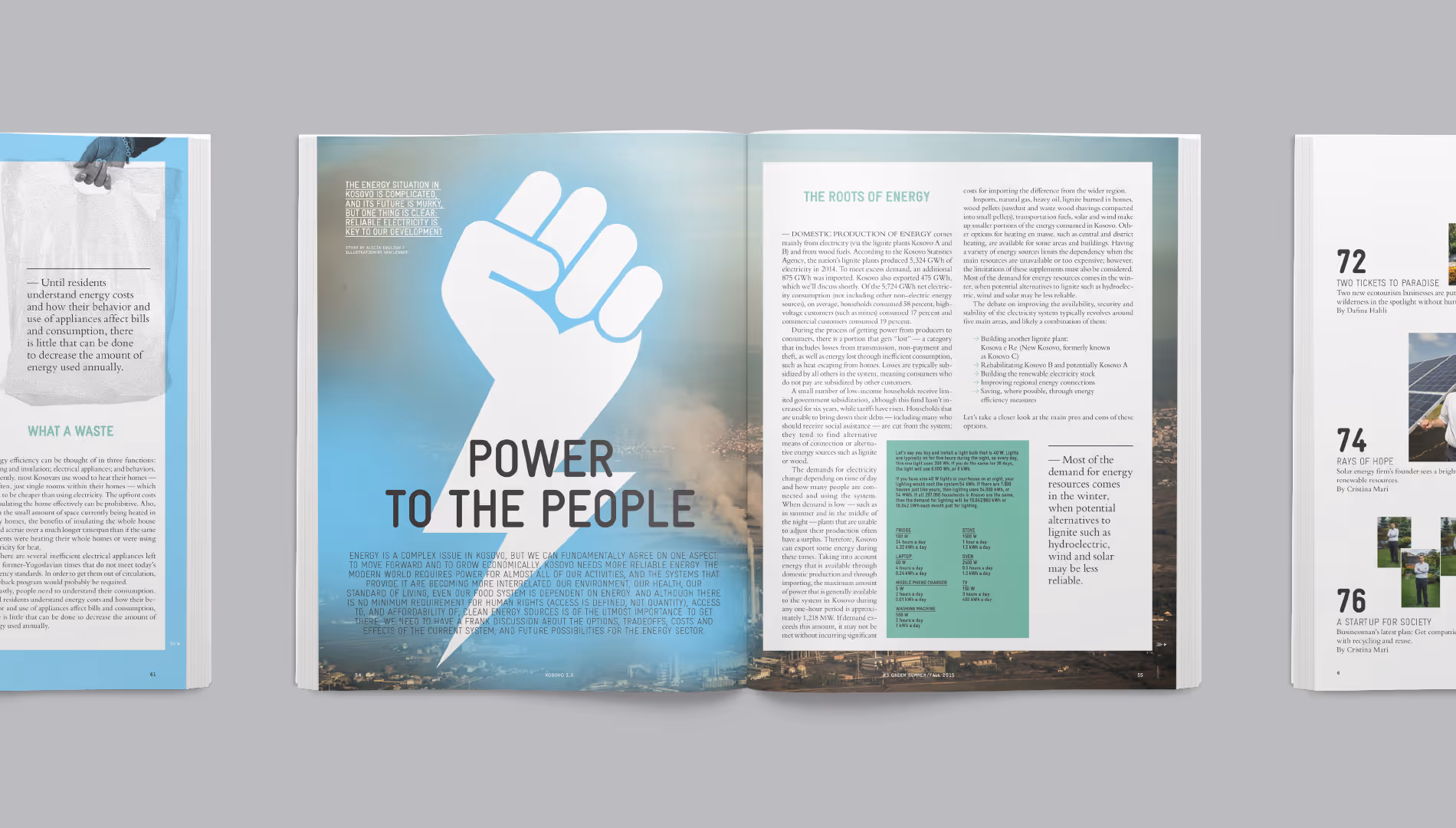
Kosovo is bursting with talented young media professionals, but has few outlets for editorial promise. Up-and-coming local journalists, photographers, graphic designers and illustrators were selected to learn the trade first-hand in a new magazine about Kosovo, by its residents. The magazine tells the story of the young nation in ten issues. Van Lennep designed 10 magazines and 3 websites for KOSOVO 2.0 the last five years to continue to give voice to the unfettered and unafraid.

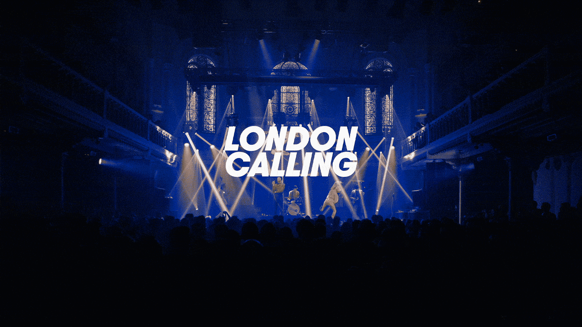
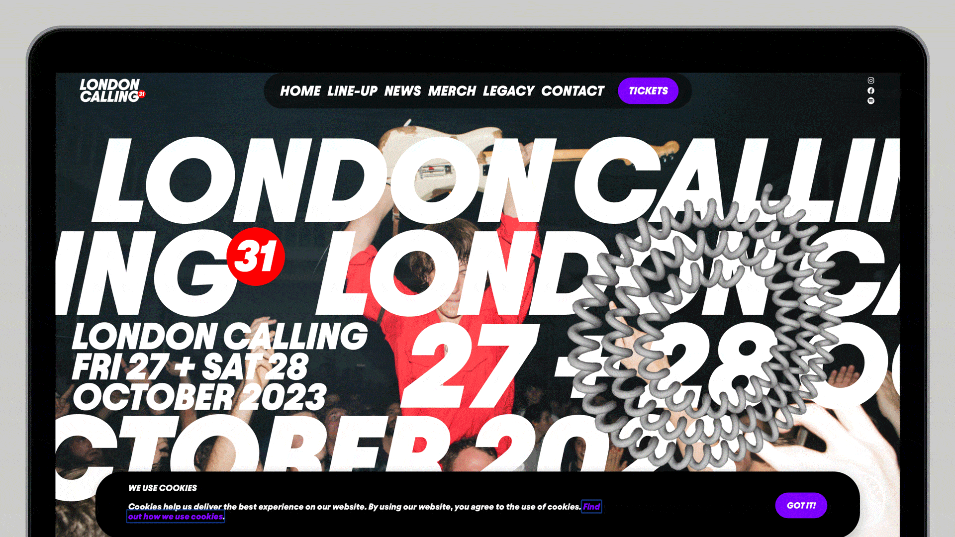
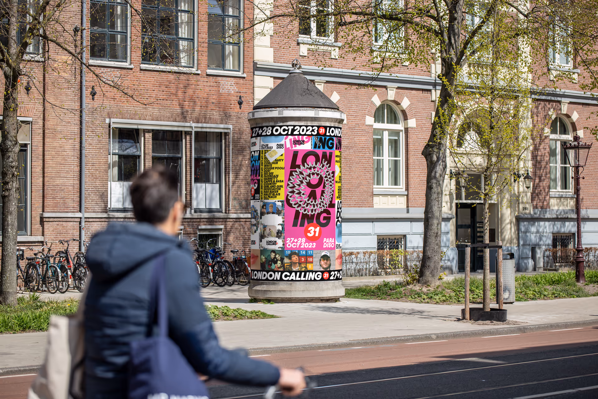
A showcase festival for bands from all over the world acting as a springboard to conquer the music scene from hereon.
Already 30 years in the game! The legacy of London Calling reads like: Blur, Placebo, Snow Patrol, Franz Ferdinand, Kaiser Chiefs and so on…
Our London Calling analysis
…needs no introduction
…is too big to be modest
…raw & unpolished gems
…as direct as U.K. headlines
Hommage to the past whilst being present & future hugging. Simple, bold and recognisable ingredients with emphasis on collaboration and co-creation.

.gif)

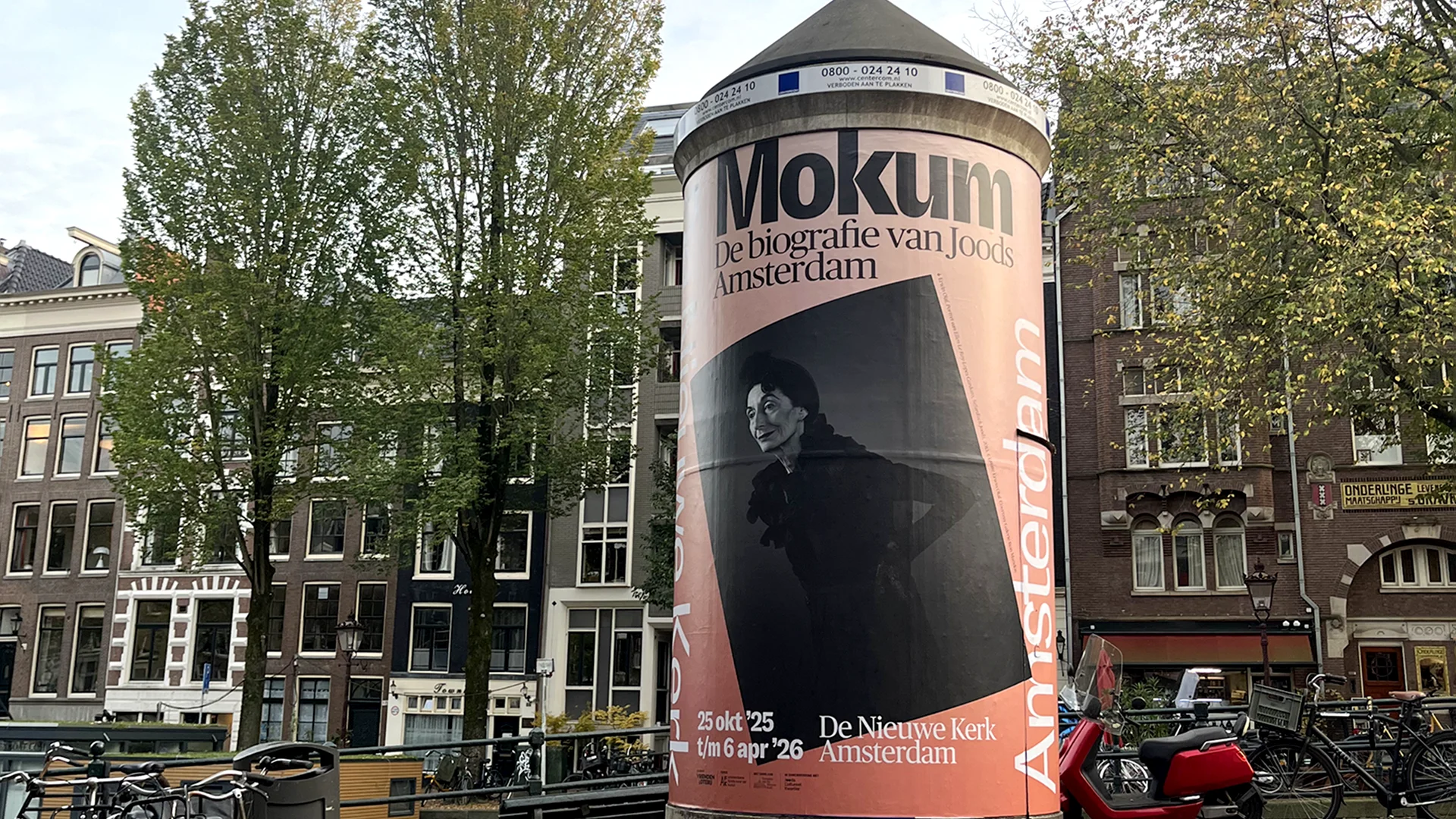
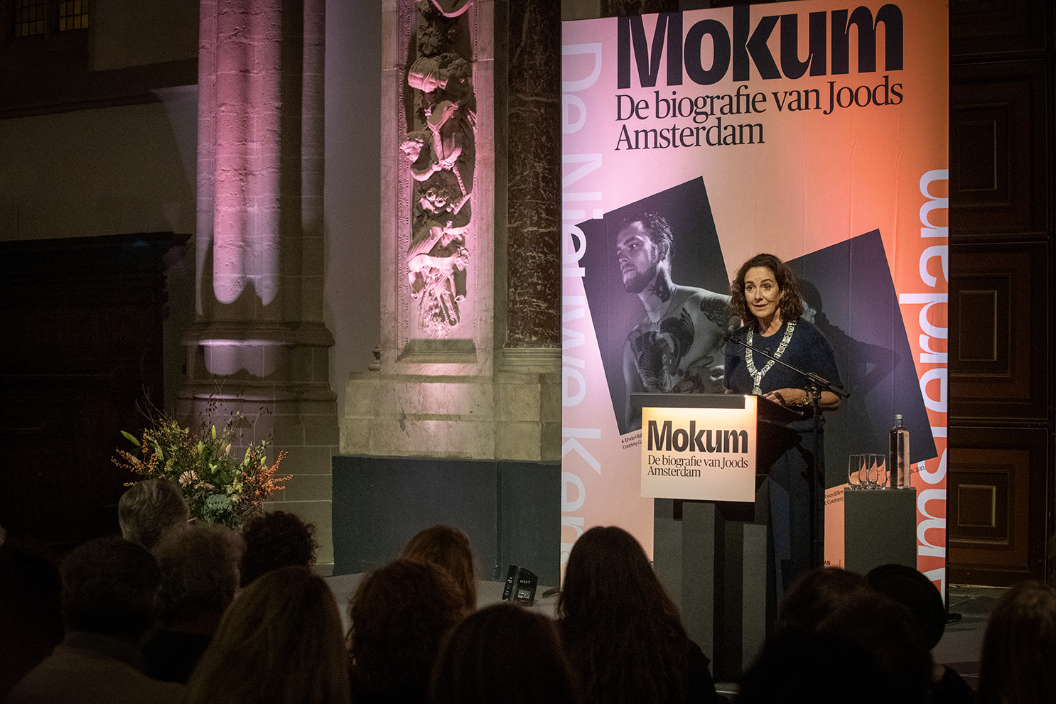
Mokum – De biografie van Joods Amsterdam at De Nieuwe Kerk is an exhibition created by De Nieuwe Kerk in collaboration with the Jewish Cultural Quarter, marking the finale of Amsterdam’s 750th anniversary year.
We developed the exhibition campaign and a wide range of assets, including posters, motion graphics and the peperbus.
“Mokum,” originally a Yiddish word for “place” or “city,” is now a beloved nickname for Amsterdam. The exhibition uses hundreds of objects across thirteen chapters to show how Jewish life and culture have shaped the city from the 16th century to today.

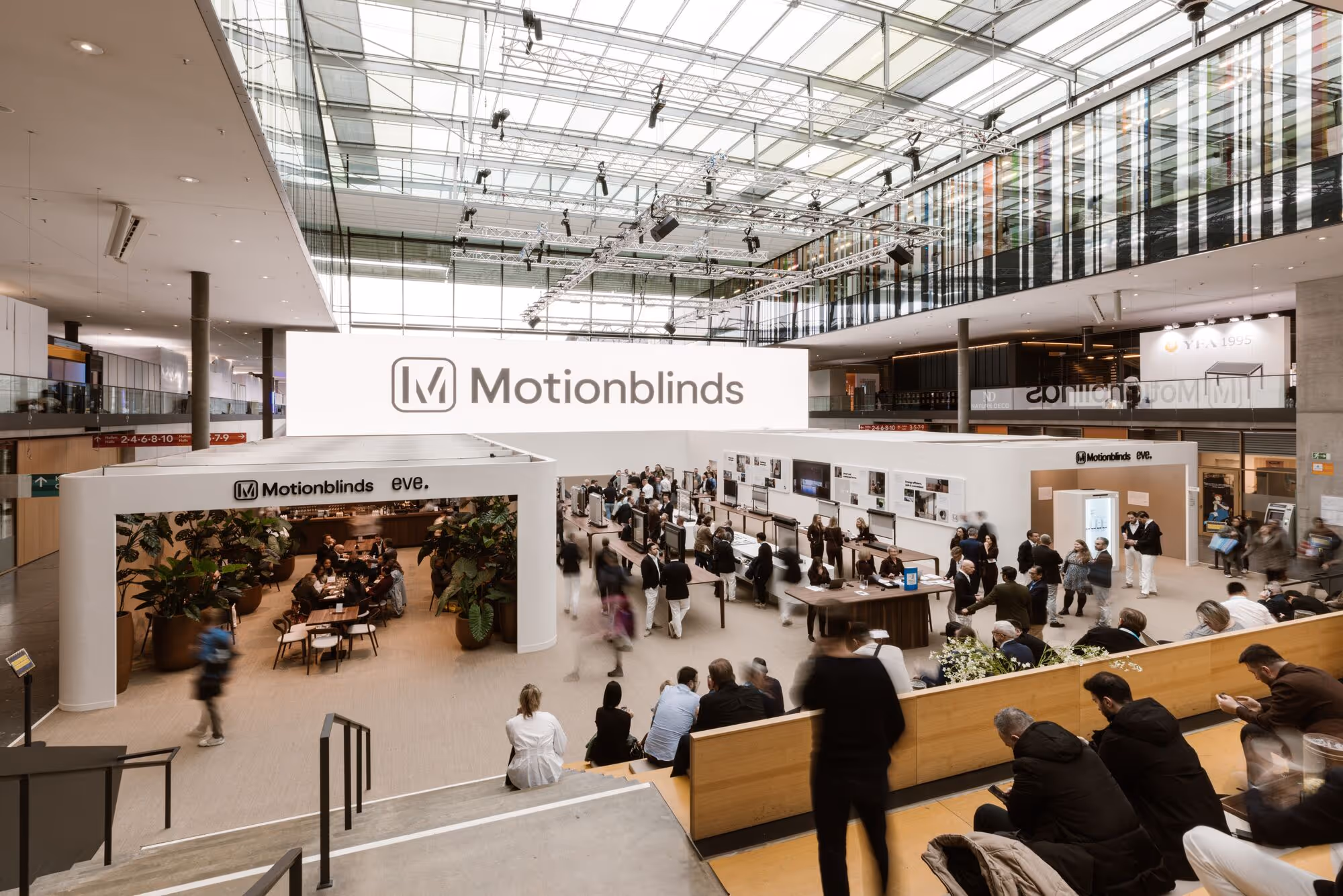
Coulisse is leader in smart window covering. We developed the idenitity for their Motionblinds brand. Motionblinds is a smart motor solution for interior shading applications. We made two animations for big (and when we say big, we mean really big) screens to show the story of Motionblinds on R+T, world’s biggest trade fair for their market.

.avif)
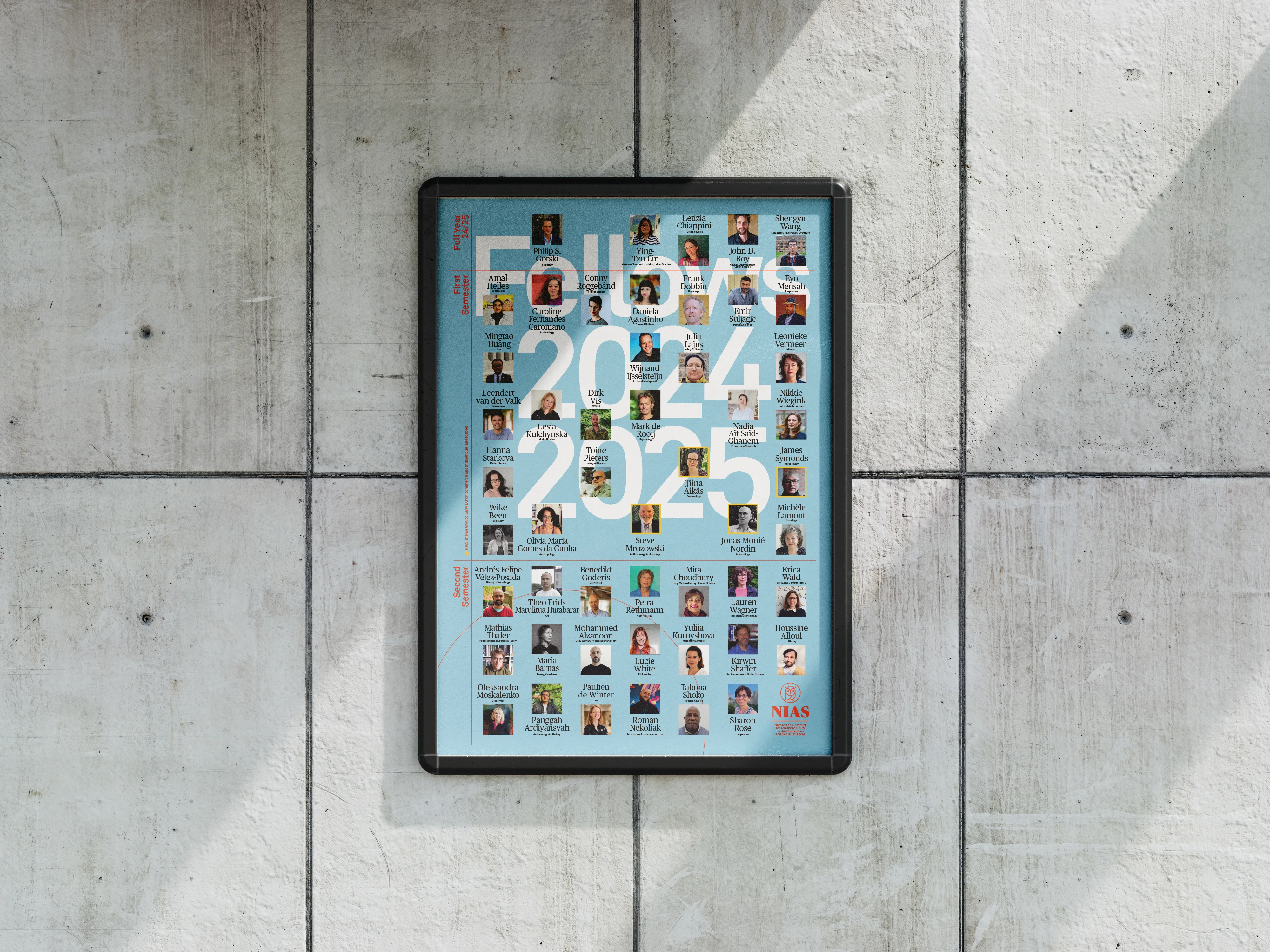
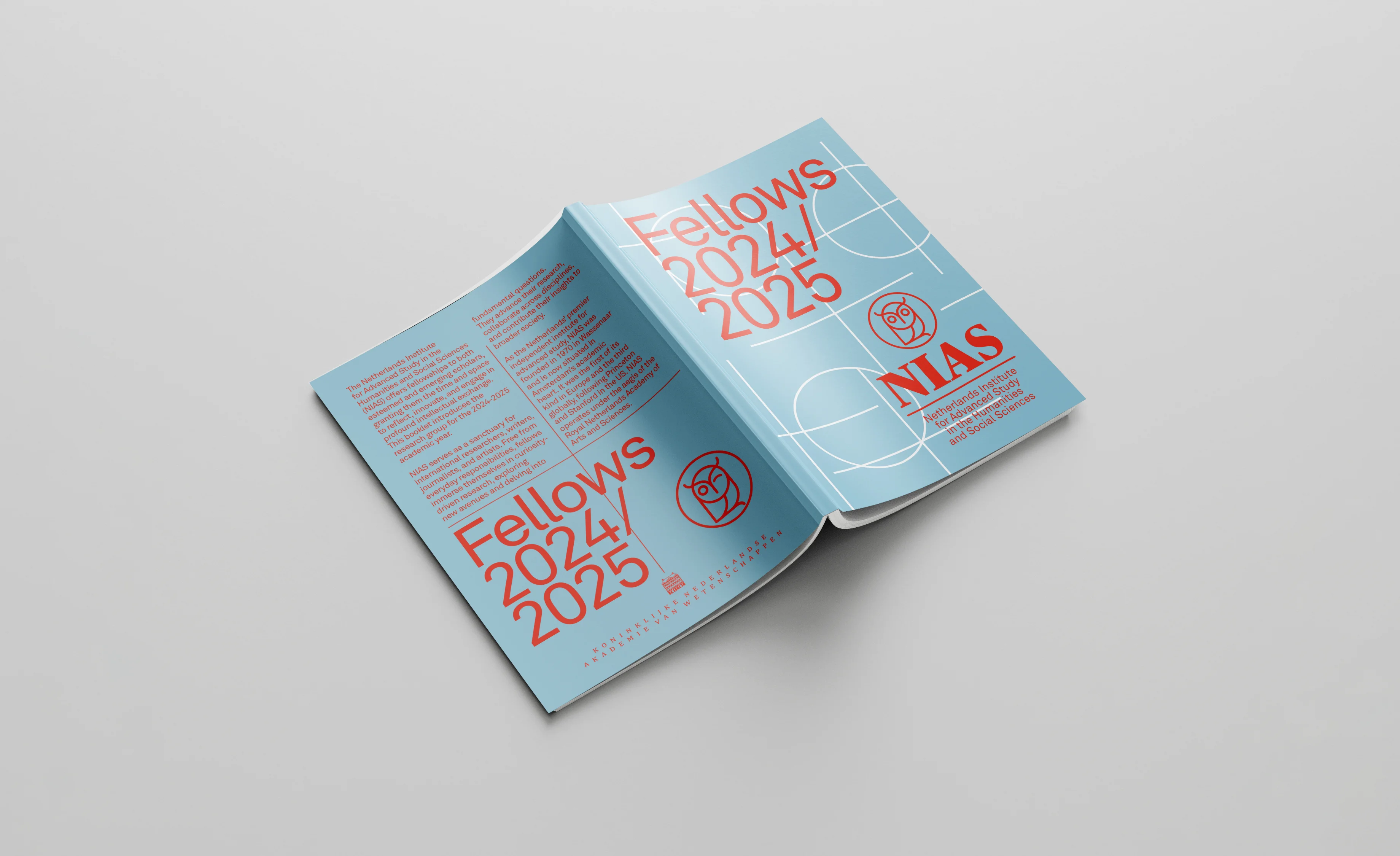
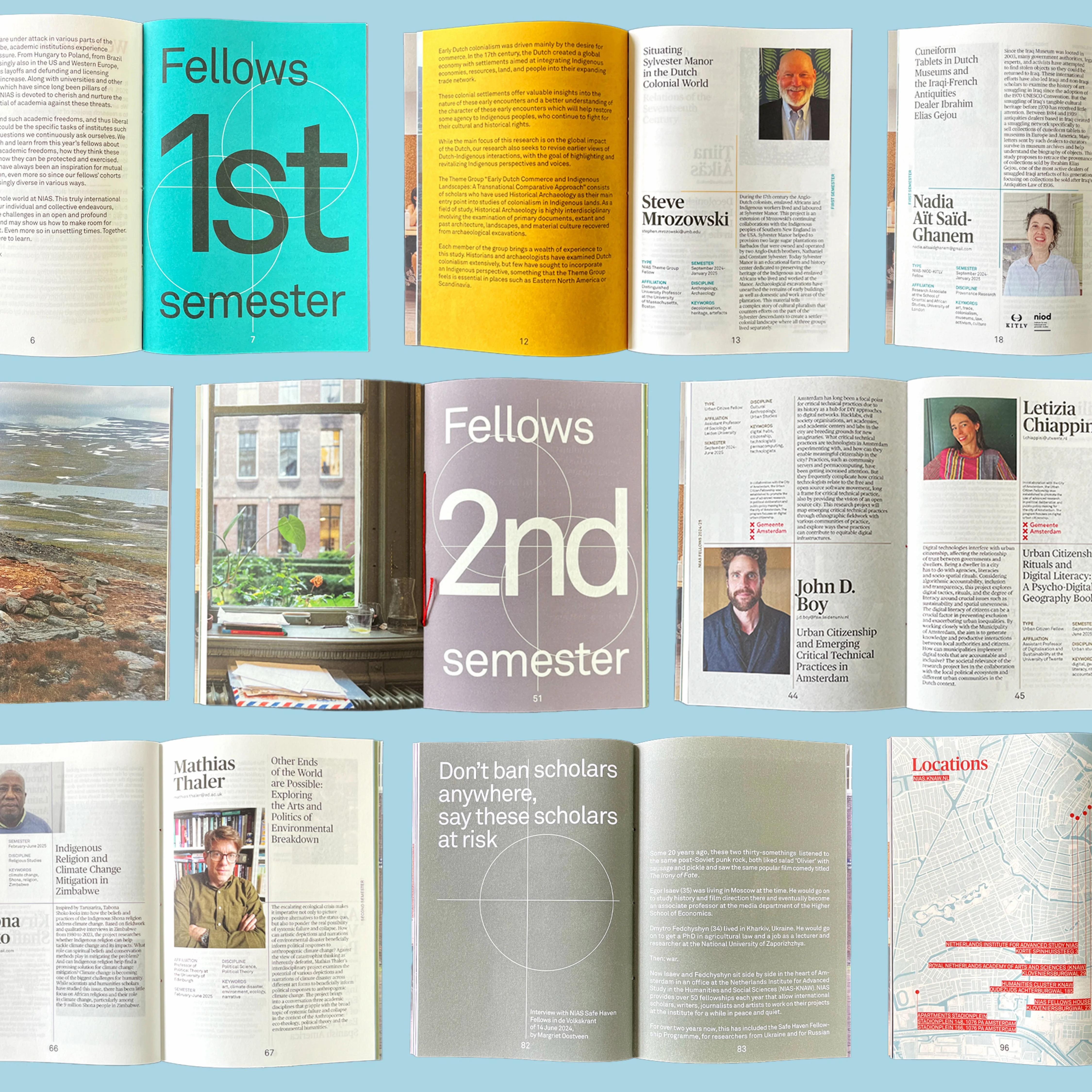
We had the pleasure of collaborating with the Netherlands Institute for Advanced Study in the Humanities and Social Sciences (NIAS) on the development of a refreshed visual identity. As part of this project, we also designed a range of supporting materials including the Fellows Booklet, poster, and additional print and digital assets.

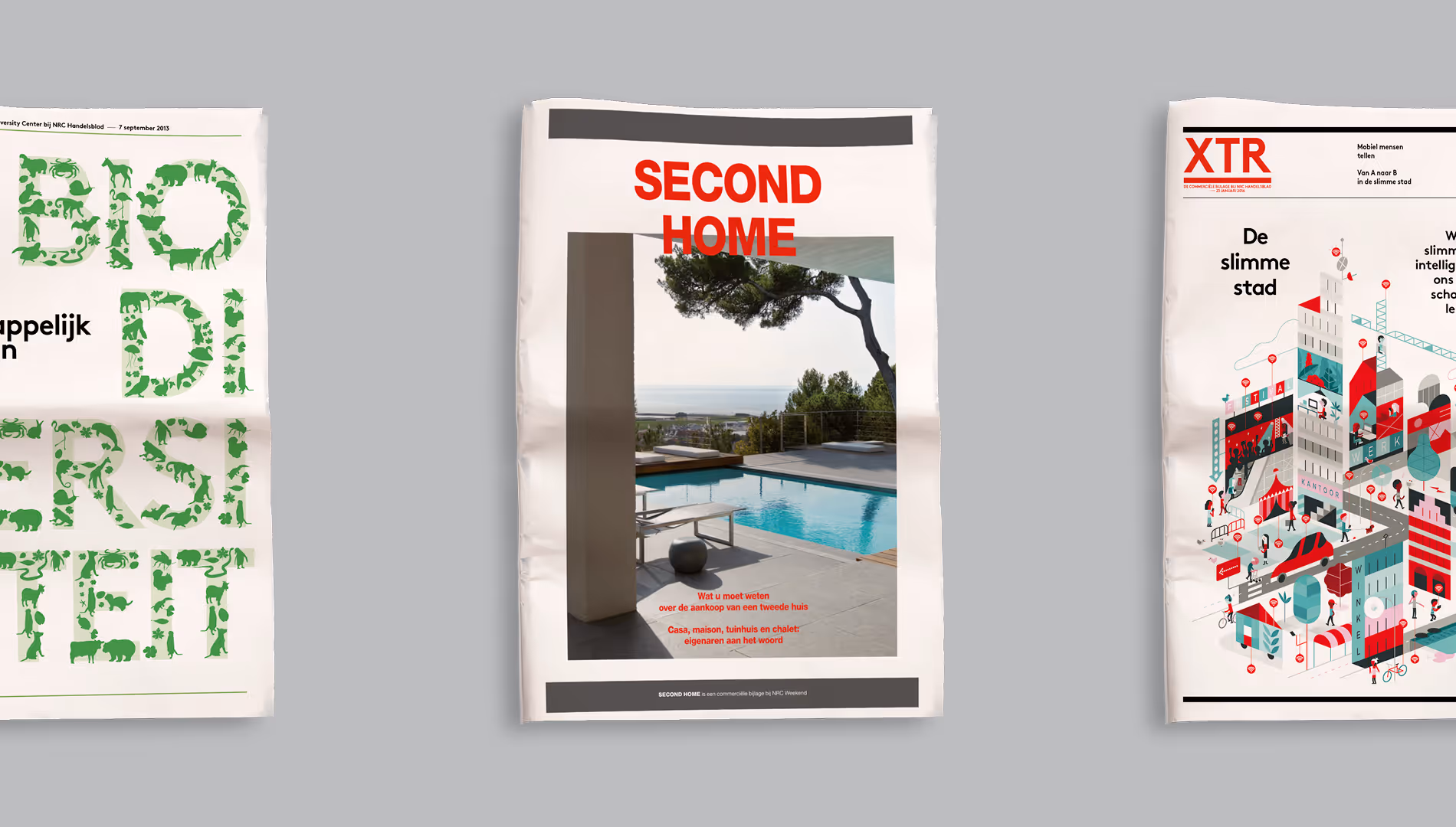
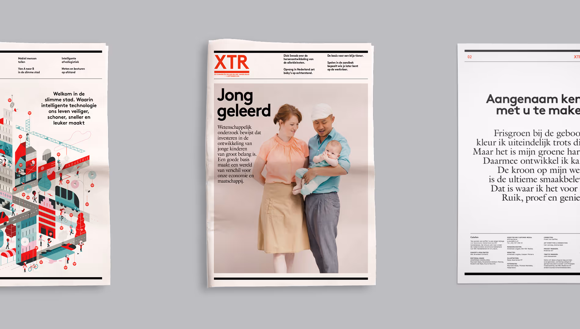
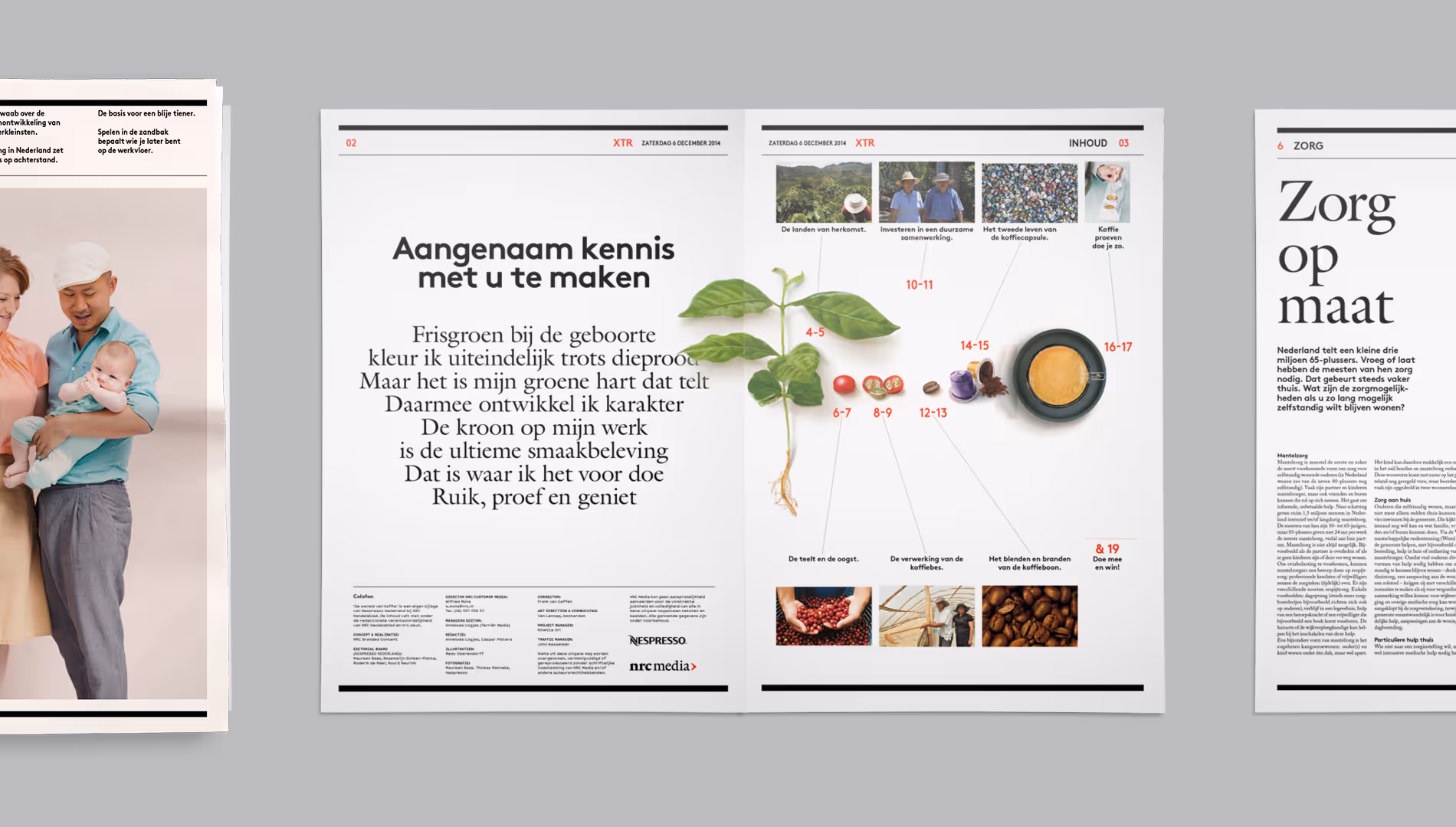
How to make the commercial supplement of a paper stand out from the rest and truly engage the reader? By creating an additional brand. XTR is an on- and offline supplement with branded content, created in collaboration with brands as Nespresso, Nikon, Vodafone and ONVZ.
For Dutch health insurance company ONVZ we invented the Guide in Health, a booklet with which ONVZ wants to inform and inspire its readers with relevant stories about various health topics. In our design we deviate from the cliché health insurance stock photos. That’s why we involved illustrators. To communicate about health in a different and more artistic way.

%20(1).gif)
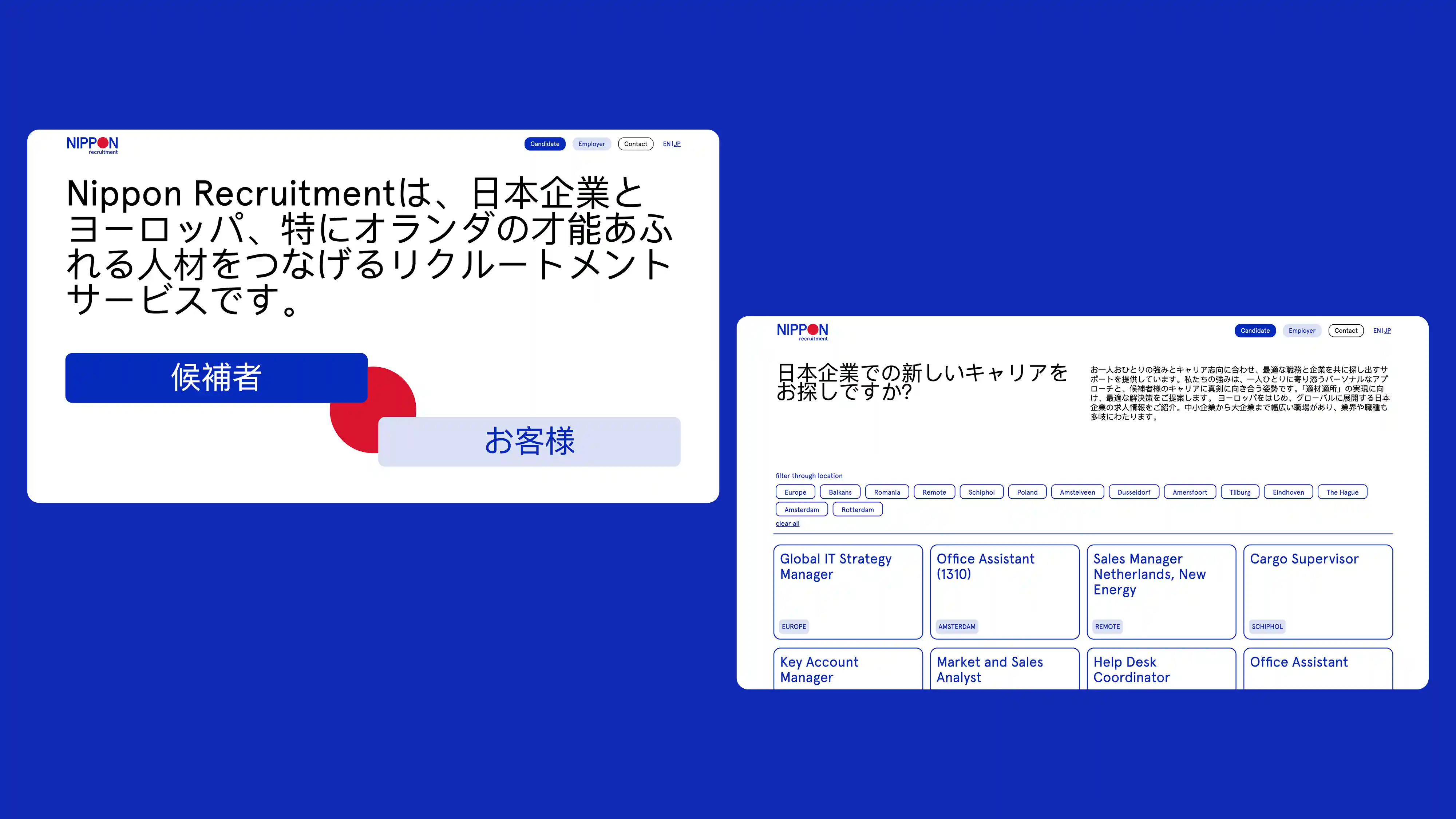
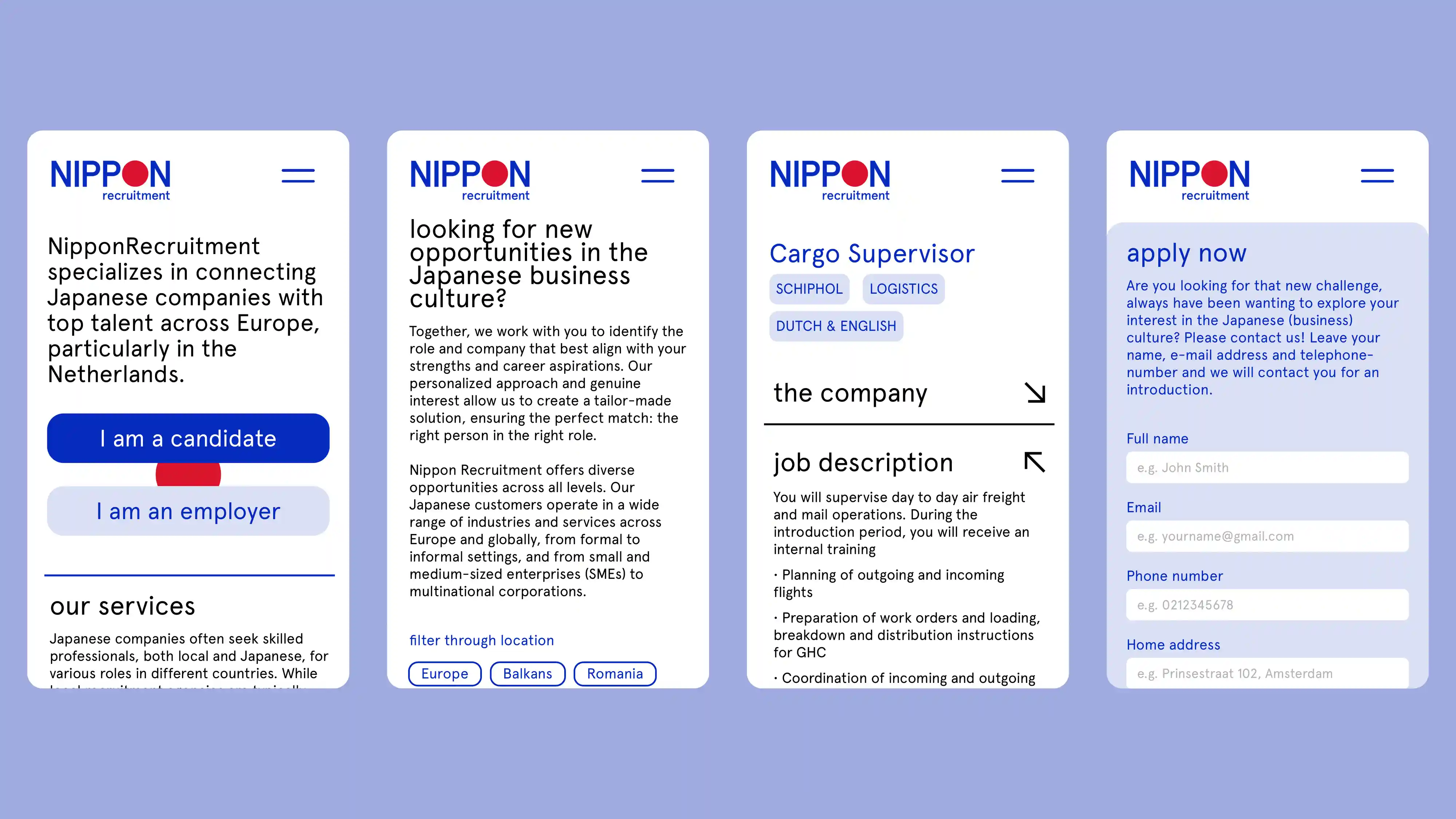
Nippon Recruitment connects Japanese companies with top European talent, focusing on the Netherlands. We redesigned their brand identity and website, which is their primary recruitment channel. The new site features a clear, user-friendly structure mainly tailored to recruiters and job seekers. A built-in filter system helps users search by location and apply directly through the jobs openings pages. The website design is clean and distinctive, bringing a sense of friendliness and freshness while maintaining professionalism.
%20(1).gif)

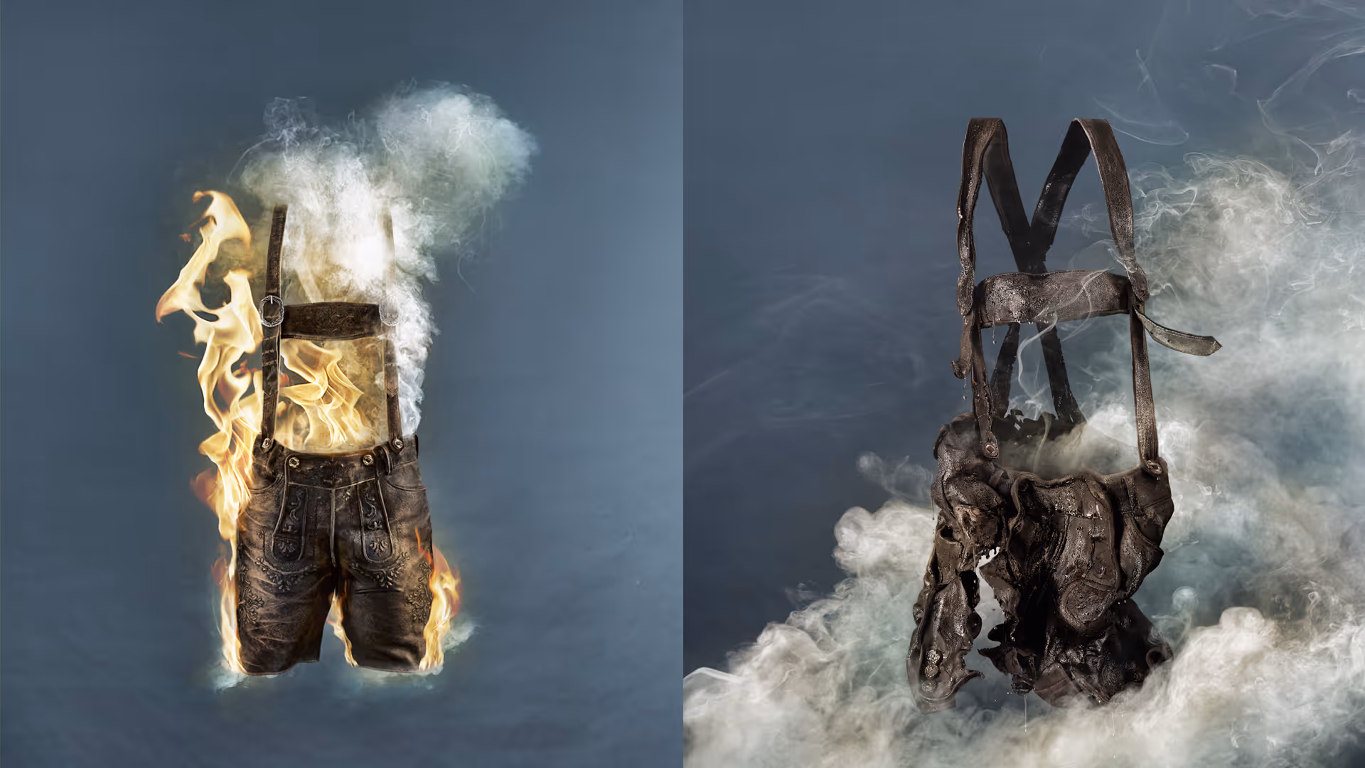
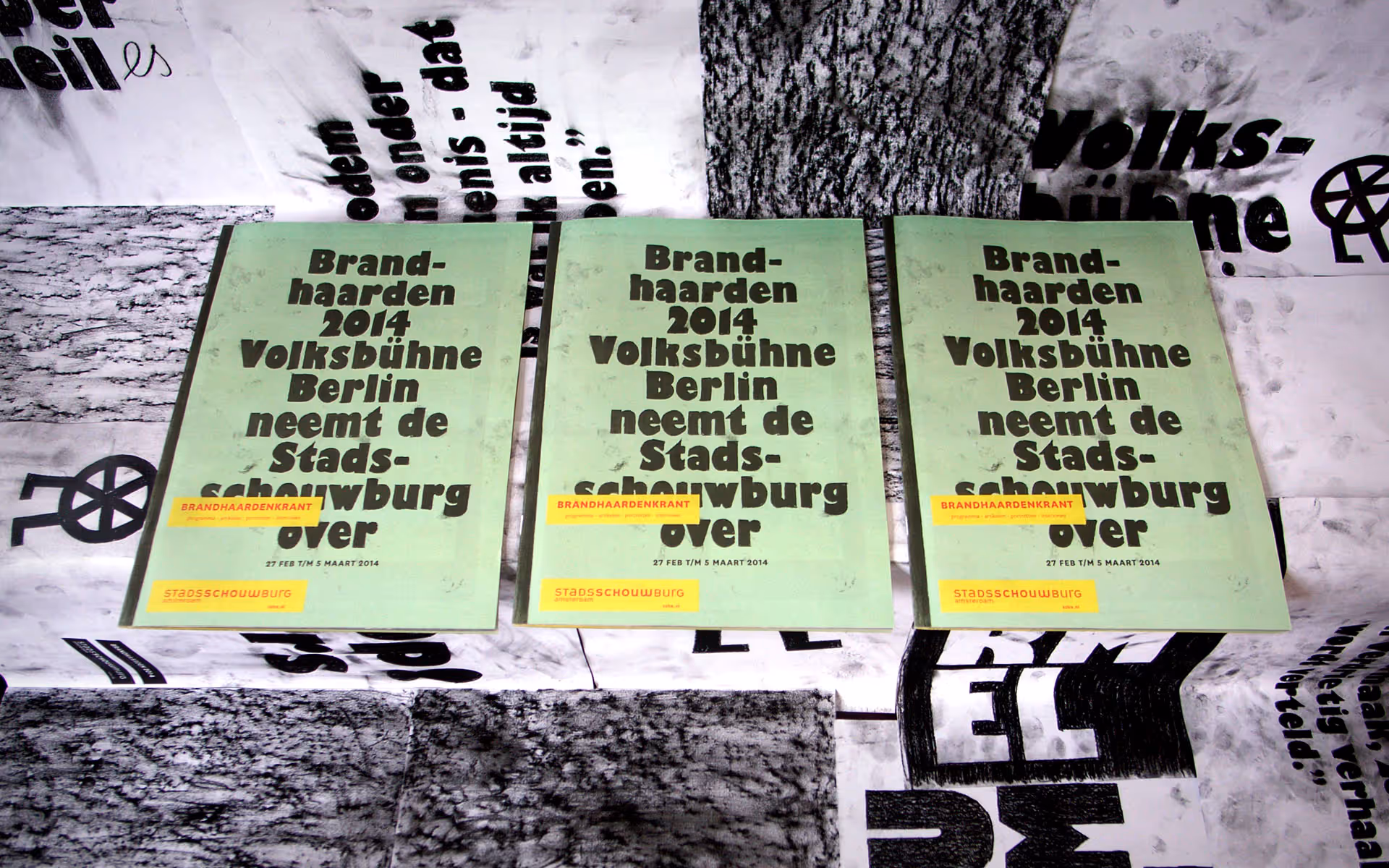
Stadsschouwburg Amsterdam has a special, long-running series called Brandhaarden. Meaning both a fireplace and a conflict zone in Dutch, the idea is to stage international productions that deal with 'hot' social or political topics. Van Lennep turned up the heat for the promo posters. Each shows a cliche from the theatre company's home country, set on fire.
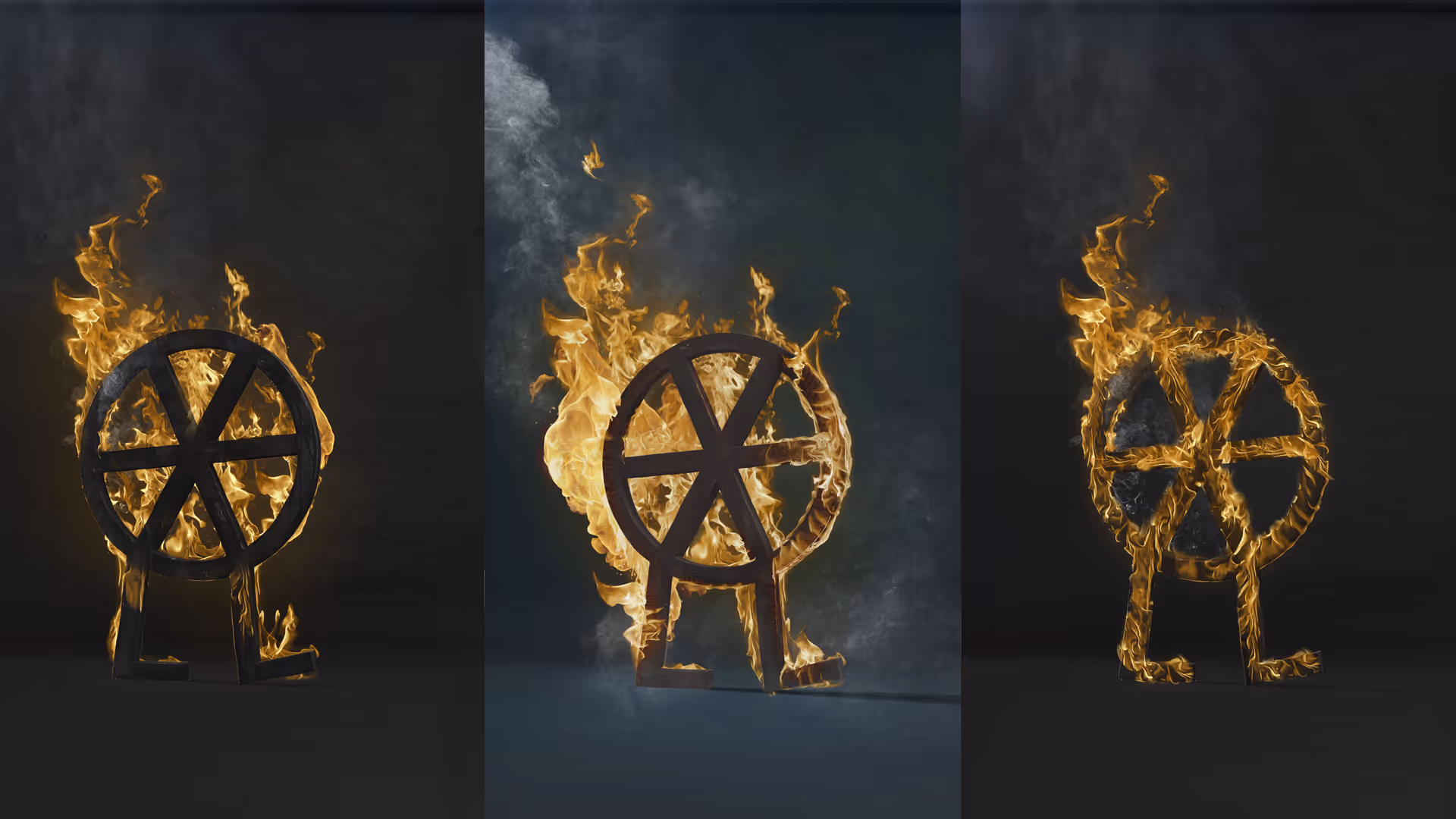

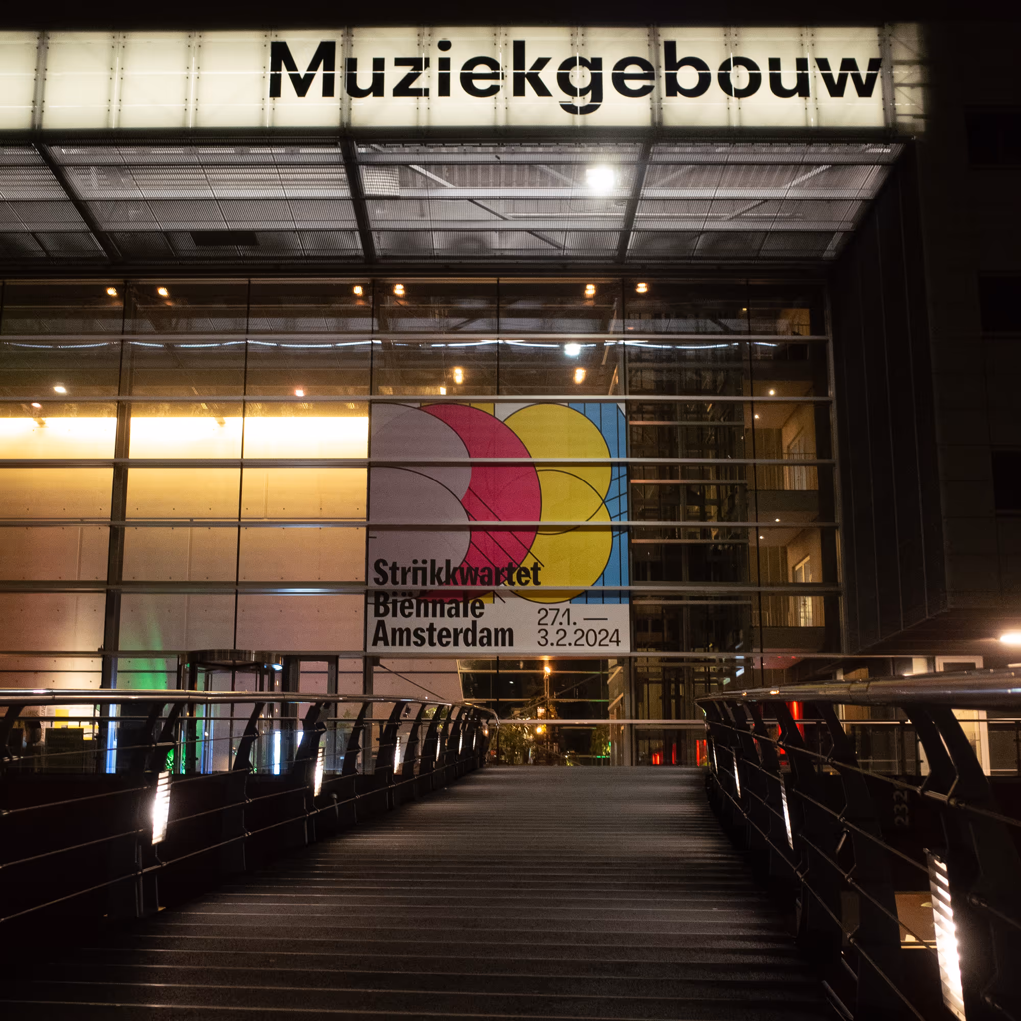
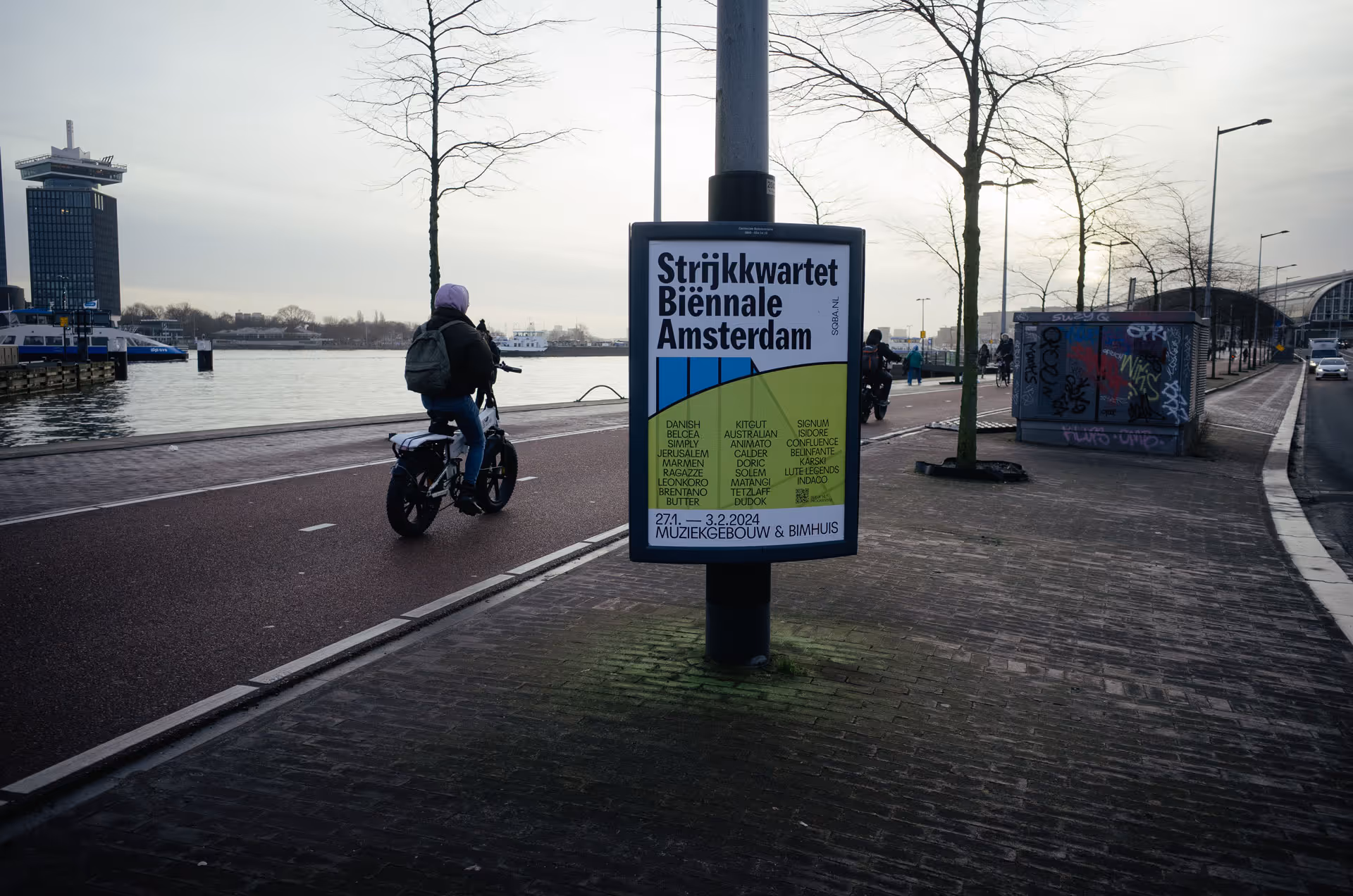
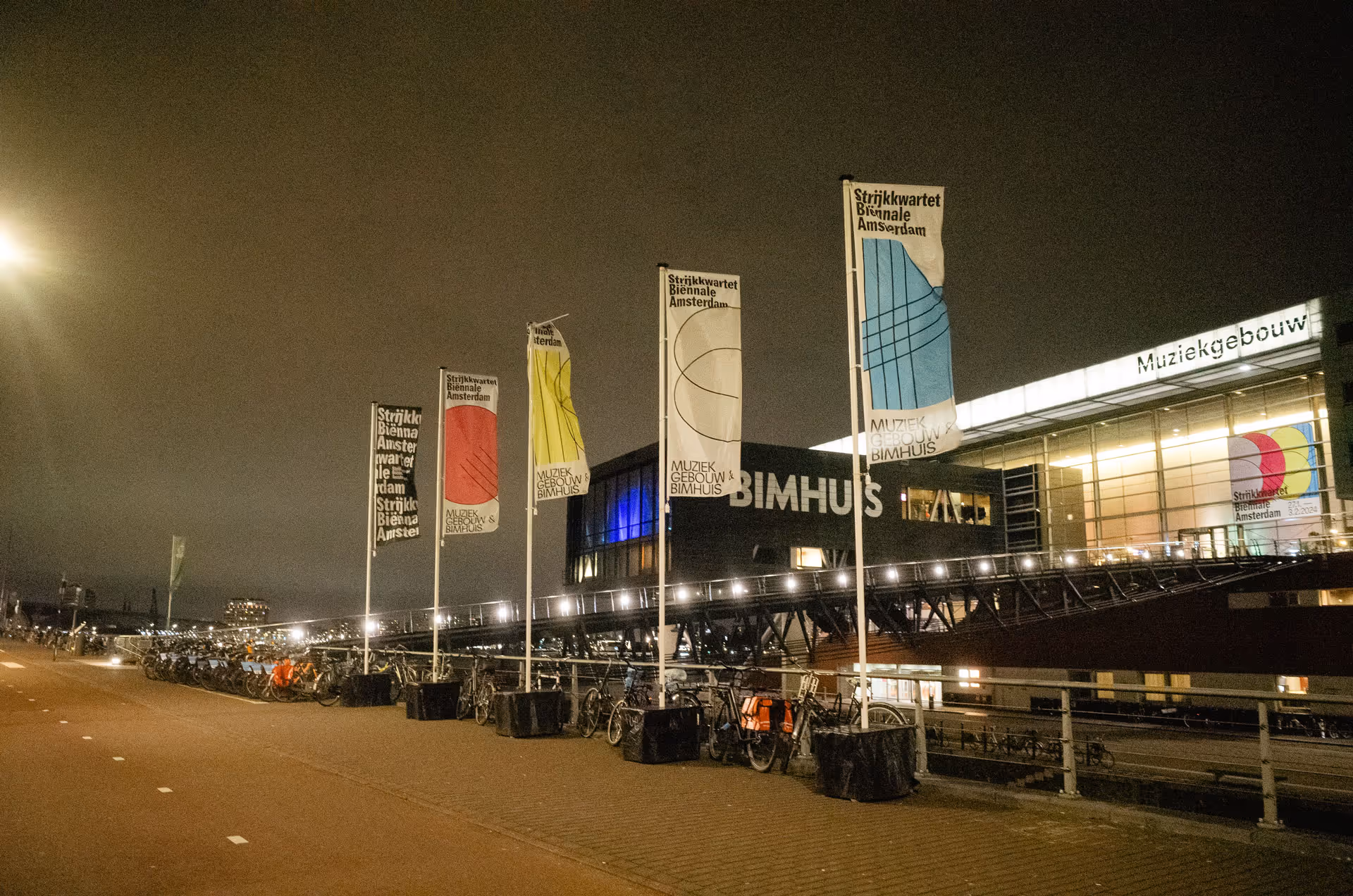
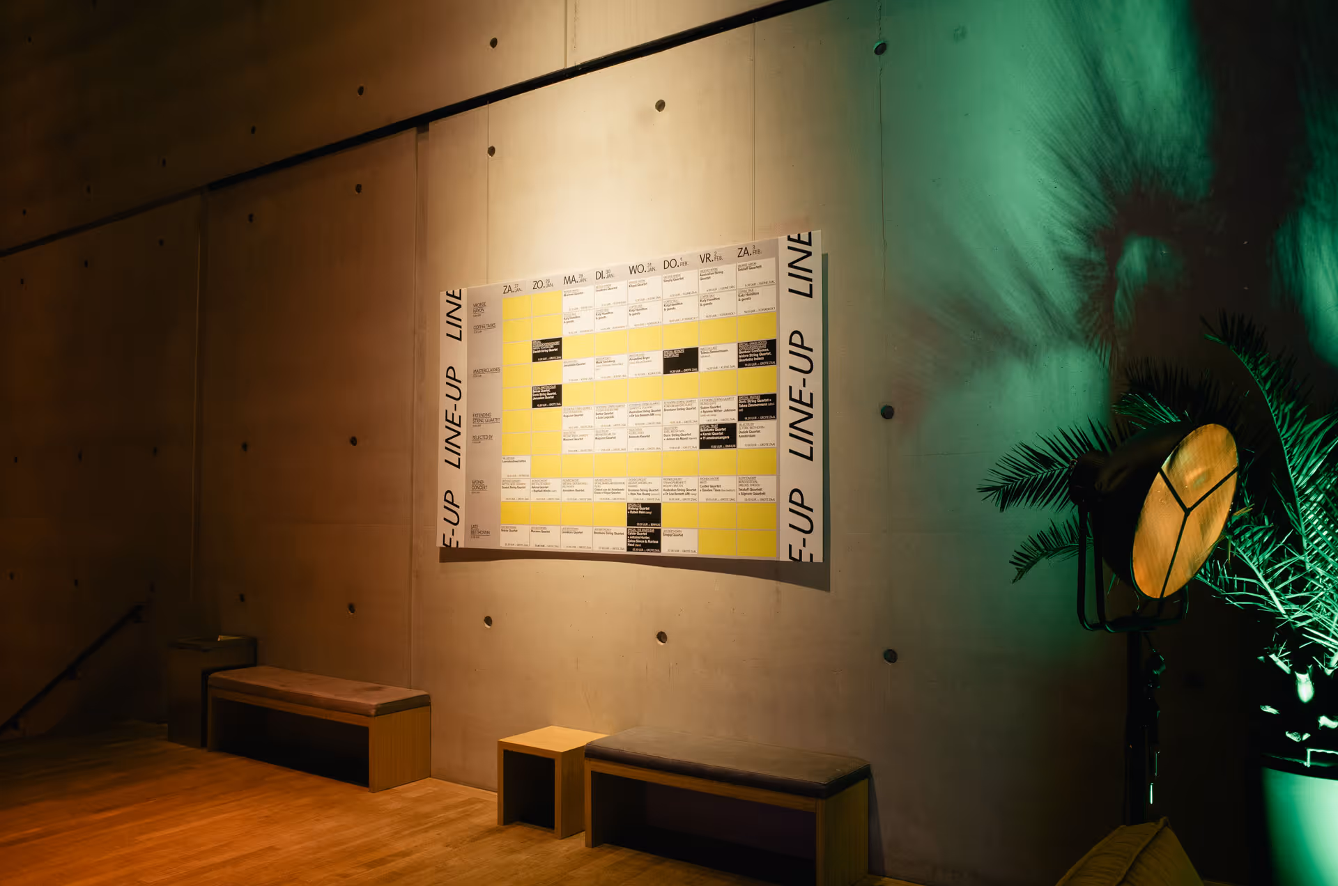
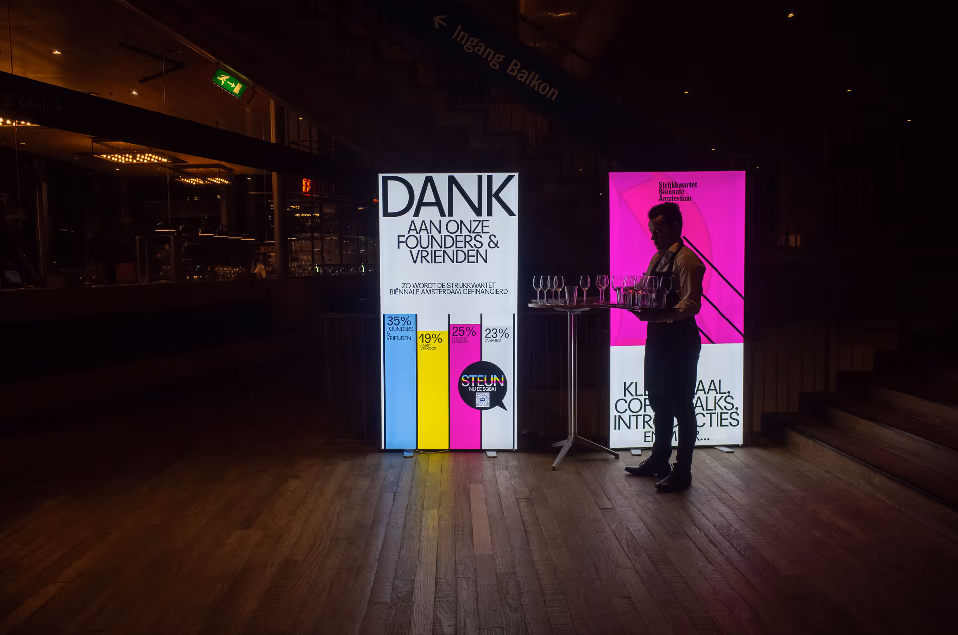
Unknown to many, the string quartet once enjoyed the same status as opera, theatre and ballet. It was built on the principles of Enlightenment, thus representing democracy and equality. The string quartet biennale brings string quartets as an art form back to the 21st century. Inspired by this exciting history, Van Lennep gave visual expression to its revival.

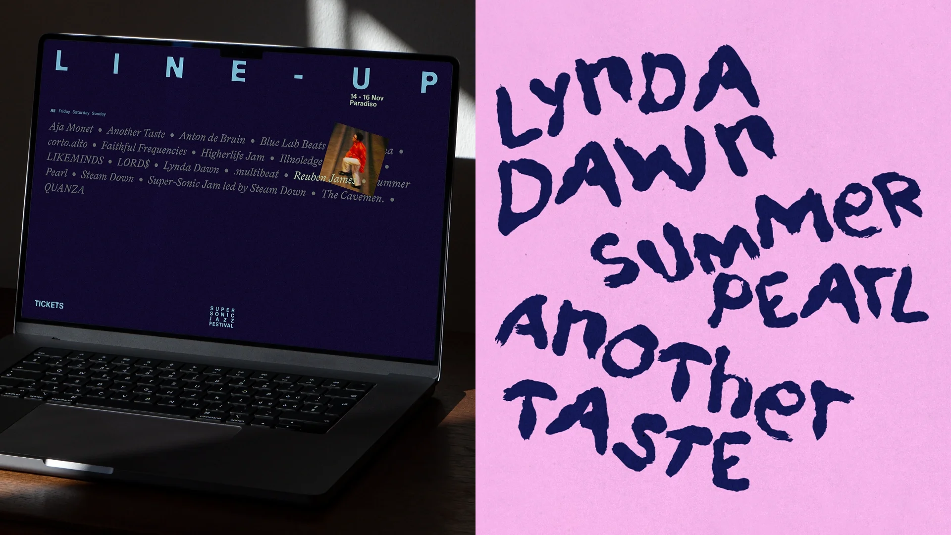
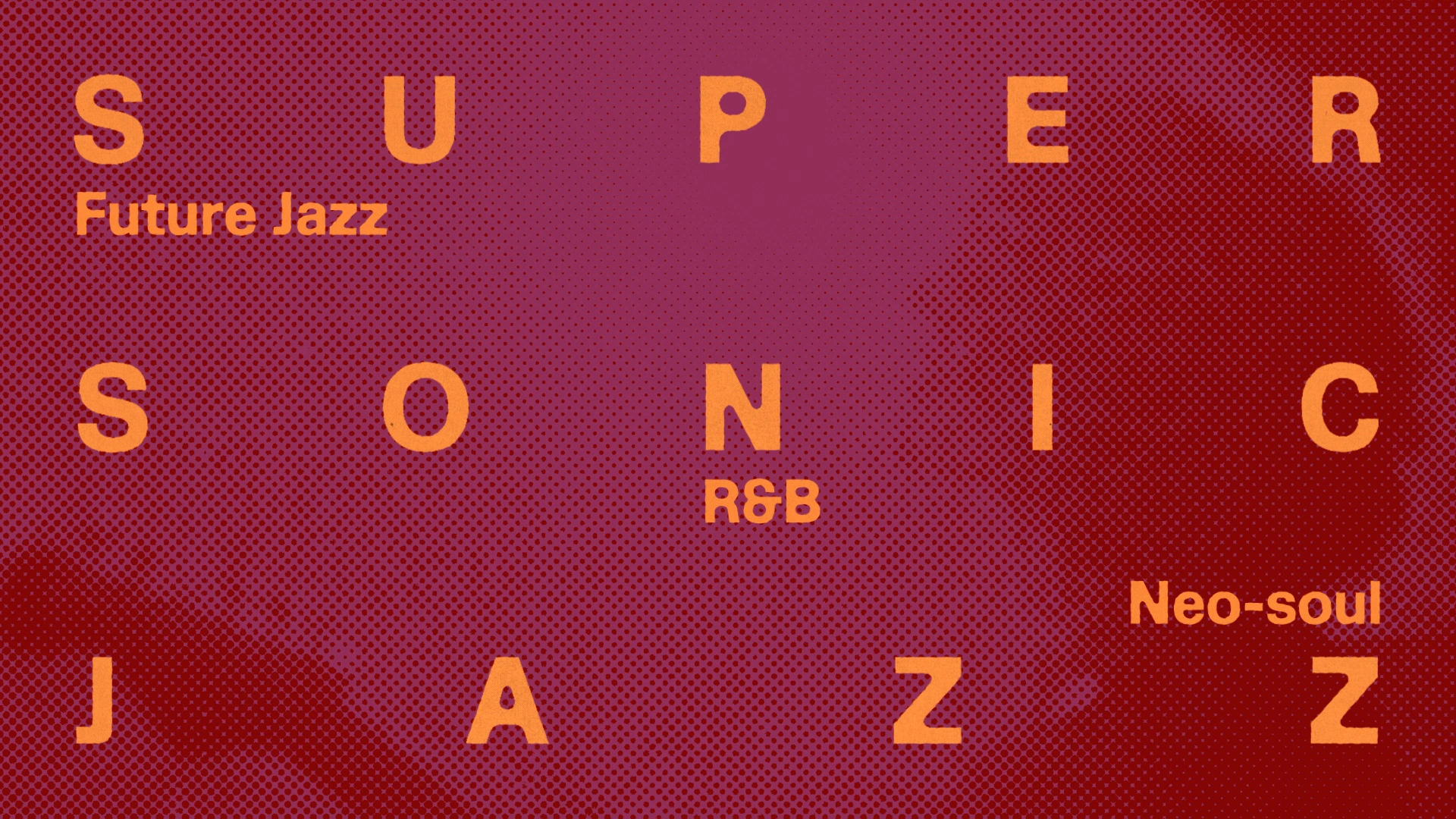
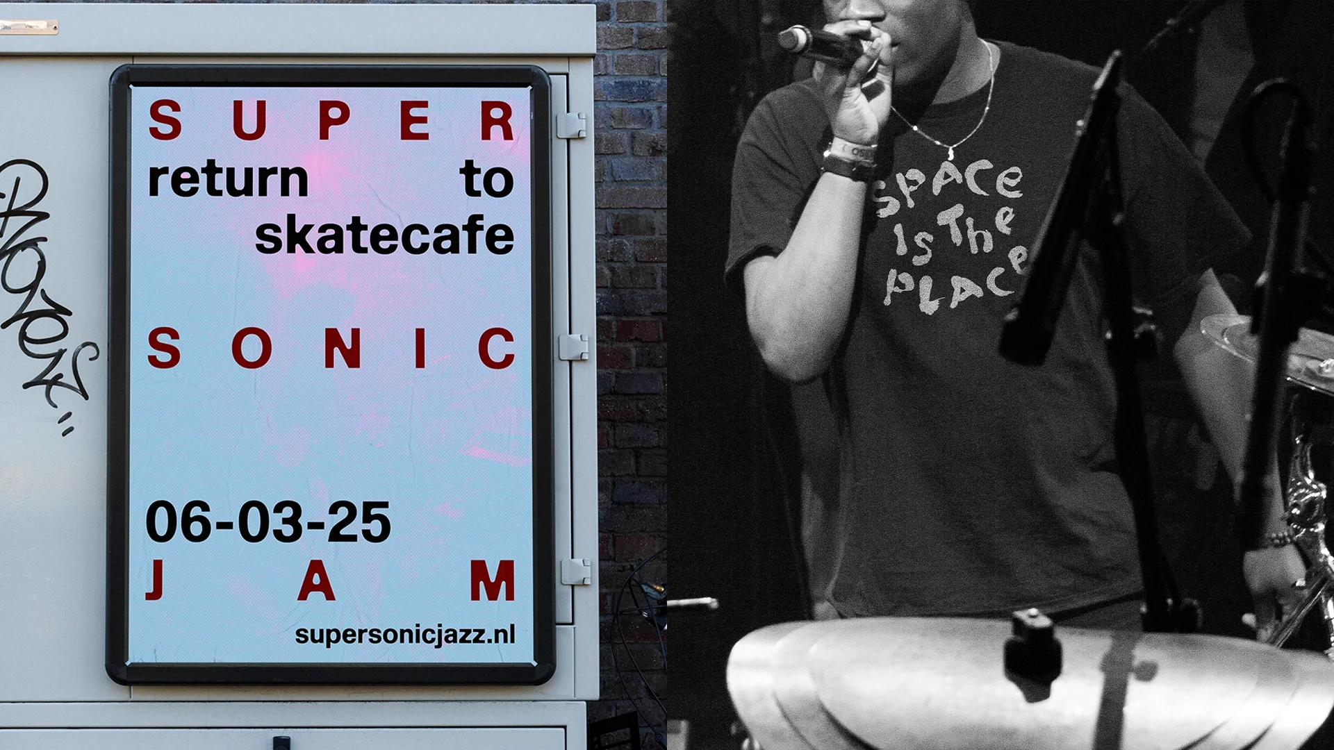
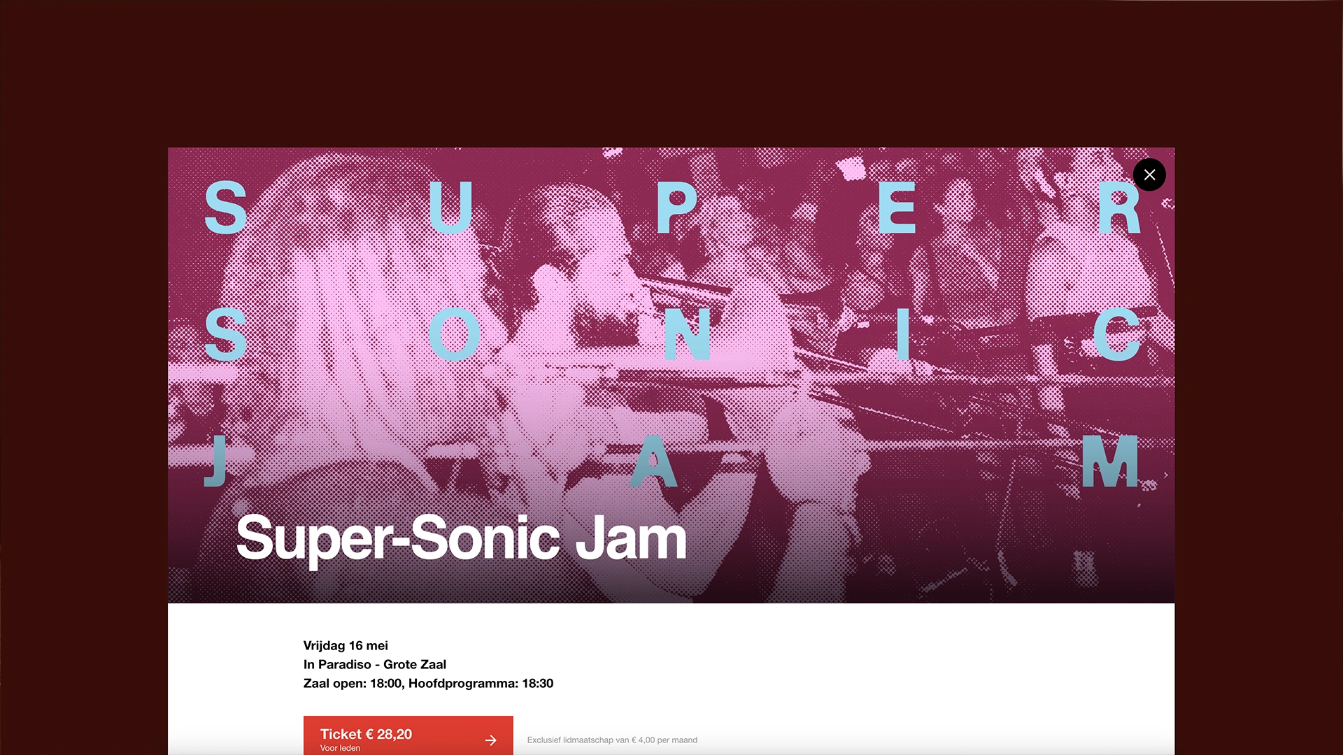
Super-Sonic Jazz at Paradiso features R&B, Future Jazz, Neo Soul and beyond. At once a monthly event, festival, label, and community, its identity is built on the concept of making space, stepping back to spotlight emerging talent. The identity we designed embraces the vintage and the analogue. Keeping things human with lo-fi animation and a bespoke hand lettered font.
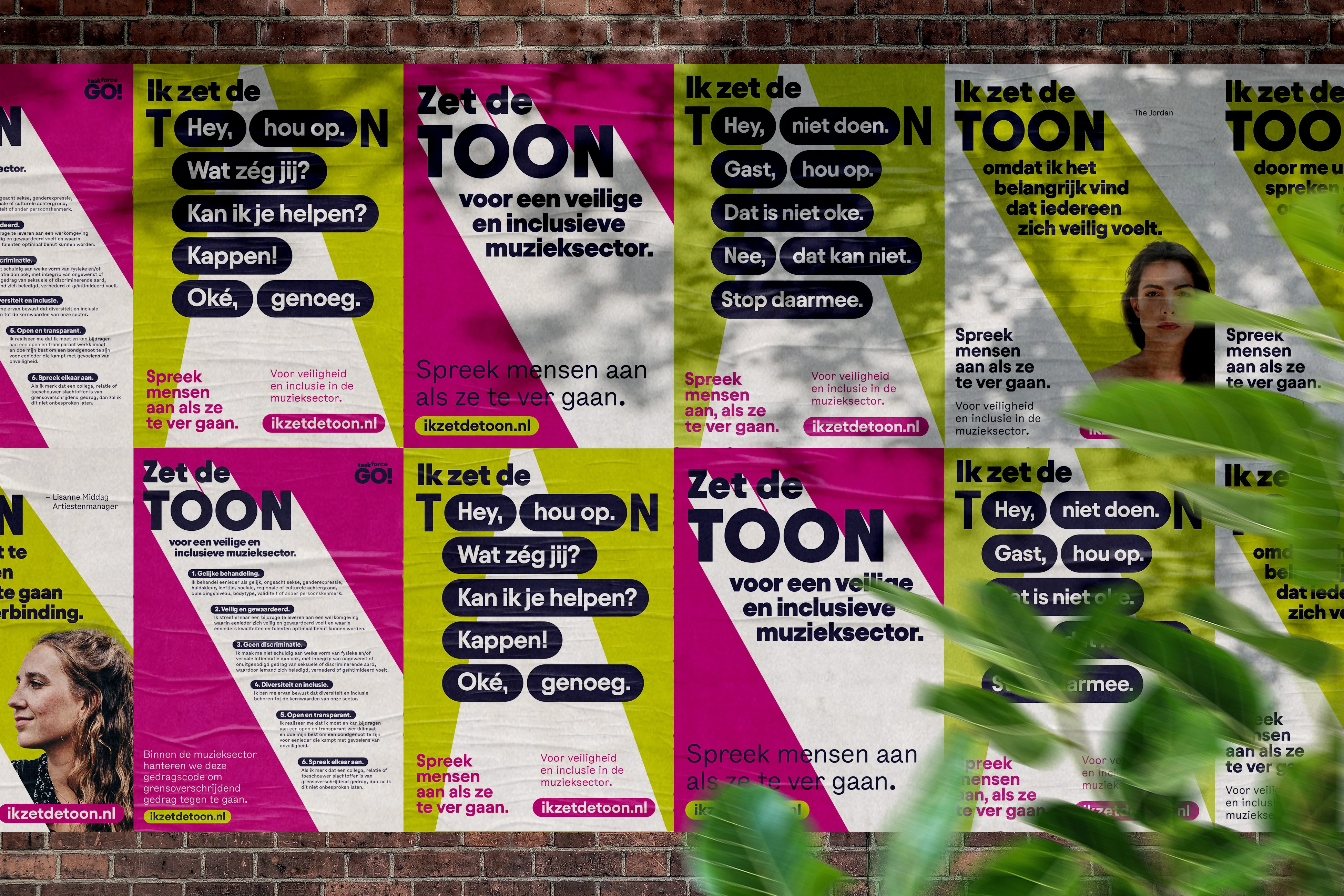
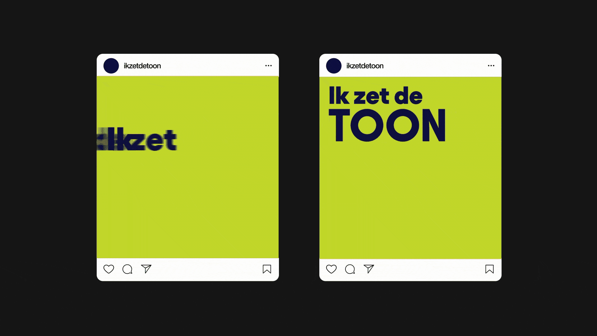
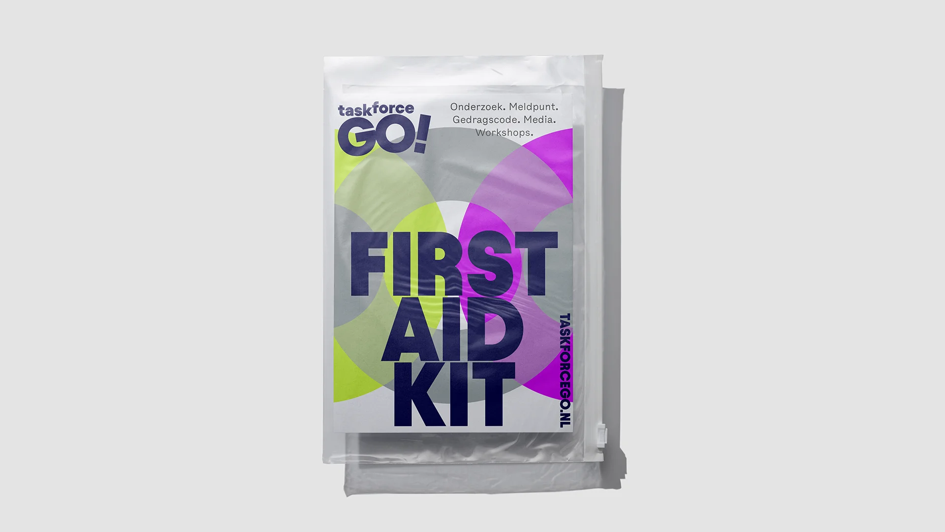
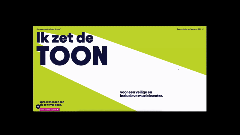
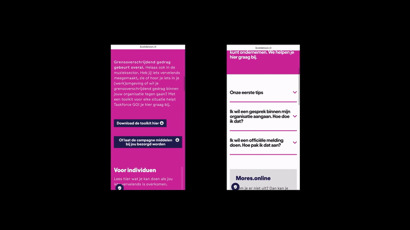
Inappropriate behavior in the music industry is far too common. In response to growing concerns, Taskforce GO! launched a survey and research to better understand the issue.
Together with BKB, we created the awareness campaign ‘Zet de Toon’, sending a clear message: there is no place for inappropriate behavior—whether it’s discrimination, intimidation, or abuse.
The campaign encourages everyone in and around the music industry to take action and speak out. A practical toolkit is available for download at ikzetdetoon.nl, offering resources for professionals working behind the scenes at venues, festivals, and studios.
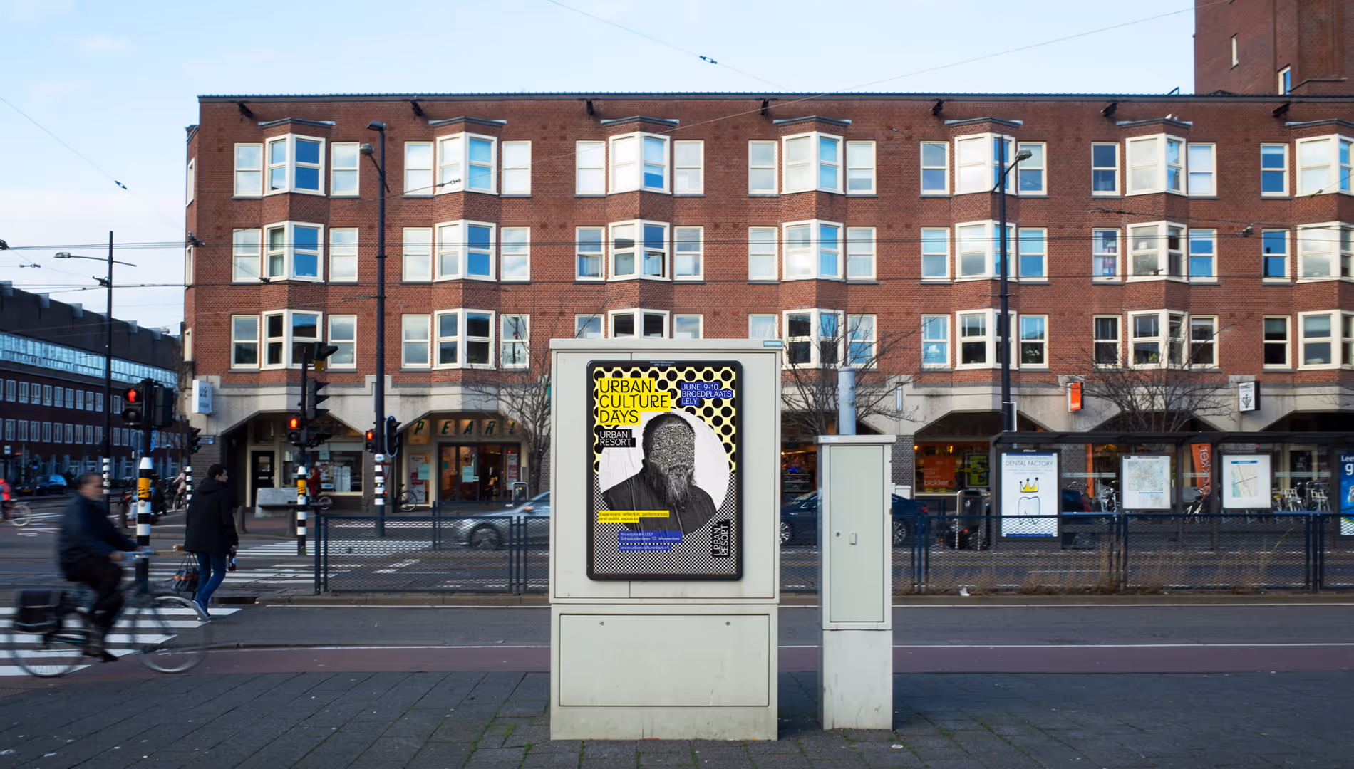
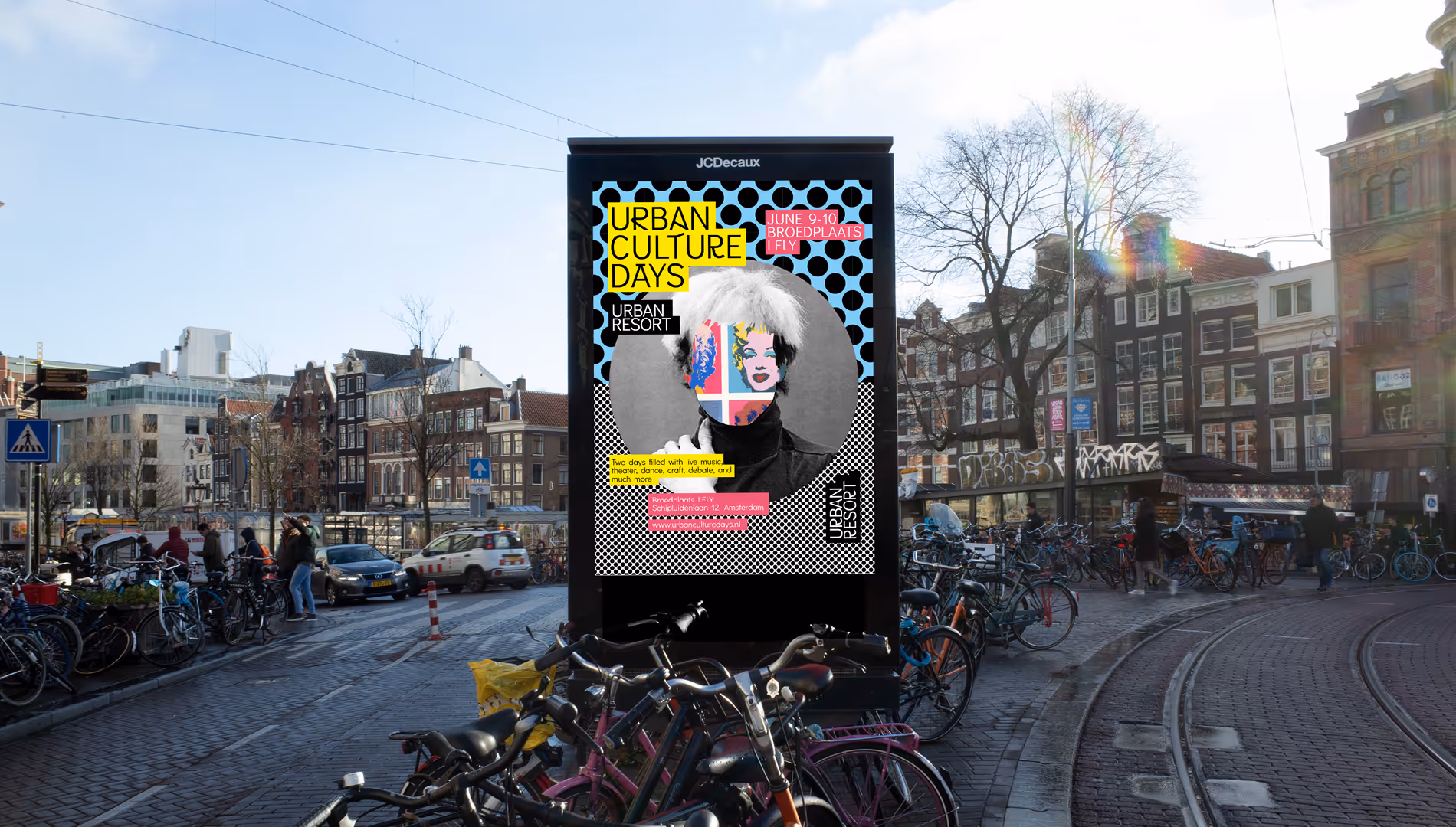
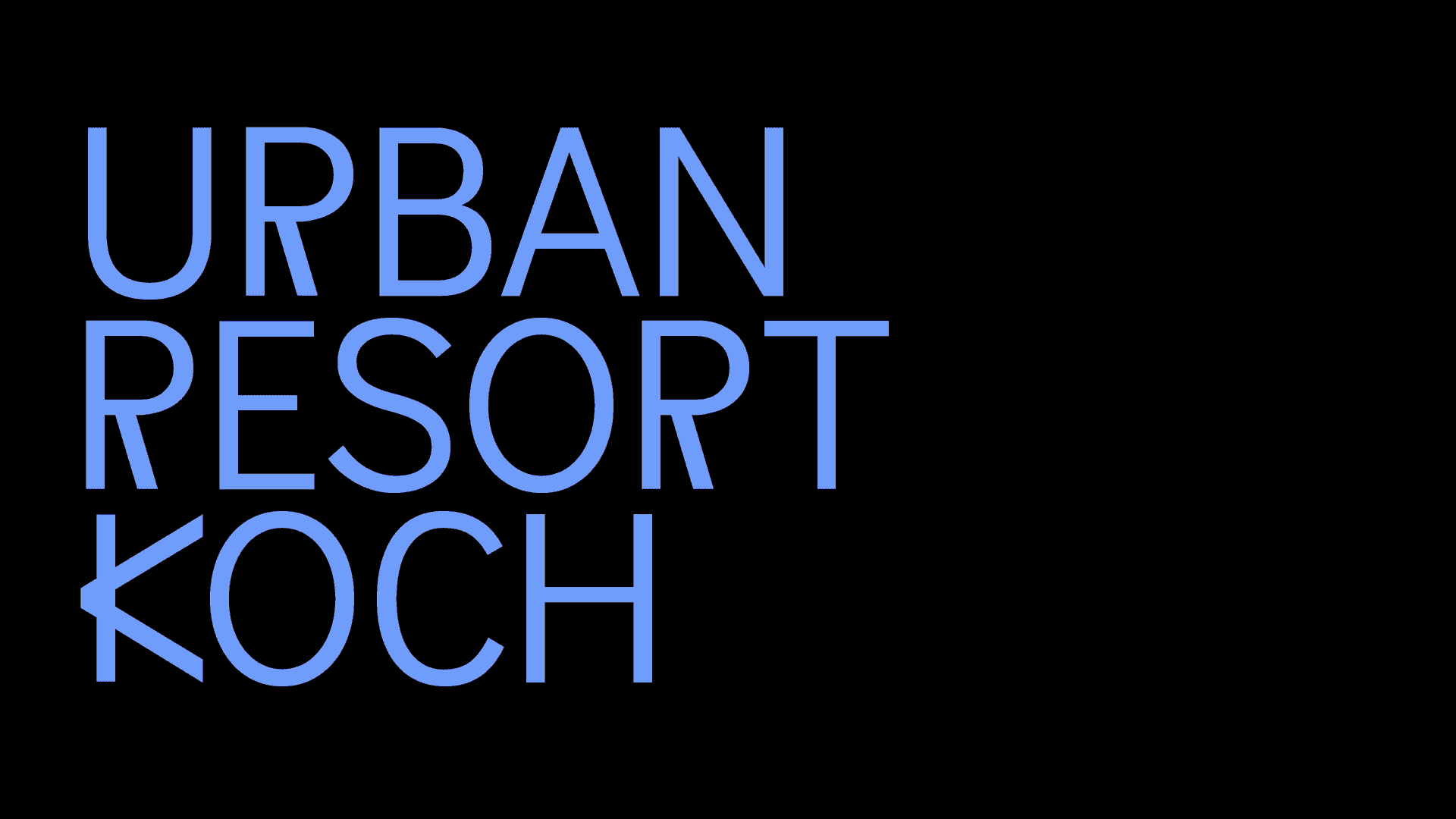
Artists need places to cook new ideas. Luckily there’s Urban Resort. They offer affordable living and work spaces for creative people. Their goal is to keep Amsterdam accessible and diverse. Of course we were happy to help them to spread this beautiful message. So we designed an identity that helps them to reach an even larger audience, including a brand new website.

.gif)
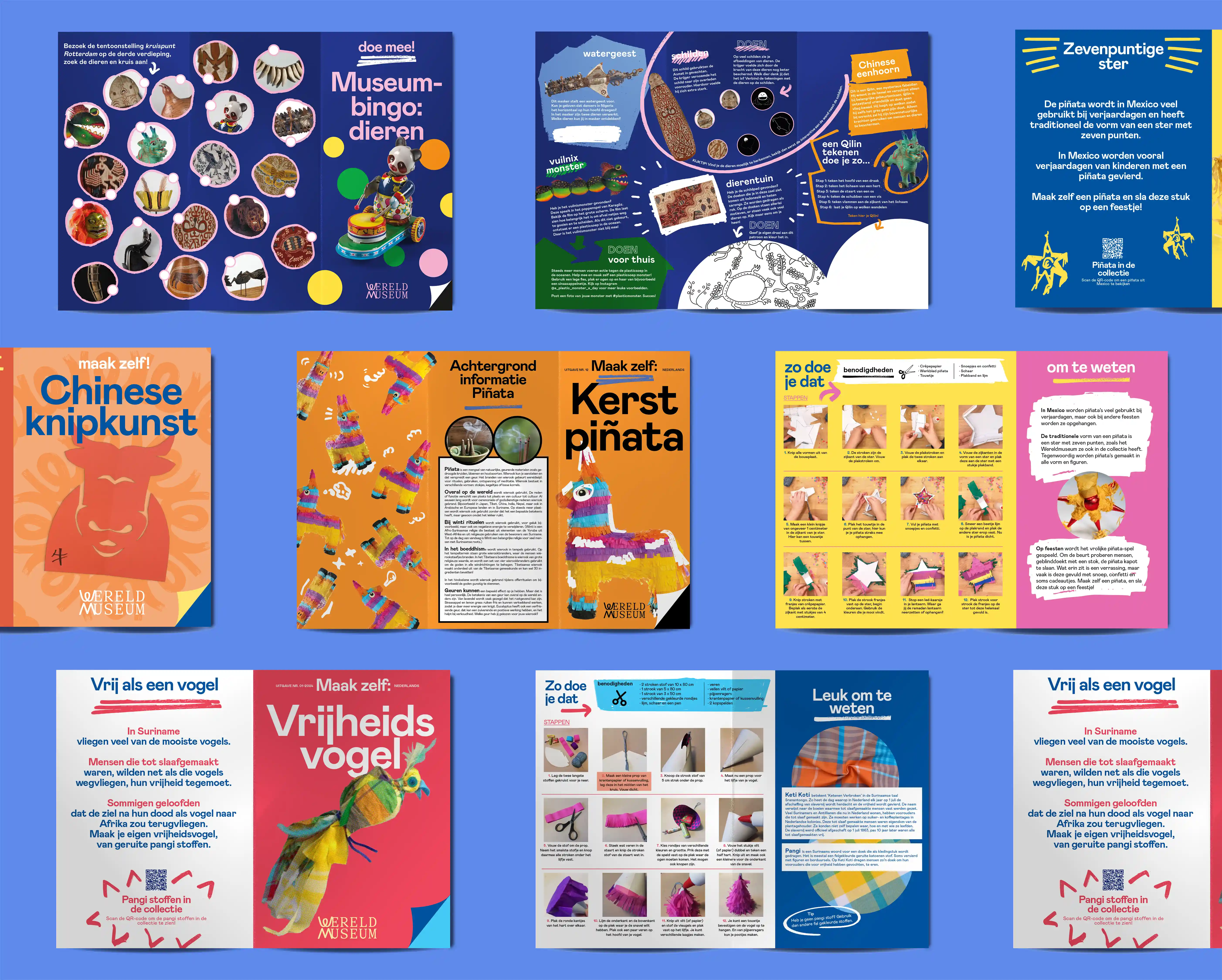
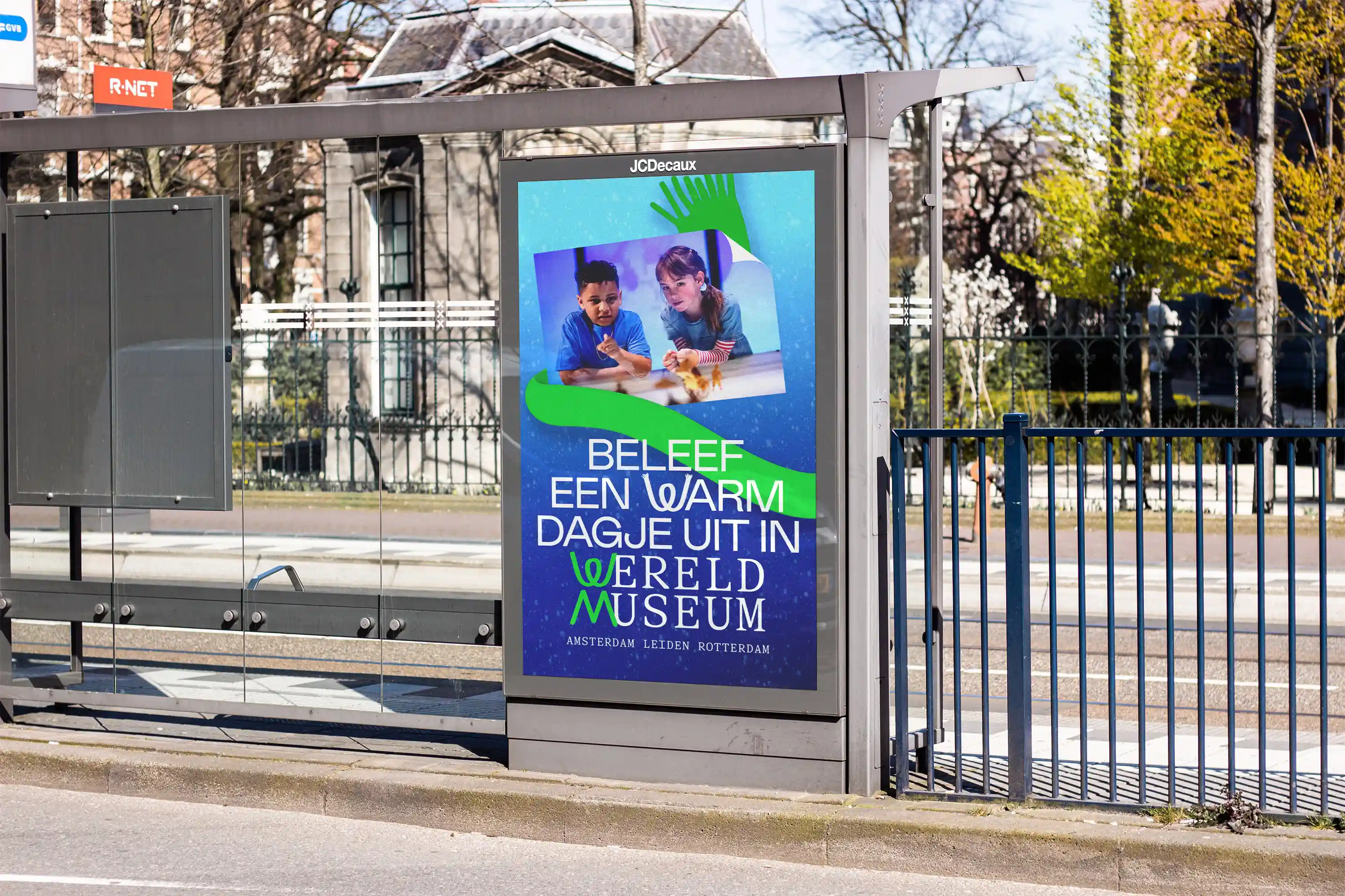
The Wereldmuseum shares stories about how people live across the globe—both in the past and today across its three locations in Amsterdam, Rotterdam and Leiden. Through its exhibitions and programs, the museum invites visitors to explore how human lives are shaped by history, culture, and the world around us.
We designed the identity for the educational materials, staying close to the museum’s own style but adding distinctive elements to give the education program its own character. We also create educational content aimed at a junior audience.